안녕하세요, 이번 글은 [Microsoft Control Style & Template 톺아보기] 시리즈의 개별 Control로 들어가기 전 Template에 관하여 알려드리도록 하겠습니다.

Control Style & Template의 각 Control의 예제를 보면 <Setter Property="Template">라는 부분이 존재합니다. 내부의 코드를 살펴보면 외형 및 상태에 대하여 자세하게 설정이 되어있습니다. Control에 대한 설정의 경우 Style의 기본 속성(Property)들을 사용하여 변경할 수 있지만, Style의 경우 Control의 기본 속성에 대해서만 변경이 가능합니다. Control의 기본 속성뿐만 아니라 좀 더 세세한 부분을 변경하고 싶을 경우 Template을 사용해야 합니다.
Style과 Template의 차이점
- Style은 Control의 기본 속성(Property)만 변경 가능
- Template은 Style보다 Control의 더 많은 부분을 변경 가능
Template의 유형 - Control, Data, ItemsPanel
1. Control Template
Control에 외형의 형태를 지정해줄 수 있는 Template입니다.
[예제]
<Style x:Key="baseBtn" TargetType="{x:Type Button}">
	...
    <Setter Property="Template">
        <Setter.Value>
            <ControlTemplate TargetType="{x:Type Button}">
                <Grid>
                    <Border x:Name="Border" CornerRadius="5" BorderThickness="{TemplateBinding BorderThickness}" Background="{TemplateBinding Background}" BorderBrush="{TemplateBinding BorderBrush}" Effect="{StaticResource BlackShadow2}"/>
                    <Border x:Name="Border2" CornerRadius="5" BorderThickness="{TemplateBinding BorderThickness}" Background="{TemplateBinding Background}" BorderBrush="{TemplateBinding BorderBrush}" Effect="{StaticResource BlackShadow2}"/>
                    <ContentPresenter Margin="4" HorizontalAlignment="Center" VerticalAlignment="Center" RecognizesAccessKey="True"/>
                </Grid>
                <ControlTemplate.Triggers>
                    <Trigger Property="IsMouseOver" Value="true">
                        <Setter Property="Effect" Value="{StaticResource BlackShadow3}" TargetName="Border2"/>
                        <Setter Property="Effect" Value="{StaticResource WhiteShadow3}" TargetName="Border"/>
                    </Trigger>
                </ControlTemplate.Triggers>
            </ControlTemplate>
        </Setter.Value>
    </Setter>
</Style>
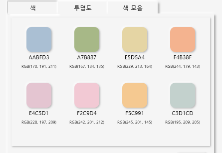
2. Data Template
Control에 외형 및 표현될 데이터의 형태를 지정해줄 수 있는 Template입니다. Content를 꾸미는 것으로 주로 사용됩니다.
[예제]


<DataTemplate x:Key="ItemDataTemplate1">
    <StackPanel Width="70" Margin="5">
        <Border Width="50" Height="50" CornerRadius="50" HorizontalAlignment="Center" Effect="{DynamicResource WhiteShadow2}">
            <Border Background="{Binding solidColorbrush}" CornerRadius="10" Effect="{DynamicResource BlackShadow2}"/>
        </Border>
        <Viewbox Height="15" Margin="3">
            <TextBlock HorizontalAlignment="Center" Text="{Binding hex}"/>
        </Viewbox>
        <Viewbox Height="15">
            <StackPanel Orientation="Horizontal">
                <TextBlock Text="RGB("/>
                <TextBlock Text="{Binding r}"/>
                <TextBlock Text=", "/>
                <TextBlock Text="{Binding g}"/>
                <TextBlock Text=", "/>
                <TextBlock Text="{Binding b}"/>
                <TextBlock Text=")"/>
            </StackPanel>
        </Viewbox>
    </StackPanel>
</DataTemplate>

<Style x:Key="TabLV" TargetType="{x:Type ListView}">
	...
    <Setter Property="ItemsSource" Value="{Binding ListColors}"/>
    <Setter Property="ItemsControl.ItemsPanel" Value="{StaticResource ItemPanelTemplate}"/>
    <Setter Property="ItemTemplate" Value="{StaticResource ItemDataTemplate1}"/>
	...
</Style>
3. ItemsPanelTemplate
여러 개의 객체를 갖는 Control의 레이아웃에 사용되는 패널을 지정해줄 수 있는 Template입니다.
[예제]

<ItemsPanelTemplate x:Key="ItemPanelTemplate">
    <UniformGrid Columns="4" HorizontalAlignment="Center" VerticalAlignment="Top" Margin="5"/>
</ItemsPanelTemplate>

<Style x:Key="TabLV" TargetType="{x:Type ListView}">
	...
    <Setter Property="ItemsSource" Value="{Binding ListColors}"/>
    <Setter Property="ItemsControl.ItemsPanel" Value="{StaticResource ItemPanelTemplate}"/>
    <Setter Property="ItemTemplate" Value="{StaticResource ItemDataTemplate1}"/>
	...
</Style>
Template을 정의하는 방법 - Inline, Resource, Style
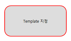
1. Inline
Control 내부에 직접적으로 Template을 정의하여 사용하는 방법입니다.
<Button MinHeight="100" MinWidth="200">
    <Button.Template>
        <ControlTemplate TargetType="Button">
            <Border x:Name="Border" CornerRadius="20" BorderBrush="Red" BorderThickness="2" Background="{TemplateBinding Background}">
                <ContentPresenter Content="Template 지정" HorizontalAlignment="Center" VerticalAlignment="Center"/>
            </Border>
        </ControlTemplate>
    </Button.Template>
</Button>
2. Resource
Resource 내부에 특정 키값에 Template을 정의한 뒤 정의한 키 값을 Control의 기본 속성인 Template에서 사용하는 방법입니다. 키 값(x:Key)을 지정하지 않을 경우 오류가 발생하니 반드시 지정하셔야 합니다.
<Window.Resources>
    <ControlTemplate TargetType="Button" x:Key="corner20">
        <Border x:Name="Border" CornerRadius="20" BorderBrush="Red" BorderThickness="2" Background="{TemplateBinding Background}">
            <ContentPresenter Content="Template 지정" HorizontalAlignment="Center" VerticalAlignment="Center"/>
        </Border>
    </ControlTemplate>
</Window.Resources>

<Grid HorizontalAlignment="Center" VerticalAlignment="Center">
    <StackPanel Orientation="Horizontal">
        <Button MinHeight="100" MinWidth="200" Template="{StaticResource corner20}"/>
    </StackPanel>
</Grid>
3. Style
Style에 Template 내용을 정의한 뒤 Style 값을 Control에 적용하여 사용하는 방법입니다. Style의 경우 Key 값을 지정하지 않을 경우 해당되는 Control에 전체 적용됩니다. Microsoft Control Style & Template의 예제에서 주로 사용되는 방법입니다.
<Window.Resources>
    <Style TargetType="Button" x:Key="corner20">
        <Setter Property="MinHeight" Value="100"/>
        <Setter Property="MinWidth" Value="200"/>
        <Setter Property="Template">
            <Setter.Value>
                <ControlTemplate TargetType="Button">
                    <Border x:Name="Border" CornerRadius="20" BorderBrush="Red" BorderThickness="2" Background="{TemplateBinding Background}">
                        <ContentPresenter Content="Template 지정" HorizontalAlignment="Center" VerticalAlignment="Center"/>
                    </Border>
                </ControlTemplate>
            </Setter.Value>
        </Setter>
    </Style>
</Window.Resources>

<Grid HorizontalAlignment="Center" VerticalAlignment="Center">
    <StackPanel Orientation="Horizontal">
        <Button Style="{StaticResource corner20}"/>
    </StackPanel>
</Grid>
참고 페이지
- https://www.tutorialspoint.com/wpf/wpf_templates.htm
- https://sunday5214.tistory.com/21
- https://chriskim10.tistory.com/4
'프로그램 개발 > WPF: Style&Template' 카테고리의 다른 글
| Calendar② (0) | 2022.05.04 |
|---|---|
| Calendar① (0) | 2022.05.03 |
| Button (0) | 2022.04.22 |
| Color (0) | 2022.04.08 |
| [wpf] Microsoft Control Style & Template 톺아보기 (0) | 2022.04.07 |