
안녕하세요, 이번 글에서는 지난 [Microsoft Control Style & Template 톺아보기 - Calendar①]을 이어서 WPF [Calendar의 스타일 및 템플릿] 예제 중 CalendarItem을 톺아보도록 하겠습니다.
⭐ [Microsoft Control Style & Template 톺아보기 - Calendar]편은 총 3편(Calendar, CalendarItem, CalendarButtonStyle/CalendarDayButtonStyle)으로 구성되어있습니다.
[CalendarItem Style]
<Style x:Key="CalendarItemStyle" TargetType="{x:Type CalendarItem}">
    <Setter Property="Margin" Value="0, 3, 0, 3" />
    <Setter Property="Template">
        <Setter.Value>
          ...
        </Setter.Value>
    </Setter>
</Style>
CalendarItem은 Calendar에 현재 표시된 월 또는 연도를 나타내는 Control입니다. Calendar에서 실질적인 달력 부분으로 CalendarItem에서는 구성이 더 세세하게 나뉘게 됩니다.
Margin
Control의 외부 여백을 설정합니다. 값을 1개(상하좌우 동일), 2개(좌우, 상하), 4개(좌, 상, 우, 하)로 나누어서 설정 가능합니다.
Template
<Setter Property="Template">
    <Setter.Value>
        <ControlTemplate TargetType="{x:Type CalendarItem}">
            <ControlTemplate.Resources>
                <DataTemplate x:Key="{x:Static CalendarItem.DayTitleTemplateResourceKey}">
                    <TextBlock Foreground="#FF333333" FontWeight="Bold" FontSize="9.5" FontFamily="Verdana"
                               Margin="0,6,0,6" Text="{Binding}" HorizontalAlignment="Center" VerticalAlignment="Center" />
                </DataTemplate>
            </ControlTemplate.Resources>
            ...
    </Setter.Value>
</Setter>
CalendarItemStyle에서는 ControlTemplate과 DataTemplate이 사용되었습니다. CalendarItem의 전체적인 외형 설정을 위해서 ControlTemplate를 사용하고 DataTemplate를 사용하여 DayTitle를 설정하였습니다.
⭐ CalendarItem.DayTitleTemplateResourceKey는 요일을 표시하는 DataTemplate에 대한 리소스 키로 예제에서 DataTemplate의 x:Key에 직접적으로 사용하여 DataTemplate을 설정합니다.
TextBlock
텍스트 지원을 하는 Control입니다.
Foreground
Control의 글자색을 설정합니다. 값의 경우 정의된 색을 사용하거나 16진수로 사용할 수 있습니다.
FontWeight
Control의 글자 굵기를 설정합니다. 기본값은 Normal이며, 다른 값으로는 Thin, ExtraLight, UltraLight, Light, Regular, Medium, DemiBold, SemiBold, Bold, ExtraBold, UltraBold, Black, Heavy, ExtraBlack, UltraBlack이 있습니다.
FontSize
Control의 글자 크기를 설정합니다.
FontFamily
Control의 글꼴을 설정합니다.
Margin
Control의 외부 여백을 설정합니다. 값을 1개(상하좌우 동일), 2개(좌우, 상하), 4개(좌, 상, 우, 하)로 나누어서 설정 가능합니다.
Text
TextBlock의 텍스트 Content를 설정합니다. 예제에서는 Binding을 사용하여 지정된 값을 설정합니다.
HorizontalAlignment
Control의 가로 정렬 위치를 설정합니다. 기본값은 Stretch이며, 다른 값으로는 Center, Left, Right가 있습니다.
VerticalAlignment
Control의 세로 정렬 위치를 설정합니다. 기본값은 Stretch이며, 다른 값으로는 Top, Center, Bottom이 있습니다.
CalendarItem 구성

CalendarItem에서 Template 속성에서 외형을 설정하기 위해서는 CalendarItem의 구성을 알아야 합니다. CalendarItem의 구성은 PART_Root, PART_PreviousButton, PART_NextButton, PART_HeaderButton, PART_MonthView, PART_YearView, PART_DisabledVisual, DayTitleTemplate로 나눠집니다.
⭐ DayTitleTemplate(DataTemplate에서 확인)의 경우 위에서 설명했기 때문에 여기서는 설명을 제외했습니다.

예제의 PART_Root 구성을 이미지로 나타내어보면 위와 같이 Grid(PART_Root)가 Border와 Rectangle(PART_DisabledVisual)를 감싼 모습입니다. Grid(PART_Root) 내부의 Border은 CalenderItem의 기본 외형을 나타내고, Rectangle(PART_DisabledVisual)은 Calendaer가 Disabled(사용 불가능) 상태일 때를 나타냅니다.
Grid(PART_Root)
<Grid x:Name="PART_Root">
    <Grid.Resources>
        <SolidColorBrush x:Key="DisabledColor" Color="#A5FFFFFF" />
    </Grid.Resources>

    <Border BorderBrush="{TemplateBinding BorderBrush}" BorderThickness="{TemplateBinding BorderThickness}"
            Background="{TemplateBinding Background}" CornerRadius="1">
        <Border BorderBrush="#FFFFFFFF" BorderThickness="2" CornerRadius="1">
          ...
        </Border>
    </Border>

    <Rectangle x:Name="PART_DisabledVisual" Fill="{StaticResource DisabledColor}"
                 Opacity="0" RadiusY="2" RadiusX="2" Stretch="Fill"
                 Stroke="{StaticResource DisabledColor}" StrokeThickness="1" Visibility="Collapsed" />
</Grid>
Grid(PART_Root) 내부 Border의 경우 CalendarItem에서 설정한 BorderBrush(테두리색), BorderThickness(테두리 두께), Background(배경 색) 속성을 사용하고 모서리에 라운드(CornerRadius)만 추가적으로 주었습니다. 즉, Border 내부의 Border가 실질적인 CalenderItem을 나타냅니다.
Grid(PART_Root)
열 및 행으로 구성되는 모눈 영역을 정의하는 Control입니다.
⭐ Grid 속성
x:Name
Control에 이름을 설정합니다. 이름을 붙이는 것과 동시에 다른 곳에서 사용할 수 있도록 만들어줍니다. 예제의 Grid에서는 CalendarItem의 자체를 나타내는 "PART_Root"로 사용되었습니다.
Grid.Resources
Grid의 Resource들을 설정합니다. 예제에서는 SolidColorBrush를 이용해서 "DisabledColor" 색을 설정하였고 이 색은 Recangle에서 사용됩니다.
SolidColorBrush
단색을 설정합니다.
Rectangle(PART_DisabledVisual)
사각형을 그리는 Control입니다.
⭐ Rectangle 속성
x:Name
Control에 이름을 설정합니다. 이름을 붙이는 것과 동시에 다른 곳에서 사용할 수 있도록 만들어줍니다. 예제의 Rextangle에서는 Disabled 상태를 나타내는 "PART_DisabledVisual"로 사용되었습니다.
Fill
도형의 내부의 색을 설정합니다. 예제에서는 Grid.Resources에서 정의된 "DisabledColor"를 사용하였습니다.
Opacity
Control의 불투명도를 설정합니다. 값은 0(투명)~1(불투명) 사이를 사용합니다. 기본값은 1입니다.
RadiusY
Rectangle의 모퉁이를 둥글게 하는 데 사용되는 타원의 y축 반경을 설정합니다.
RadiusX
Rectangle의 모퉁이를 둥글게 하는 데 사용되는 타원의 x축 반경을 설정합니다.
Stretch
도형이 할당된 영역을 채우는 위해 Content의 크기를 조정하는 방식을 설정합니다. 값으로는 Fill, None, Uniform, UniformToFill이 있습니다.
Fill : 가로 세로 비율은 무시한 채로 대상 크기가 채워지도록 콘텐츠 크기가 조정됩니다.
None : 원래 크기 유지합니다.
Uniform : 가로 세로 비율은 유지하면서 대상 크기에 맞게 크기가 조정됩니다.
UniformToFill : Uniform 설정과 같으며 대상 사각형의 가로 세로 비율이 원본과 다를 경우 원본이 대상 크기에 맞게 잘립니다.
Stroke
도형 윤곽선(테두리) 색을 설정합니다. 예제에서는 Grid.Resources에서 정의된 "DisabledColor"를 사용하였습니다.
StrokeThickness
도형 윤곽선(테두리)의 두께를 설정합니다.
Visibility
Control의 표시 유형을 설정합니다. 기본 값은 Visible이며 다른 값으로는 Collapsed와 Hidden이 있습니다.
Border
<Border BorderBrush="#FFFFFFFF" BorderThickness="2" CornerRadius="1">
    <Grid>
        <Grid.Resources></Grid.Resources>
        <Grid.ColumnDefinitions>
            <ColumnDefinition Width="Auto" />
            <ColumnDefinition Width="Auto" />
            <ColumnDefinition Width="Auto" />
        </Grid.ColumnDefinitions>
        <Grid.RowDefinitions>
            <RowDefinition Height="Auto" />
            <RowDefinition Height="*" />
        </Grid.RowDefinitions>

        <Button x:Name="PART_PreviousButton" .../>

        <Button x:Name="PART_HeaderButton" .../>

        <Button x:Name="PART_NextButton" .../>

        <Grid x:Name="PART_MonthView" .../>

        <Grid x:Name="PART_YearView".../>
    </Grid>
</Border>
Border 내부 Grid는 ColumnDefinitions을 사용하여 열, RowDefinitions을 사용하여 행을 생성하였습니다. ColumnDefinitions의 Width와 RowDefinitions의 Height의 값을 숫자, Auto 또는 '*'로 설정할 수 있습니다. 숫자 값은 그 숫자의 픽셀 값이 고정되고 Auto는 Content 개체의 크기 속성에 따라 값을 결정합니다. 그리고 '*'은 가중치에 따른 여유 공간을 비율에 따라서 값을 결정합니다. Control에 행과 열을 적용할 때는 Grid.Row와 Grid.Column 속성 값을 사용합니다.(행열의 시작 값은 0입니다.)
⭐ 예시


1행 : ◀ Header ▶
<Button x:Name="PART_PreviousButton" Template="{StaticResource PreviousButtonTemplate}"
        Focusable="False" HorizontalAlignment="Left" Grid.Column="0" Grid.Row="0"
        Height="20" Width="28" />

<Button x:Name="PART_HeaderButton" FontWeight="Bold" Focusable="False" FontSize="10.5"
        HorizontalAlignment="Center" VerticalAlignment="Center"
        Grid.Column="1" Grid.Row="0" Template="{StaticResource HeaderButtonTemplate}" />

<Button x:Name="PART_NextButton" Focusable="False" HorizontalAlignment="Right"
        Grid.Column="2" Grid.Row="0" Template="{StaticResource NextButtonTemplate}"
        Height="20" Width="28" />
1열의 모습은 위의 이미지입니다. 화살표들과 년월은 각각 Button 유형으로 클릭 이벤트로 날짜 이동이 가능합니다. 예제에서는 각 버튼의 Template을 따로 구성하여 적용하였습니다.
⭐ Button 속성
x:Name
Control에 이름을 설정합니다. 이름을 붙이는 것과 동시에 다른 곳에서 사용할 수 있도록 만들어줍니다.
Focusable
Control이 포커스를 받을 수 있는지 여부를 설정합니다.
HorizontalAlignment
Control의 가로 정렬 위치를 설정합니다. 기본값은 Stretch이며, 다른 값으로는 Center, Left, Right가 있습니다.
Grid.Column
부모 Grid 열을 설정합니다.
Grid.Row
부모 Grid 행을 설정합니다.
Height
Control의 높이를 설정합니다.
Width
Control의 너비를 설정합니다.
FontWeight
Control의 글자 굵기를 설정합니다.
FontSize
Control의 글자 크기를 설정합니다.
VerticalAlignment
Control의 세로 정렬 위치를 설정합니다. 기본 값은 Stretch이며, 다른 값으로는 Top, Center, Bottom이 있습니다.
PreviousButtonTemplate & NextButtonTemplate & HeaderButtonTemplate
<!-- PreviousButtonTemplate -->
<ControlTemplate x:Key="PreviousButtonTemplate" TargetType="{x:Type Button}">
    <Grid Cursor="Hand">
        <VisualStateManager.VisualStateGroups>
            <VisualStateGroup x:Name="CommonStates">
                <VisualState x:Name="Normal" />
                <VisualState x:Name="MouseOver">
                    <Storyboard>
                        <ColorAnimation Duration="0" Storyboard.TargetName="path"
                                        Storyboard.TargetProperty="(Shape.Fill).(SolidColorBrush.Color)"
                                        To="{DynamicResource GlyphMouseOver}" />
                    </Storyboard>
                </VisualState>
                <VisualState x:Name="Disabled">
                    <Storyboard>
                        <DoubleAnimation Duration="0" To=".5"
                                         Storyboard.TargetProperty="(Shape.Fill).(Brush.Opacity)"
                                         Storyboard.TargetName="path" />
                    </Storyboard>
                </VisualState>
            </VisualStateGroup>
        </VisualStateManager.VisualStateGroups>

        <Grid  Background="Transparent">
            <Path x:Name="path" Margin="14, -6, 0, 0" Stretch="Fill" HorizontalAlignment="Left"
                  Height="10" VerticalAlignment="Center" Width="6"
                  Data="M288.75,232.25 L288.75,240.625 L283,236.625 z">
                <Path.Fill>
                    <SolidColorBrush Color="{DynamicResource GlyphColor}" />
                </Path.Fill>
            </Path>
        </Grid>
    </Grid>
</ControlTemplate>

<!-- NextButtonTemplate -->
<ControlTemplate x:Key="NextButtonTemplate" TargetType="{x:Type Button}">
    <Grid Cursor="Hand">
        ...
        <Grid Background="Transparent">
            <Path x:Name="path" Data="M282.875,231.875 L282.875,240.375 L288.625,236 z"
                  HorizontalAlignment="Right" Height="10" Margin="0,-6,14,0"
                  Stretch="Fill" VerticalAlignment="Center" Width="6">
                <Path.Fill>
                    <SolidColorBrush Color="{DynamicResource GlyphColor}" />
                </Path.Fill>
            </Path>
        </Grid>
    </Grid>
</ControlTemplate>

<!-- HeaderButtonTemplate -->
<ControlTemplate x:Key="HeaderButtonTemplate" TargetType="{x:Type Button}">
    <Grid Cursor="Hand">
        <VisualStateManager.VisualStateGroups>
            <VisualStateGroup x:Name="CommonStates">
                <VisualState x:Name="Normal" />
                <VisualState x:Name="MouseOver">
                    <Storyboard>
                        <ColorAnimation Duration="0" To="{DynamicResource GlyphMouseOver}"
                                        Storyboard.TargetProperty="(TextElement.Foreground). (SolidColorBrush.Color)"
                                        Storyboard.TargetName="buttonContent" />
                    </Storyboard>
                </VisualState>
                <VisualState x:Name="Disabled">
                    <Storyboard>
                        <DoubleAnimation Duration="0" To=".5"
                                         Storyboard.TargetProperty="Opacity"
                                         Storyboard.TargetName="buttonContent" />
                    </Storyboard>
                </VisualState>
            </VisualStateGroup>
        </VisualStateManager.VisualStateGroups>

        <ContentPresenter x:Name="buttonContent" Margin="1, 4, 1, 9"
                          ContentTemplate="{TemplateBinding ContentTemplate}"
                          Content="{TemplateBinding Content}" TextElement.Foreground="#FF333333"
                          HorizontalAlignment="{TemplateBinding HorizontalContentAlignment}"
                          VerticalAlignment="{TemplateBinding VerticalContentAlignment}" />
    </Grid>
</ControlTemplate>
Button 구성
PreviousButtonTemplate와 NextButtonTemplate는 Path를 제외한 모든 구성이 같습니다. HeaderButtonTemplate의 경우 Path 대신 ContentPresent로 구성되었습니다.
Button 속성
Cursor : 마우스 포인터에 사용되는 이미지를 설정합니다.
Background="Transparent" : 배경색을 투명으로 설정합니다.
Button 이벤트
PreviousButtonTemplate와 NextButtonTemplate
- MouseOver : "path"의 Fill 속성을 "GlyphMouseOver" 색으로 변경합니다.
- Disabled : "path" 이름을 가진 Control의 불투명도를 0.5로 변경합니다.
HeaderButtonTemplate
- MouseOver : "buttonContent"의 Foreground 속성(글자색)을 "GlyphMouseOver" 색으로 변경합니다.
- Disabled : "buttonContent" 이름을 가진 Control의 불투명도를 0.5로 변경합니다.
⭐ Path에 관해서는 이 페이지를 참고하시길 바랍니다.
⭐ Button의 더 자세한 설명은 이 페이지를 참고하시길 바랍니다.
2행 : PART_MonthView, PART_YearView
<Grid x:Name="PART_MonthView" Visibility="Visible" Grid.ColumnSpan="3"
      Grid.Row="1" Margin="6, -1, 6, 6" HorizontalAlignment="Center">
    <Grid.ColumnDefinitions> ... </Grid.ColumnDefinitions>
    <Grid.RowDefinitions> ... </Grid.RowDefinitions>
</Grid>

<Grid x:Name="PART_YearView" Visibility="Hidden" Grid.ColumnSpan="3"
      Grid.Row="1" HorizontalAlignment="Center" Margin="6,-3,7,6">
    <Grid.ColumnDefinitions> ... </Grid.ColumnDefinitions>
    <Grid.RowDefinitions> ... </Grid.RowDefinitions>
</Grid>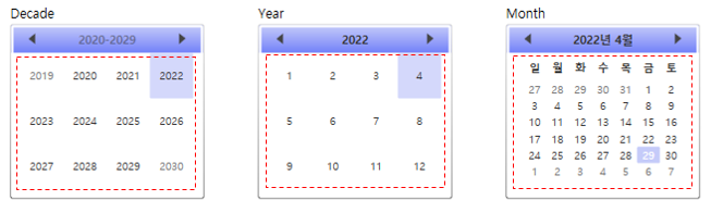
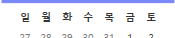
2열의 모습은 위의 이미지에서 빨간색 사각형 부분입니다. PART_MonthView와 PART_YearView의 유형은 Grid로 각각 모드의 Content를 표시합니다. PART_MonthView의 경우 월 모드로 각 월에 맞는 날짜를 표시하고 PART_YearView의 경우 연도 또는 10년 모드에서 월과 년도를 표시합니다. 그래서 PART_MonthView는 칸을 7x7, PART_YearView는 칸을 3x4로 나누었습니다.
⭐ PART_MonthView의 Visibility만 "Visible"로 설정되어있고 PART_YearView는 "Hidden"으로 설정되어있는 이유는 DisplayDate의 기본값이 Month이기 때문입니다.
CalendarItem 이벤트

예제에서는 Calendar의 이벤트로 Disabled와 DisplayMode 변화를 표현하였습니다. Disabled는 VisualStateGroup의 CommonStates와 Trigger를 사용하였고 DisplayMode 변화는 DataTrigger를 사용하였습니다.
⭐ Disabled라는 속성은 Calendar에서 존재하지 않습니다. 대신 IsEnabled를 이용하여 Disabled 상태로 적용할 수 있습니다.
<Calendar IsEnabled="false"/>
VisualStateManager
<ControlTemplate TargetType="{x:Type CalendarItem}">
    ...
    <Grid x:Name="PART_Root">
        ...
        <VisualStateManager.VisualStateGroups>
            <VisualStateGroup x:Name="CommonStates">
                <VisualState x:Name="Normal" />
                <VisualState x:Name="Disabled">
                    <Storyboard>
                        <DoubleAnimation Duration="0" To="1" Storyboard.TargetProperty="Opacity" Storyboard.TargetName="PART_DisabledVisual" />
                    </Storyboard>
                </VisualState>
            </VisualStateGroup>
        </VisualStateManager.VisualStateGroups>
        ...
    </Grid>
    ...
</ControlTemplate>
VisualState는 Control의 시각적 상태를 나타냅니다. Disabled는 CommonStates라는 VisualStateGroup에 포함되므로 VisualStateGroup은 CommonStates로 x:Name을 설정합니다.
⭐ Normal의 경우 Storyboard가 존재하지 않지만 명시해주지 않으면 상태가 Disabled에서 Normal로 변할 때 외형이 변경되지 않습니다.
Storyboard의 내용을 풀어보면 ["PART_DisabledVisual"라는 이름을 가진 것의 Opacity(불투명도)를 1로 바꾸는 것]입니다. 이렇게 Storyboard를 구성하기 위해서 우선적으로 "PART_DisabledVisual"라는 이름을 가진 Control이 존재해야 하고, 이 Control에 Opacity 속성이 존재해야 합니다. (이 예제에서는 CalendarItem의 Rectangle의 이름이 "PART_DisabledVisual"입니다.)
Triggers
<ControlTemplate TargetType="{x:Type CalendarItem}">
    ...
    <ControlTemplate.Triggers>
        <Trigger Property="IsEnabled" Value="False">
            <Setter Property="Visibility" TargetName="PART_DisabledVisual" Value="Visible" />
        </Trigger>

        <DataTrigger Binding="{Binding DisplayMode,  RelativeSource={RelativeSource FindAncestor, AncestorType={x:Type Calendar}}}" Value="Year">
            <Setter Property="Visibility" TargetName="PART_MonthView" Value="Hidden" />
            <Setter Property="Visibility" TargetName="PART_YearView" Value="Visible" />
        </DataTrigger>

        <DataTrigger Binding="{Binding DisplayMode, RelativeSource={RelativeSource FindAncestor, AncestorType={x:Type Calendar}}}" Value="Decade">
            <Setter Property="Visibility" TargetName="PART_MonthView" Value="Hidden" />
            <Setter Property="Visibility" TargetName="PART_YearView" Value="Visible" />
        </DataTrigger>
    </ControlTemplate.Triggers>
</ControlTemplate>
Trigger는 어떤 조건이나 이벤트 등이 주어졌을 때 Control의 상태 또는 이벤트 핸들러 등을 호출하는 기능을 의미합니다. 예제의 코드는 IsEnabled의 속성이 False일 경우 "PART_DisabledVisual"의 Visibility가 Visible이 되어 시각적으로 표현되도록 설정되어있습니다.
DataTrigger는 Binding으로 다른 Element를 참조하여 어떤 조건이나 이벤트 등이 주어졌을 때 Control의 상태 또는 이벤트 핸들러 등을 호출하는 기능을 의미합니다. 예제에서는 Calendar의 DisplayMode를 참조하여 값이 "Year"일 때와 "Decade"일 때 "PART_MonthView"의 Visibility는 Hidden으로, "PART_YearView"의 Visibility는 Visible로 표현되도록 설정되어있습니다.
⭐ 만약 "PART_MonthView"의 Visibility, "PART_YearView"의 Visibility를 수정하고 DataTrigger에서 Year과 Decade 대신 Month로 이벤트를 수정해도 제대로 동작합니다. 저는 예제보다 이 방법이 코드 길이가 줄어서 더 좋은 것 같습니다.😊
전체 코드
<!--Style for the days of a month.-->
<Style TargetType="CalendarDayButton"
x:Key="CalendarDayButtonStyle">
<Setter Property="MinWidth"
Value="5" />
<Setter Property="MinHeight"
Value="5" />
<Setter Property="FontSize"
Value="10" />
<Setter Property="HorizontalContentAlignment"
Value="Center" />
<Setter Property="VerticalContentAlignment"
Value="Center" />
<Setter Property="Template">
<Setter.Value>
<ControlTemplate TargetType="CalendarDayButton">
<Grid>
<VisualStateManager.VisualStateGroups>
<VisualStateGroup Name="CommonStates">
<VisualStateGroup.Transitions>
<VisualTransition GeneratedDuration="0:0:0.1" />
</VisualStateGroup.Transitions>
<VisualState Name="Normal" />
<VisualState Name="MouseOver">
<Storyboard>
<DoubleAnimation Storyboard.TargetName="HighlightBackground"
Storyboard.TargetProperty="Opacity"
To="0.5"
Duration="0" />
</Storyboard>
</VisualState>
<VisualState Name="Pressed">
<Storyboard>
<DoubleAnimation Storyboard.TargetName="HighlightBackground"
Storyboard.TargetProperty="Opacity"
To="0.5"
Duration="0" />
</Storyboard>
</VisualState>
<VisualState Name="Disabled">
<Storyboard>
<DoubleAnimation Storyboard.TargetName="HighlightBackground"
Storyboard.TargetProperty="Opacity"
To="0"
Duration="0" />
<DoubleAnimation Storyboard.TargetName="NormalText"
Storyboard.TargetProperty="Opacity"
To=".35"
Duration="0" />
</Storyboard>
</VisualState>
</VisualStateGroup>
<VisualStateGroup Name="SelectionStates">
<VisualStateGroup.Transitions>
<VisualTransition GeneratedDuration="0" />
</VisualStateGroup.Transitions>
<VisualState Name="Unselected" />
<VisualState Name="Selected">
<Storyboard>
<DoubleAnimation Storyboard.TargetName="SelectedBackground"
Storyboard.TargetProperty="Opacity"
To=".75"
Duration="0" />
</Storyboard>
</VisualState>
</VisualStateGroup>
<VisualStateGroup Name="CalendarButtonFocusStates">
<VisualStateGroup.Transitions>
<VisualTransition GeneratedDuration="0" />
</VisualStateGroup.Transitions>
<VisualState Name="CalendarButtonFocused">
<Storyboard>
<ObjectAnimationUsingKeyFrames Storyboard.TargetName="DayButtonFocusVisual"
Storyboard.TargetProperty="Visibility"
Duration="0">
<DiscreteObjectKeyFrame KeyTime="0">
<DiscreteObjectKeyFrame.Value>
<Visibility>Visible</Visibility>
</DiscreteObjectKeyFrame.Value>
</DiscreteObjectKeyFrame>
</ObjectAnimationUsingKeyFrames>
</Storyboard>
</VisualState>
<VisualState Name="CalendarButtonUnfocused">
<Storyboard>
<ObjectAnimationUsingKeyFrames Storyboard.TargetName="DayButtonFocusVisual"
Storyboard.TargetProperty="Visibility"
Duration="0">
<DiscreteObjectKeyFrame KeyTime="0">
<DiscreteObjectKeyFrame.Value>
<Visibility>Collapsed</Visibility>
</DiscreteObjectKeyFrame.Value>
</DiscreteObjectKeyFrame>
</ObjectAnimationUsingKeyFrames>
</Storyboard>
</VisualState>
</VisualStateGroup>
<VisualStateGroup Name="ActiveStates">
<VisualStateGroup.Transitions>
<VisualTransition GeneratedDuration="0" />
</VisualStateGroup.Transitions>
<VisualState Name="Active" />
<VisualState Name="Inactive">
<Storyboard>
<ColorAnimation Duration="0"
Storyboard.TargetName="NormalText"
Storyboard.TargetProperty="(TextElement.Foreground).
(SolidColorBrush.Color)"
To="#FF777777" />
</Storyboard>
</VisualState>
</VisualStateGroup>
<VisualStateGroup Name="DayStates">
<VisualStateGroup.Transitions>
<VisualTransition GeneratedDuration="0" />
</VisualStateGroup.Transitions>
<VisualState Name="RegularDay" />
<VisualState Name="Today">
<Storyboard>
<DoubleAnimation Storyboard.TargetName="TodayBackground"
Storyboard.TargetProperty="Opacity"
To="1"
Duration="0" />
<ColorAnimation Duration="0"
Storyboard.TargetName="NormalText"
Storyboard.TargetProperty="(TextElement.Foreground).
(SolidColorBrush.Color)"
To="#FFFFFFFF" />
</Storyboard>
</VisualState>
</VisualStateGroup>
<VisualStateGroup Name="BlackoutDayStates">
<VisualStateGroup.Transitions>
<VisualTransition GeneratedDuration="0" />
</VisualStateGroup.Transitions>
<VisualState Name="NormalDay" />
<VisualState Name="BlackoutDay">
<Storyboard>
<DoubleAnimation Duration="0"
Storyboard.TargetName="Blackout"
Storyboard.TargetProperty="Opacity"
To=".2" />
</Storyboard>
</VisualState>
</VisualStateGroup>
</VisualStateManager.VisualStateGroups>
<Rectangle x:Name="TodayBackground"
RadiusX="1"
RadiusY="1"
Opacity="0">
<Rectangle.Fill>
<SolidColorBrush Color="{DynamicResource SelectedBackgroundColor}" />
</Rectangle.Fill>
</Rectangle>
<Rectangle x:Name="SelectedBackground"
RadiusX="1"
RadiusY="1"
Opacity="0">
<Rectangle.Fill>
<SolidColorBrush Color="{DynamicResource SelectedBackgroundColor}" />
</Rectangle.Fill>
</Rectangle>
<Border Background="{TemplateBinding Background}"
BorderThickness="{TemplateBinding BorderThickness}"
BorderBrush="{TemplateBinding BorderBrush}" />
<Rectangle x:Name="HighlightBackground"
RadiusX="1"
RadiusY="1"
Opacity="0">
<Rectangle.Fill>
<SolidColorBrush Color="{DynamicResource ControlMouseOverColor}" />
</Rectangle.Fill>
</Rectangle>
<ContentPresenter x:Name="NormalText"
HorizontalAlignment="{TemplateBinding HorizontalContentAlignment}"
VerticalAlignment="{TemplateBinding VerticalContentAlignment}"
Margin="5,1,5,1">
<TextElement.Foreground>
<SolidColorBrush Color="#FF333333" />
</TextElement.Foreground>
</ContentPresenter>
<Path x:Name="Blackout"
Opacity="0"
Margin="3"
HorizontalAlignment="Stretch"
VerticalAlignment="Stretch"
RenderTransformOrigin="0.5,0.5"
Fill="#FF000000"
Stretch="Fill"
Data="M8.1772461,11.029181 L10.433105,
11.029181 L11.700684,12.801641 L12.973633,
11.029181 L15.191895,11.029181 L12.844727,
13.999395 L15.21875,17.060919 L12.962891,
17.060919 L11.673828,15.256231 L10.352539,
17.060919 L8.1396484,17.060919 L10.519043,
14.042364 z" />
<Rectangle x:Name="DayButtonFocusVisual"
Visibility="Collapsed"
IsHitTestVisible="false"
RadiusX="1"
RadiusY="1">
<Rectangle.Stroke>
<SolidColorBrush Color="{DynamicResource SelectedBackgroundColor}" />
</Rectangle.Stroke>
</Rectangle>
</Grid>
</ControlTemplate>
</Setter.Value>
</Setter>
</Style>
<!--Style for the months of a year and years of a decade.-->
<Style TargetType="CalendarButton"
x:Key="CalendarButtonStyle">
<Setter Property="MinWidth"
Value="40" />
<Setter Property="MinHeight"
Value="42" />
<Setter Property="FontSize"
Value="10" />
<Setter Property="HorizontalContentAlignment"
Value="Center" />
<Setter Property="VerticalContentAlignment"
Value="Center" />
<Setter Property="Template">
<Setter.Value>
<ControlTemplate TargetType="CalendarButton">
<Grid>
<VisualStateManager.VisualStateGroups>
<VisualStateGroup Name="CommonStates">
<VisualStateGroup.Transitions>
<VisualTransition GeneratedDuration="0:0:0.1" />
</VisualStateGroup.Transitions>
<VisualState Name="Normal" />
<VisualState Name="MouseOver">
<Storyboard>
<DoubleAnimation Storyboard.TargetName="Background"
Storyboard.TargetProperty="Opacity"
To=".5"
Duration="0" />
</Storyboard>
</VisualState>
<VisualState Name="Pressed">
<Storyboard>
<DoubleAnimation Storyboard.TargetName="Background"
Storyboard.TargetProperty="Opacity"
To=".5"
Duration="0" />
</Storyboard>
</VisualState>
</VisualStateGroup>
<VisualStateGroup Name="SelectionStates">
<VisualStateGroup.Transitions>
<VisualTransition GeneratedDuration="0" />
</VisualStateGroup.Transitions>
<VisualState Name="Unselected" />
<VisualState Name="Selected">
<Storyboard>
<DoubleAnimation Storyboard.TargetName="SelectedBackground"
Storyboard.TargetProperty="Opacity"
To=".75"
Duration="0" />
</Storyboard>
</VisualState>
</VisualStateGroup>
<VisualStateGroup Name="ActiveStates">
<VisualStateGroup.Transitions>
<VisualTransition GeneratedDuration="0" />
</VisualStateGroup.Transitions>
<VisualState Name="Active" />
<VisualState Name="Inactive">
<Storyboard>
<ColorAnimation Duration="0"
Storyboard.TargetName="NormalText"
Storyboard.TargetProperty="(TextElement.Foreground).
(SolidColorBrush.Color)"
To="#FF777777" />
</Storyboard>
</VisualState>
</VisualStateGroup>
<VisualStateGroup Name="CalendarButtonFocusStates">
<VisualStateGroup.Transitions>
<VisualTransition GeneratedDuration="0" />
</VisualStateGroup.Transitions>
<VisualState Name="CalendarButtonFocused">
<Storyboard>
<ObjectAnimationUsingKeyFrames Duration="0"
Storyboard.TargetName="CalendarButtonFocusVisual"
Storyboard.TargetProperty="Visibility">
<DiscreteObjectKeyFrame KeyTime="0">
<DiscreteObjectKeyFrame.Value>
<Visibility>Visible</Visibility>
</DiscreteObjectKeyFrame.Value>
</DiscreteObjectKeyFrame>
</ObjectAnimationUsingKeyFrames>
</Storyboard>
</VisualState>
<VisualState Name="CalendarButtonUnfocused" />
</VisualStateGroup>
</VisualStateManager.VisualStateGroups>
<Rectangle x:Name="SelectedBackground"
RadiusX="1"
RadiusY="1"
Opacity="0">
<Rectangle.Fill>
<SolidColorBrush Color="{DynamicResource SelectedBackgroundColor}" />
</Rectangle.Fill>
</Rectangle>
<Rectangle x:Name="Background"
RadiusX="1"
RadiusY="1"
Opacity="0">
<Rectangle.Fill>
<SolidColorBrush Color="{DynamicResource SelectedBackgroundColor}" />
</Rectangle.Fill>
</Rectangle>
<ContentPresenter x:Name="NormalText"
HorizontalAlignment="{TemplateBinding HorizontalContentAlignment}"
VerticalAlignment="{TemplateBinding VerticalContentAlignment}"
Margin="1,0,1,1">
<TextElement.Foreground>
<SolidColorBrush Color="#FF333333" />
</TextElement.Foreground>
</ContentPresenter>
<Rectangle x:Name="CalendarButtonFocusVisual"
Visibility="Collapsed"
IsHitTestVisible="false"
RadiusX="1"
RadiusY="1">
<Rectangle.Stroke>
<SolidColorBrush Color="{DynamicResource SelectedBackgroundColor}" />
</Rectangle.Stroke>
</Rectangle>
</Grid>
</ControlTemplate>
</Setter.Value>
</Setter>
<Setter Property="Background">
<Setter.Value>
<SolidColorBrush Color="{DynamicResource ControlMediumColor}" />
</Setter.Value>
</Setter>
</Style>
<!--Button to go to the previous month or year.-->
<ControlTemplate x:Key="PreviousButtonTemplate"
TargetType="{x:Type Button}">
<Grid Cursor="Hand">
<VisualStateManager.VisualStateGroups>
<VisualStateGroup x:Name="CommonStates">
<VisualState x:Name="Normal" />
<VisualState x:Name="MouseOver">
<Storyboard>
<ColorAnimation Duration="0"
Storyboard.TargetName="path"
Storyboard.TargetProperty="(Shape.Fill).(SolidColorBrush.Color)"
To="{DynamicResource GlyphMouseOver}" />
</Storyboard>
</VisualState>
<VisualState x:Name="Disabled">
<Storyboard>
<DoubleAnimation Duration="0"
To=".5"
Storyboard.TargetProperty="(Shape.Fill).(Brush.Opacity)"
Storyboard.TargetName="path" />
</Storyboard>
</VisualState>
</VisualStateGroup>
</VisualStateManager.VisualStateGroups>
<!--<Rectangle Fill="Transparent" Opacity="1" Stretch="Fill"/>-->
<Grid Background="Transparent">
<Path x:Name="path"
Margin="14,-6,0,0"
Stretch="Fill"
HorizontalAlignment="Left"
Height="10"
VerticalAlignment="Center"
Width="6"
Data="M288.75,232.25 L288.75,240.625 L283,236.625 z">
<Path.Fill>
<SolidColorBrush Color="{DynamicResource GlyphColor}" />
</Path.Fill>
</Path>
</Grid>
</Grid>
</ControlTemplate>
<!--Button to go to the next month or year.-->
<ControlTemplate x:Key="NextButtonTemplate"
TargetType="{x:Type Button}">
<Grid Cursor="Hand">
<VisualStateManager.VisualStateGroups>
<VisualStateGroup x:Name="CommonStates">
<VisualState x:Name="Normal" />
<VisualState x:Name="MouseOver">
<Storyboard>
<ColorAnimation Duration="0"
To="{StaticResource GlyphMouseOver}"
Storyboard.TargetProperty="(Shape.Fill).(SolidColorBrush.Color)"
Storyboard.TargetName="path" />
</Storyboard>
</VisualState>
<VisualState x:Name="Disabled">
<Storyboard>
<DoubleAnimation Duration="0"
To=".5"
Storyboard.TargetProperty="(Shape.Fill).(Brush.Opacity)"
Storyboard.TargetName="path" />
</Storyboard>
</VisualState>
</VisualStateGroup>
</VisualStateManager.VisualStateGroups>
<!--<Rectangle Fill="#11E5EBF1" Opacity="1" Stretch="Fill"/>-->
<Grid Background="Transparent">
<Path x:Name="path"
Data="M282.875,231.875 L282.875,240.375 L288.625,236 z"
HorizontalAlignment="Right"
Height="10"
Margin="0,-6,14,0"
Stretch="Fill"
VerticalAlignment="Center"
Width="6">
<Path.Fill>
<SolidColorBrush Color="{DynamicResource GlyphColor}" />
</Path.Fill>
</Path>
</Grid>
</Grid>
</ControlTemplate>
<!--Button to go up a level to the year or decade.-->
<ControlTemplate x:Key="HeaderButtonTemplate"
TargetType="{x:Type Button}">
<Grid Cursor="Hand">
<VisualStateManager.VisualStateGroups>
<VisualStateGroup x:Name="CommonStates">
<VisualState x:Name="Normal" />
<VisualState x:Name="MouseOver">
<Storyboard>
<ColorAnimation Duration="0"
To="{DynamicResource GlyphMouseOver}"
Storyboard.TargetProperty="(TextElement.Foreground).
(SolidColorBrush.Color)"
Storyboard.TargetName="buttonContent" />
</Storyboard>
</VisualState>
<VisualState x:Name="Disabled">
<Storyboard>
<DoubleAnimation Duration="0"
To=".5"
Storyboard.TargetProperty="Opacity"
Storyboard.TargetName="buttonContent" />
</Storyboard>
</VisualState>
</VisualStateGroup>
</VisualStateManager.VisualStateGroups>
<ContentPresenter x:Name="buttonContent"
Margin="1,4,1,9"
ContentTemplate="{TemplateBinding ContentTemplate}"
Content="{TemplateBinding Content}"
TextElement.Foreground="#FF333333"
HorizontalAlignment="{TemplateBinding HorizontalContentAlignment}"
VerticalAlignment="{TemplateBinding VerticalContentAlignment}" />
</Grid>
</ControlTemplate>
<Style x:Key="CalendarItemStyle" TargetType="{x:Type CalendarItem}">
<Setter Property="Margin"
Value="0,3,0,3" />
<Setter Property="Template">
<Setter.Value>
<ControlTemplate TargetType="{x:Type CalendarItem}">
<ControlTemplate.Resources>
<DataTemplate x:Key="{x:Static CalendarItem.DayTitleTemplateResourceKey}">
<TextBlock Foreground="#FF333333"
FontWeight="Bold"
FontSize="9.5"
FontFamily="Verdana"
Margin="0,6,0,6"
Text="{Binding}"
HorizontalAlignment="Center"
VerticalAlignment="Center" />
</DataTemplate>
</ControlTemplate.Resources>
<Grid x:Name="PART_Root">
<Grid.Resources>
<SolidColorBrush x:Key="DisabledColor"
Color="#A5FFFFFF" />
</Grid.Resources>
<VisualStateManager.VisualStateGroups>
<VisualStateGroup x:Name="CommonStates">
<VisualState x:Name="Normal" />
<VisualState x:Name="Disabled">
<Storyboard>
<DoubleAnimation Duration="0"
To="1"
Storyboard.TargetProperty="Opacity"
Storyboard.TargetName="PART_DisabledVisual" />
</Storyboard>
</VisualState>
</VisualStateGroup>
</VisualStateManager.VisualStateGroups>
<Border BorderBrush="{TemplateBinding BorderBrush}"
BorderThickness="{TemplateBinding BorderThickness}"
Background="{TemplateBinding Background}"
CornerRadius="1">
<Border BorderBrush="#FFFFFFFF"
BorderThickness="2"
CornerRadius="1">
<Grid>
<Grid.Resources>
</Grid.Resources>
<Grid.ColumnDefinitions>
<ColumnDefinition Width="Auto" />
<ColumnDefinition Width="Auto" />
<ColumnDefinition Width="Auto" />
</Grid.ColumnDefinitions>
<Grid.RowDefinitions>
<RowDefinition Height="Auto" />
<RowDefinition Height="*" />
</Grid.RowDefinitions>
<Button x:Name="PART_PreviousButton"
Template="{StaticResource PreviousButtonTemplate}"
Focusable="False"
HorizontalAlignment="Left"
Grid.Column="0"
Grid.Row="0"
Height="20"
Width="28" />
<Button x:Name="PART_HeaderButton"
FontWeight="Bold"
Focusable="False"
FontSize="10.5"
HorizontalAlignment="Center"
VerticalAlignment="Center"
Grid.Column="1"
Grid.Row="0"
Template="{StaticResource HeaderButtonTemplate}" />
<Button x:Name="PART_NextButton"
Focusable="False"
HorizontalAlignment="Right"
Grid.Column="2"
Grid.Row="0"
Template="{StaticResource NextButtonTemplate}"
Height="20"
Width="28" />
<Grid x:Name="PART_MonthView"
Visibility="Visible"
Grid.ColumnSpan="3"
Grid.Row="1"
Margin="6,-1,6,6"
HorizontalAlignment="Center">
<Grid.ColumnDefinitions>
<ColumnDefinition Width="Auto" />
<ColumnDefinition Width="Auto" />
<ColumnDefinition Width="Auto" />
<ColumnDefinition Width="Auto" />
<ColumnDefinition Width="Auto" />
<ColumnDefinition Width="Auto" />
<ColumnDefinition Width="Auto" />
</Grid.ColumnDefinitions>
<Grid.RowDefinitions>
<RowDefinition Height="Auto" />
<RowDefinition Height="Auto" />
<RowDefinition Height="Auto" />
<RowDefinition Height="Auto" />
<RowDefinition Height="Auto" />
<RowDefinition Height="Auto" />
<RowDefinition Height="Auto" />
</Grid.RowDefinitions>
</Grid>
<Grid x:Name="PART_YearView"
Visibility="Hidden"
Grid.ColumnSpan="3"
Grid.Row="1"
HorizontalAlignment="Center"
Margin="6,-3,7,6">
<Grid.ColumnDefinitions>
<ColumnDefinition Width="Auto" />
<ColumnDefinition Width="Auto" />
<ColumnDefinition Width="Auto" />
<ColumnDefinition Width="Auto" />
</Grid.ColumnDefinitions>
<Grid.RowDefinitions>
<RowDefinition Height="Auto" />
<RowDefinition Height="Auto" />
<RowDefinition Height="Auto" />
</Grid.RowDefinitions>
</Grid>
</Grid>
</Border>
</Border>
<Rectangle x:Name="PART_DisabledVisual"
Fill="{StaticResource DisabledColor}"
Opacity="0"
RadiusY="2"
RadiusX="2"
Stretch="Fill"
Stroke="{StaticResource DisabledColor}"
StrokeThickness="1"
Visibility="Collapsed" />
</Grid>
<ControlTemplate.Triggers>
<Trigger Property="IsEnabled"
Value="False">
<Setter Property="Visibility"
TargetName="PART_DisabledVisual"
Value="Visible" />
</Trigger>
<DataTrigger Binding="{Binding DisplayMode,
RelativeSource={RelativeSource FindAncestor,
AncestorType={x:Type Calendar}}}"
Value="Year">
<Setter Property="Visibility"
TargetName="PART_MonthView"
Value="Hidden" />
<Setter Property="Visibility"
TargetName="PART_YearView"
Value="Visible" />
</DataTrigger>
<DataTrigger Binding="{Binding DisplayMode,
RelativeSource={RelativeSource FindAncestor,
AncestorType={x:Type Calendar}}}"
Value="Decade">
<Setter Property="Visibility"
TargetName="PART_MonthView"
Value="Hidden" />
<Setter Property="Visibility"
TargetName="PART_YearView"
Value="Visible" />
</DataTrigger>
</ControlTemplate.Triggers>
</ControlTemplate>
</Setter.Value>
</Setter>
</Style>
<Style TargetType="{x:Type Calendar}">
<Setter Property="CalendarButtonStyle"
Value="{StaticResource CalendarButtonStyle}" />
<Setter Property="CalendarDayButtonStyle"
Value="{StaticResource CalendarDayButtonStyle}" />
<Setter Property="CalendarItemStyle"
Value="{StaticResource CalendarItemStyle}" />
<Setter Property="Foreground"
Value="#FF333333" />
<Setter Property="Background">
<Setter.Value>
<LinearGradientBrush EndPoint="0.5,1"
StartPoint="0.5,0">
<!--The first two gradient stops specifies the background for
the calendar's heading and navigation buttons.-->
<GradientStop Color="{DynamicResource HeaderTopColor}"
Offset="0" />
<GradientStop Color="{DynamicResource ControlMediumColor}"
Offset="0.16" />
<!--The next gradient stop specifies the background for
the calendar area.-->
<GradientStop Color="{DynamicResource ControlLightColor}"
Offset="0.16" />
</LinearGradientBrush>
</Setter.Value>
</Setter>
<Setter Property="BorderBrush">
<Setter.Value>
<LinearGradientBrush EndPoint="0,1"
StartPoint="0,0">
<GradientStop Color="{DynamicResource BorderLightColor}"
Offset="0" />
<GradientStop Color="{DynamicResource BorderDarkColor}"
Offset="1" />
</LinearGradientBrush>
</Setter.Value>
</Setter>
<Setter Property="BorderThickness"
Value="1" />
<Setter Property="Template">
<Setter.Value>
<ControlTemplate TargetType="{x:Type Calendar}">
<StackPanel x:Name="PART_Root"
HorizontalAlignment="Center">
<CalendarItem x:Name="PART_CalendarItem"
BorderBrush="{TemplateBinding BorderBrush}"
BorderThickness="{TemplateBinding BorderThickness}"
Background="{TemplateBinding Background}"
Style="{TemplateBinding CalendarItemStyle}" />
</StackPanel>
</ControlTemplate>
</Setter.Value>
</Setter>
</Style>
<!--Control colors.-->
<Color x:Key="WindowColor">#FFE8EDF9</Color>
<Color x:Key="ContentAreaColorLight">#FFC5CBF9</Color>
<Color x:Key="ContentAreaColorDark">#FF7381F9</Color>
<Color x:Key="DisabledControlLightColor">#FFE8EDF9</Color>
<Color x:Key="DisabledControlDarkColor">#FFC5CBF9</Color>
<Color x:Key="DisabledForegroundColor">#FF888888</Color>
<Color x:Key="SelectedBackgroundColor">#FFC5CBF9</Color>
<Color x:Key="SelectedUnfocusedColor">#FFDDDDDD</Color>
<Color x:Key="ControlLightColor">White</Color>
<Color x:Key="ControlMediumColor">#FF7381F9</Color>
<Color x:Key="ControlDarkColor">#FF211AA9</Color>
<Color x:Key="ControlMouseOverColor">#FF3843C4</Color>
<Color x:Key="ControlPressedColor">#FF211AA9</Color>
<Color x:Key="GlyphColor">#FF444444</Color>
<Color x:Key="GlyphMouseOver">sc#1, 0.004391443, 0.002428215, 0.242281124</Color>
<!--Border colors-->
<Color x:Key="BorderLightColor">#FFCCCCCC</Color>
<Color x:Key="BorderMediumColor">#FF888888</Color>
<Color x:Key="BorderDarkColor">#FF444444</Color>
<Color x:Key="PressedBorderLightColor">#FF888888</Color>
<Color x:Key="PressedBorderDarkColor">#FF444444</Color>
<Color x:Key="DisabledBorderLightColor">#FFAAAAAA</Color>
<Color x:Key="DisabledBorderDarkColor">#FF888888</Color>
<Color x:Key="DefaultBorderBrushDarkColor">Black</Color>
<!--Control-specific resources.-->
<Color x:Key="HeaderTopColor">#FFC5CBF9</Color>
<Color x:Key="DatagridCurrentCellBorderColor">Black</Color>
<Color x:Key="SliderTrackDarkColor">#FFC5CBF9</Color>
<Color x:Key="NavButtonFrameColor">#FF3843C4</Color>
<LinearGradientBrush x:Key="MenuPopupBrush"
EndPoint="0.5,1"
StartPoint="0.5,0">
<GradientStop Color="{DynamicResource ControlLightColor}"
Offset="0" />
<GradientStop Color="{DynamicResource ControlMediumColor}"
Offset="0.5" />
<GradientStop Color="{DynamicResource ControlLightColor}"
Offset="1" />
</LinearGradientBrush>
<LinearGradientBrush x:Key="ProgressBarIndicatorAnimatedFill"
StartPoint="0,0"
EndPoint="1,0">
<LinearGradientBrush.GradientStops>
<GradientStopCollection>
<GradientStop Color="#000000FF"
Offset="0" />
<GradientStop Color="#600000FF"
Offset="0.4" />
<GradientStop Color="#600000FF"
Offset="0.6" />
<GradientStop Color="#000000FF"
Offset="1" />
</GradientStopCollection>
</LinearGradientBrush.GradientStops>
</LinearGradientBrush>
이 글의 내용은 아래의 사이트에서 기초합니다.
Calendar 스타일 및 템플릿 - WPF .NET Framework
Calendar 스타일 및 템플릿 아티클 04/18/2022 읽는 데 13분 걸림 기여자 1명 이 문서의 내용 --> 이 항목에서는 컨트롤의 스타일 및 템플릿에 Calendar 대해 설명합니다. 기본값을 수정할 수 있습니다 Contr
docs.microsoft.com