
안녕하세요, 이번 글에서는 Microsoft에서 제공하는 WPF [Label의 스타일 및 템플릿] 예제를 톺아보도록 하겠습니다.
Label

Control에 대한 Text 레이블을 나타내며 선택키에 대한 지원을 제공합니다.
[ Label 속성 ]
Target
사용자가 레이블의 선택키를 누를 때 focus를 받는 요소를 설정합니다.
<TextBox Name="tb" Width="50"/>
<Label Target="{Binding ElementName=tb}">_File</Label>
[ Label Style ]
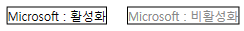
예제의 XAML 코드를 Label에 적용하면 위와 같은 결과가 나옵니다. 이러한 결과에 도달하도록 코드 순서로 속성을 살펴보면 다음과 같습니다.
Label 속성
<Style x:Key="{x:Type Label}" TargetType="Label">
  <Setter Property="HorizontalContentAlignment" Value="Left" />
  <Setter Property="VerticalContentAlignment" Value="Top" />
  <Setter Property="Template">
    <Setter.Value>
      ...
    </Setter.Value>
  </Setter>
</Style>
x:Key
XAML 정의 사전에서 만들고 참조하는 요소를 고유하게 식별합니다.
TargetType
이 Style을 적용할 형식을 설정합니다.
HorizontalContentAlignment
Label Content의 가로 맞춤을 설정합니다. 기본값은 Left이며 다른 값으로 Stretch, Center, Right가 있습니다.
VerticalContentAlignment
Label Content의 세로 맞춤을 설정합니다. 기본값은 Top이며 다른 값으로 Stretch, Center, Bottom이 있습니다.
Template
<Setter Property="Template">
  <Setter.Value>
    <ControlTemplate TargetType="Label">
      <Border>
        <ContentPresenter ... />
      </Border>
      <ControlTemplate.Triggers>
        ...
      </ControlTemplate.Triggers>
    </ControlTemplate>
  </Setter.Value>
</Setter>
Control의 템플릿을 설정합니다. 예제에서 사용되는 Template는 Control의 외형을 지정해줄 수 있는 ControlTemplate입니다.
👀 Template에 대해서 좀 더 아시고 싶으신 분은 이 페이지를 참고하시길 바랍니다.
Label 구성
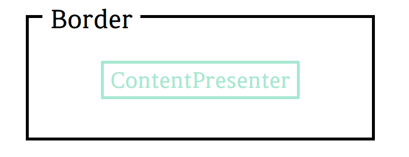
Label은 Border 내부에 ContentPresenter로 구성되어있습니다.
Border
다른 요소의 주위에 윤곽선, 배경 또는 둘 다를 그립니다.
ContentPresenter
모든 유형의 단일 Content로 이루어진 Control을 나타냅니다.
⭐ ContentPresenter 속성
<ContentPresenter HorizontalAlignment="{TemplateBinding HorizontalContentAlignment}"
                  VerticalAlignment="{TemplateBinding VerticalContentAlignment}"
                  RecognizesAccessKey="True" />
HorizontalAlignment
ContentPresenter의 가로 정렬 위치를 설정합니다. 예제에서는 TemplateBinding을 사용하여 Label의 HorizontalContentAlignment 값으로 설정했습니다.
VerticalAlignment
ContentPresenter의 세로 정렬 위치를 설정합니다. 예제에서는 TemplateBinding을 사용하여 Label의 VerticalContentAlignment 값으로 설정했습니다.
RecognizesAccessKey
ContentPresenter의 Style에 AccessText가 사용되는지 여부를 나타내는 값을 설정합니다. AccessText가 사용되면 true이고, 그렇지 않으면 false(기본값)입니다.
Label 이벤트
예제에서는 IsEnabled의 상태 변화를 Trigger로 표현했습니다.
Triggers
<ControlTemplate.Triggers>
  <Trigger Property="IsEnabled" Value="false">
    <Setter Property="Foreground">
      <Setter.Value>
        <SolidColorBrush Color="{DynamicResource DisabledForegroundColor}" />
      </Setter.Value>
    </Setter>
  </Trigger>
</ControlTemplate.Triggers>
Trigger는 어떤 조건이나 이벤트 등이 주어졌을 때 Control의 상태 또는 이벤트 핸들러 등을 호출하는 기능을 의미합니다. 예제에서는 IsEnabled의 값이 false일 경우 Foreground 값이 미리 정의한 색인 DisabledForegroundColor로 변하는 것입니다.
전체 코드
<Style x:Key="{x:Type Label}"
       TargetType="Label">
  <Setter Property="HorizontalContentAlignment"
          Value="Left" />
  <Setter Property="VerticalContentAlignment"
          Value="Top" />
  <Setter Property="Template">
    <Setter.Value>
      <ControlTemplate TargetType="Label">
        <Border>
          <ContentPresenter HorizontalAlignment="{TemplateBinding HorizontalContentAlignment}"
                            VerticalAlignment="{TemplateBinding VerticalContentAlignment}"
                            RecognizesAccessKey="True" />
        </Border>
        <ControlTemplate.Triggers>
          <Trigger Property="IsEnabled"
                   Value="false">
            <Setter Property="Foreground">
              <Setter.Value>
                <SolidColorBrush Color="{DynamicResource DisabledForegroundColor}" />
              </Setter.Value>
            </Setter>
          </Trigger>
        </ControlTemplate.Triggers>
      </ControlTemplate>
    </Setter.Value>
  </Setter>
</Style>
<!--Control colors.-->
<Color x:Key="WindowColor">#FFE8EDF9</Color>
<Color x:Key="ContentAreaColorLight">#FFC5CBF9</Color>
<Color x:Key="ContentAreaColorDark">#FF7381F9</Color>

<Color x:Key="DisabledControlLightColor">#FFE8EDF9</Color>
<Color x:Key="DisabledControlDarkColor">#FFC5CBF9</Color>
<Color x:Key="DisabledForegroundColor">#FF888888</Color>

<Color x:Key="SelectedBackgroundColor">#FFC5CBF9</Color>
<Color x:Key="SelectedUnfocusedColor">#FFDDDDDD</Color>

<Color x:Key="ControlLightColor">White</Color>
<Color x:Key="ControlMediumColor">#FF7381F9</Color>
<Color x:Key="ControlDarkColor">#FF211AA9</Color>

<Color x:Key="ControlMouseOverColor">#FF3843C4</Color>
<Color x:Key="ControlPressedColor">#FF211AA9</Color>


<Color x:Key="GlyphColor">#FF444444</Color>
<Color x:Key="GlyphMouseOver">sc#1, 0.004391443, 0.002428215, 0.242281124</Color>

<!--Border colors-->
<Color x:Key="BorderLightColor">#FFCCCCCC</Color>
<Color x:Key="BorderMediumColor">#FF888888</Color>
<Color x:Key="BorderDarkColor">#FF444444</Color>

<Color x:Key="PressedBorderLightColor">#FF888888</Color>
<Color x:Key="PressedBorderDarkColor">#FF444444</Color>

<Color x:Key="DisabledBorderLightColor">#FFAAAAAA</Color>
<Color x:Key="DisabledBorderDarkColor">#FF888888</Color>

<Color x:Key="DefaultBorderBrushDarkColor">Black</Color>

<!--Control-specific resources.-->
<Color x:Key="HeaderTopColor">#FFC5CBF9</Color>
<Color x:Key="DatagridCurrentCellBorderColor">Black</Color>
<Color x:Key="SliderTrackDarkColor">#FFC5CBF9</Color>

<Color x:Key="NavButtonFrameColor">#FF3843C4</Color>

<LinearGradientBrush x:Key="MenuPopupBrush"
                     EndPoint="0.5,1"
                     StartPoint="0.5,0">
  <GradientStop Color="{DynamicResource ControlLightColor}"
                Offset="0" />
  <GradientStop Color="{DynamicResource ControlMediumColor}"
                Offset="0.5" />
  <GradientStop Color="{DynamicResource ControlLightColor}"
                Offset="1" />
</LinearGradientBrush>

<LinearGradientBrush x:Key="ProgressBarIndicatorAnimatedFill"
                     StartPoint="0,0"
                     EndPoint="1,0">
  <LinearGradientBrush.GradientStops>
    <GradientStopCollection>
      <GradientStop Color="#000000FF"
                    Offset="0" />
      <GradientStop Color="#600000FF"
                    Offset="0.4" />
      <GradientStop Color="#600000FF"
                    Offset="0.6" />
      <GradientStop Color="#000000FF"
                    Offset="1" />
    </GradientStopCollection>
  </LinearGradientBrush.GradientStops>
</LinearGradientBrush>
이 글의 내용은 아래의 사이트에서 기초합니다.
Label 스타일 및 템플릿 - WPF .NET Framework
Label 스타일 및 템플릿 아티클 05/06/2022 읽는 데 2분 걸림 기여자 1명 이 문서의 내용 --> 이 항목에서는 Label 컨트롤의 스타일 및 템플릿을 설명합니다. 기본값을 수정할 수 있습니다 ControlTemplate 고
docs.microsoft.com
'프로그램 개발 > WPF: Style&Template' 카테고리의 다른 글
| ListBoxItem (0) | 2022.05.30 |
|---|---|
| ListBox (0) | 2022.05.30 |
| GroupBox (0) | 2022.05.28 |
| Frame④ (0) | 2022.05.27 |
| Frame③ (0) | 2022.05.26 |