
안녕하세요, 이번 글에서는 지난 [Microsoft Control Style & Template 톺아보기 - Calendar②]을 이어서 WPF [Calendar의 스타일 및 템플릿] 예제 중 CalendarButton과 CalendarDayButton을 톺아보도록 하겠습니다.
⭐ [Microsoft Control Style & Template 톺아보기 - Calendar]편은 총 3편(Calendar, CalendarItem, CalendarButtonStyle/CalendarDayButtonStyle)으로 구성되어있습니다.
[CalendarButtonStyle]
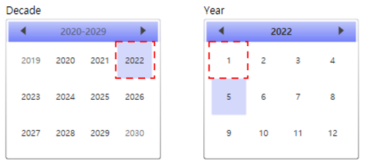
CalendarButton은 Calendar에서 월 또는 연도를 나타냅니다.
<Style TargetType="CalendarButton" x:Key="CalendarButtonStyle">
    <Setter Property="MinWidth" Value="40" />
    <Setter Property="MinHeight" Value="42" />
    <Setter Property="FontSize" Value="10" />
    <Setter Property="HorizontalContentAlignment" Value="Center" />
    <Setter Property="VerticalContentAlignment" Value="Center" />
    <Setter Property="Template">
        <Setter.Value>
            ...
        </Setter.Value>
    </Setter>
    <Setter Property="Background">
        <Setter.Value>
            <SolidColorBrush Color="{DynamicResource ControlMediumColor}" />
        </Setter.Value>
    </Setter>
</Style>
MinWidth
Control의 최소 너비를 설정합니다.
MinHeight
Control의 최소 높이를 설정합니다.
FontSize
Control의 글자 크기를 설정합니다.
HorizontalContentAlignment
Content의 가로 정렬 위치를 설정합니다. 기본값은 Left이며 예제에서는 Center로 중앙 정렬 설정하였습니다.
VerticalContentAlignment
Content의 세로 정렬 위치를 설정합니다. 기본값은 Top이며 예제에서는 Center로 중앙 정렬 설정하였습니다.
Background
Control의 배경색을 설정합니다. 예제에서는 SolidColorBrush를 사용하여 미리 정의해둔 ControlMediumColor를 설정하였습니다.
Template
  <Setter Property="Template">
    <Setter.Value>
      <ControlTemplate TargetType="CalendarButton">
        <Grid>
          <VisualStateManager.VisualStateGroups>
            ...
          </VisualStateManager.VisualStateGroups>

          <Rectangle x:Name="SelectedBackground" RadiusX="1" RadiusY="1" Opacity="0">
            <Rectangle.Fill>
              <SolidColorBrush Color="{DynamicResource SelectedBackgroundColor}" />
            </Rectangle.Fill>
          </Rectangle>

          <Rectangle x:Name="Background" RadiusX="1" RadiusY="1" Opacity="0">
            <Rectangle.Fill>
              <SolidColorBrush Color="{DynamicResource SelectedBackgroundColor}" />
            </Rectangle.Fill>
          </Rectangle>

          <ContentPresenter x:Name="NormalText" HorizontalAlignment="{TemplateBinding HorizontalContentAlignment}" VerticalAlignment="{TemplateBinding VerticalContentAlignment}" Margin="1,0,1,1">
            <TextElement.Foreground>
              <SolidColorBrush Color="#FF333333" />
            </TextElement.Foreground>
          </ContentPresenter>

          <Rectangle x:Name="CalendarButtonFocusVisual" Visibility="Collapsed" IsHitTestVisible="false" RadiusX="1" RadiusY="1">
            <Rectangle.Stroke>
              <SolidColorBrush Color="{DynamicResource SelectedBackgroundColor}" />
            </Rectangle.Stroke>
          </Rectangle>

        </Grid>
      </ControlTemplate>
    </Setter.Value>
  </Setter>
위의 코드는 이벤트 부분(VisualStateManager 부분)을 제외한 Template 코드입니다. 구성을 살펴보면 아래의 이미지처럼 Grid 내부에 3개의 Rectangle과 1개의 ContentPresenter가 있습니다.
Rectangle(SelectedBackground, Background, CalendarButtonFocusVisual)
x:Name
Control에 이름을 설정합니다. 이름을 붙이는 것과 동시에 다른 곳에서 사용할 수 있도록 만들어줍니다. 예제에서는 CalendarButton의 이벤트 변화를 시각적으로 표현하기 위하여 "SelectedBackground", "Background", "CalendarButtonFocusVisual"로 사용되었습니다.
RadiusX
Rectangle의 모퉁이를 둥글게 하는 데 사용되는 타원의 x축 반경을 설정합니다.
RadiusY
Rectangle의 모퉁이를 둥글게 하는 데 사용되는 타원의 y축 반경을 설정합니다.
Opacity
Rectangle의 불투명도를 설정합니다. 값은 0(투명) ~ 1(불투명) 사이를 사용합니다. 기본값은 1입니다.
Visibility
Rectangle의 표시 유형을 설정합니다. 기본 값은 Visible이며 다른 값으로는 Collapsed와 Hidden이 있습니다.
IsHitTestVisible
Rectangle의 일부에서 롤오버 테스트 결과로 반환될 수 있는지 여부를 설정합니다. 예제에서는 False로 마우스 이벤트를 받지 않도록 설정했습니다. 기본값은 true입니다.
Fill
Rectangle 내부의 색을 설정합니다. 예제에서는 SolidColorBrush를 사용하여 미리 지정한 색을 설정하였습니다.
Stroke
Rectangle의 윤곽선 색을 설정합니다. 예제에서는 SolidColorBrush를 사용하여 미리 지정한 색을 설정하였습니다.
ContentPresenter(NormalText)
x:Name
ContentPresenter에 이름을 설정합니다. 이름을 붙이는 것과 동시에 다른 곳에서 사용할 수 있도록 만들어줍니다.
HorizontalAlignment
ContentPresenter의 가로 정렬 위치를 설정합니다.
VerticalAlignment
ContentPresenter의 세로 정렬 위치를 설정합니다.
Margin
ContentPresenter의 외부 여백을 설정합니다. 값을 1개(상하좌우 동일), 2개(좌우, 상하), 4개(좌, 상, 우, 하)로 나눠서 설정 가능합니다.
TextElement.Foreground
ContentPresenter 내부의 글자색을 설정합니다. 예제에서는 SolidColorBrush를 사용하여 16진수 특정 색을 설정했습니다.
⭐ ContentPresenter의 기본 속성에는 Foreground가 없기 때문에 TextElement.Foreground를 사용하였습니다.

Template - VisualState
<VisualStateManager.VisualStateGroups>
  <VisualStateGroup Name="CommonStates">
    ...
  </VisualStateGroup>

  <VisualStateGroup Name="SelectionStates">
    ...
  </VisualStateGroup>

  <VisualStateGroup Name="ActiveStates">
    ...
  </VisualStateGroup>

  <VisualStateGroup Name="CalendarButtonFocusStates">
    ...
  </VisualStateGroup>
</VisualStateManager.VisualStateGroups>
VisualState는 Control의 시각적 상태를 나타냅니다. CalendarButtonStyle은 이벤트에서 시각적 변화를 주기 위해서 VisualStateGroup의 x:Name을 각각 CommonStates(MouseOver, Pressed), SelectionStates(Selected), ActiveStates(InActive), CalendarButtonFocusStates(CalendarButtonFocused)로 설정했습니다.
⭐ CalendarButton은 6개(CommonStates, SelectionStates, CalendarButtonFocusStates, FocusStates, ActiveStates, ValidationStates)의 VisualStateGroup을 가지고 있습니다.
CommonStates
<VisualStateGroup Name="CommonStates">
  <VisualStateGroup.Transitions>
    <VisualTransition GeneratedDuration="0:0:0.1" />
  </VisualStateGroup.Transitions>
  <VisualState Name="Normal" />
  <VisualState Name="MouseOver">
    <Storyboard>
      <DoubleAnimation Storyboard.TargetName="Background" Storyboard.TargetProperty="Opacity" To=".5" Duration="0" />
    </Storyboard>
  </VisualState>
  <VisualState Name="Pressed">
    <Storyboard>
      <DoubleAnimation Storyboard.TargetName="Background" Storyboard.TargetProperty="Opacity" To=".5" Duration="0" />
    </Storyboard>
  </VisualState>
</VisualStateGroup>
MouseOver & Pressed
Storyboard의 내용을 풀어보면 ["Background"라는 이름을 가진 Control의 Opacity(불투명도)를 0.5로 바꾸는 것]입니다.
⭐ Normal의 경우 Storyboard가 존재하지 않지만 명시해주지 않으면 상태가 MouseOver에서 Normal로 변할 때 외형이 바뀌지 않습니다.
DoubleAnimation
지정된 Duration 동안 선형 보간을 사용하여 두 대상 값 사이의 Double 속성 값을 애니메이션 합니다.
SelectionStates
<VisualStateGroup Name="SelectionStates">
  <VisualStateGroup.Transitions>
    <VisualTransition GeneratedDuration="0" />
  </VisualStateGroup.Transitions>
  <VisualState Name="Unselected" />
  <VisualState Name="Selected">
    <Storyboard>
      <DoubleAnimation Storyboard.TargetName="SelectedBackground" Storyboard.TargetProperty="Opacity" To=".75" Duration="0" />
    </Storyboard>
  </VisualState>
</VisualStateGroup>
Selected
Storyboard의 내용을 풀어보면 ["SelectedBackground"라는 이름을 가진 Control의 Opacity(불투명도)를 0.75로 바꾸는 것]입니다.
⭐ Unselected의 경우 Storyboard가 존재하지 않지만 명시해주지 않으면 상태가 Selected에서 Unselected로 변할 때 외형이 바뀌지 않습니다.
DoubleAnimation
지정된 Duration 동안 선형 보간을 사용하여 두 대상 값 사이의 Double 속성 값을 애니메이션 합니다.
ActiveStates
<VisualStateGroup Name="ActiveStates">
  <VisualStateGroup.Transitions>
    <VisualTransition GeneratedDuration="0" />
  </VisualStateGroup.Transitions>
  <VisualState Name="Active" />
  <VisualState Name="Inactive">
    <Storyboard>
      <ColorAnimation Duration="0" Storyboard.TargetName="NormalText" Storyboard.TargetProperty="(TextElement.Foreground).(SolidColorBrush.Color)" To="#FF777777" />
    </Storyboard>
  </VisualState>
</VisualStateGroup>
Inactive
Storyboard의 내용을 풀어보면 ["NormalText"라는 이름을 가진 Control의 Foreground를 #ff777777로 바꾸는 것]입니다.
⭐ Storyboard.TargetProperty에서 (TextElement.Foreground).(SolidColorBrush.Color)로 사용한 이유는 "NormalText"라는 이름을 가진 Control이 ContentPresenter이기 때문입니다. ContentPresenter의 기본 속성에는 Foreground가 없기 때문에 TextElement.Foreground로 명시하여 설정해야 합니다.
⭐ Active의 경우 Storyboard가 존재하지 않지만 명시해주지 않으면 상태가 Inactive에서 Active로 변할 때 외형이 바뀌지 않습니다.
ColorAnimation
지정된 Duration 동안 선형 보간을 사용하여 두 대상 값 사이의 Color 속성 값을 애니메이션 합니다.
CalendarButtonFocusStates
<VisualStateGroup Name="CalendarButtonFocusStates">
  <VisualStateGroup.Transitions>
    <VisualTransition GeneratedDuration="0" />
  </VisualStateGroup.Transitions>
  <VisualState Name="CalendarButtonFocused">
    <Storyboard>
      <ObjectAnimationUsingKeyFrames Duration="0" Storyboard.TargetName="CalendarButtonFocusVisual" Storyboard.TargetProperty="Visibility">
        <DiscreteObjectKeyFrame KeyTime="0">
          <DiscreteObjectKeyFrame.Value>
            <Visibility>Visible</Visibility>
          </DiscreteObjectKeyFrame.Value>
        </DiscreteObjectKeyFrame>
      </ObjectAnimationUsingKeyFrames>
    </Storyboard>
  </VisualState>
  <VisualState Name="CalendarButtonUnfocused" />
</VisualStateGroup>
CalendarButtonFocused
Storyboard의 내용을 풀어보면 ["CalendarButtonFocusVisual"라는 이름을 가진 Control의 Visibility를 Visible로 바꾸는 것]입니다.
⭐ CalendarButtonUnfocused의 경우 Storyboard가 존재하지 않지만 명시해주지 않으면 상태가 Selected에서 Unselected로 변할 때 외형이 다시 바뀌지 않습니다.
ObjectAnimationUsingKeyFrames
지정된 Object에 대해 KeyFrames 집합을 따라 Duration 속성 값에 애니메이션을 효과를 줍니다.
DiscreteObjectKeyFrame
불연속 보간을 사용하여 이전 키 프레임의 Object 값에서 고유 Value로 애니메이션 효과를 적용합니다.
[CalendarDayButtonStyle]
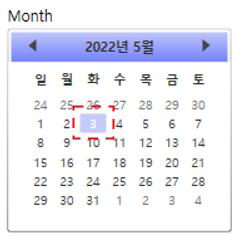
CalendarDayButton은 Calendar에서 일을 나타냅니다.
<Style TargetType="CalendarDayButton" x:Key="CalendarDayButtonStyle">
    <Setter Property="MinWidth" Value="5" />
    <Setter Property="MinHeight" Value="5" />
    <Setter Property="FontSize" Value="10" />
    <Setter Property="HorizontalContentAlignment" Value="Center" />
    <Setter Property="VerticalContentAlignment" Value="Center" />
    <Setter Property="Template">
       ...
    </Setter>
</Style>
MinWidth
Control의 최소 너비를 설정합니다.
MinHeight
Control의 최소 높이를 설정합니다.
FontSize
Control의 글자 크기를 설정합니다.
HorizontalContentAlignment
Content의 가로 정렬 위치를 설정합니다. 기본값은 Left이며 예제에서는 Center로 중앙 정렬 설정하였습니다.
VerticalContentAlignment
Content의 세로 정렬 위치를 설정합니다. 기본값은 Top이며 예제에서는 Center로 중앙 정렬 설정하였습니다.
Template
<Setter Property="Template">
  <Setter.Value>
    <ControlTemplate TargetType="CalendarDayButton">
      <Grid>
        <VisualStateManager.VisualStateGroups>
          ...
        </VisualStateManager.VisualStateGroups>

        <Rectangle x:Name="TodayBackground" RadiusX="1" RadiusY="1" Opacity="0">
          <Rectangle.Fill>
            <SolidColorBrush Color="{DynamicResource SelectedBackgroundColor}" />
          </Rectangle.Fill>
        </Rectangle>

        <Rectangle x:Name="SelectedBackground" RadiusX="1" RadiusY="1" Opacity="0">
          <Rectangle.Fill>
            <SolidColorBrush Color="{DynamicResource SelectedBackgroundColor}" />
          </Rectangle.Fill>
        </Rectangle>

        <Border Background="{TemplateBinding Background}" BorderThickness="{TemplateBinding BorderThickness}" BorderBrush="{TemplateBinding BorderBrush}" />

        <Rectangle x:Name="HighlightBackground" RadiusX="1" RadiusY="1" Opacity="0">
          <Rectangle.Fill>
            <SolidColorBrush Color="{DynamicResource ControlMouseOverColor}" />
          </Rectangle.Fill>
        </Rectangle>

        <ContentPresenter x:Name="NormalText" HorizontalAlignment="{TemplateBinding HorizontalContentAlignment}" VerticalAlignment="{TemplateBinding VerticalContentAlignment}" Margin="5,1,5,1">
          <TextElement.Foreground>
            <SolidColorBrush Color="#FF333333" />
          </TextElement.Foreground>
        </ContentPresenter>

        <Path x:Name="Blackout" Opacity="0" Margin="3" HorizontalAlignment="Stretch" VerticalAlignment="Stretch" RenderTransformOrigin="0.5,0.5" Fill="#FF000000" Stretch="Fill" Data="..." />

        <Rectangle x:Name="DayButtonFocusVisual" Visibility="Collapsed" IsHitTestVisible="false" RadiusX="1" RadiusY="1">
          <Rectangle.Stroke>
            <SolidColorBrush Color="{DynamicResource SelectedBackgroundColor}" />
          </Rectangle.Stroke>
        </Rectangle>
      </Grid>
    </ControlTemplate>
  </Setter.Value>
</Setter>
위의 코드는 이벤트 부분(VisualStateManager 부분)을 제외한 Template 코드입니다. 구성을 살펴보면 아래의 이미지처럼 Grid 내부에 Rectangle 4개와 Border, ContentPresenter, Path 각 1개씩 있습니다.
Rectangle(TodayBackground, SelectedBackground, HighlightBackground, DayButtonFocusVisual)
x:Name
Rectangle에 이름을 설정합니다. 이름을 붙이는 것과 동시에 다른 곳에서 사용할 수 있도록 만들어줍니다. 예제에서는 CalendarDayButton의 이벤트 변화를 시각적으로 표현하기 위하여 "TodayBackground", "SelectedBackground", "HighlightBackground", "DayButtonFocusVisual"로 사용되었습니다.
RadiusX
Rectangle의 모퉁이를 둥글게 하는 데 사용되는 타원의 x축 반경을 설정합니다.
RadiusY
Rectangle의 모퉁이를 둥글게 하는 데 사용되는 타원의 y축 반경을 설정합니다.
Opacity
Rectangle의 불투명도를 설정합니다. 값은 0(투명) ~ 1(불투명) 사이를 사용합니다. 기본값은 1입니다.
Visibility
Rectangle의 표시 유형을 설정합니다. 기본 값은 Visible이며 다른 값으로는 Collapsed와 Hidden이 있습니다.
IsHitTestVisible
Rectangle의 일부에서 롤오버 테스트 결과로 반환될 수 있는지 여부를 설정합니다. 예제에서는 False로 마우스 이벤트를 받지 않도록 설정했습니다. 기본값은 true입니다.
Fill
Rectangle 내부의 색을 설정합니다. 예제에서는 SolidColorBrush를 사용하여 미리 지정한 색을 설정하였습니다.
Stroke
Rectangle의 윤곽선 색을 설정합니다. 예제에서는 SolidColorBrush를 사용하여 미리 저장한 색을 설정하였습니다.
Border
Background
Control의 배경색을 설정합니다. TemplateBinding을 사용하여 부모 Control(여기서는 CalendarDayButton)의 속성을 받아들여서 사용합니다.
BorderThickness
Control의 테두리의 두께를 설정합니다. TemplateBinding을 사용하여 부모 Control(여기서는 CalendarDayButton)의 속성을 받아들여서 사용합니다.
BorderBrush
Control의 테두리 색을 설정합니다. TemplateBinding을 사용하여 부모 Control(여기서는 CalendarDayButton)의 속성을 받아들여서 사용합니다.
ContentPresenter(NormalText)
x:Name
ContentPresenter에 이름을 설정합니다. 이름을 붙이는 것과 동시에 다른 곳에서 사용할 수 있도록 만들어줍니다.
HorizontalAlignment
ContentPresenter의 가로 정렬 위치를 설정합니다.
VerticalAlignment
ContentPresenter의 세로 정렬 위치를 설정합니다.
Margin
ContentPresenter의 외부 여백을 설정합니다. 값을 1개(상하좌우 동일), 2개(좌우, 상하), 4개(좌, 상, 우, 하)로 나눠서 설정 가능합니다.
TextElement.Foreground
ContentPresenter 내부의 글자색을 설정합니다. 예제에서는 SolidColorBrush를 사용하여 16진수 특정 색을 설정했습니다.
⭐ ContentPresenter의 기본 속성에는 Foreground가 없기 때문에 TextElement.Foreground를 사용하였습니다.
Path(Blackout)
x:Name
Path에 이름을 설정합니다. 이름을 붙이는 것과 동시에 다른 곳에서 사용할 수 있도록 만들어줍니다.
Opacity
Path의 불투명도를 설정합니다. 값은 0(투명) ~ 1(불투명) 사이를 사용합니다. 기본값은 1입니다.
Margin
Path의 외부 여백을 설정합니다. 값을 1개(상하좌우 동일), 2개(좌우, 상하), 4개(좌, 상, 우, 하)로 나눠서 설정 가능합니다.
HorizontalAlignment
Path의 가로 정렬 위치를 설정합니다.
VerticalAlignment
Path의 세로 정렬 위치를 설정합니다.
RenderTransformOrigin
요소의 경계에 따라 RenderTransform에서 선언된 모든 사용 가능한 렌더링 변형의 중심점을 설정합니다. 기본값은 좌표 (0, 0)입니다.
Fill
Path 내부의 색을 설정합니다. 예제에서는 16진수로 색을 설정하였습니다.
⭐ #FF000000는 검은색이기 때문에 16진수 대신 "Black"으로 사용하셔도 무관합니다.
Stretch
할당된 영역을 채우기 위해 Content의 크기를 조정하는 방식을 설정합니다. 값으로는 Fill, None, Uniform, UniformToFill이 있습니다.
Data
그릴 모양을 지정하는 Geometry를 가져오거나 설정합니다.
⭐ Path에 관해서는 이 페이지를 참고하시길 바랍니다.

Template - VisualState
<VisualStateManager.VisualStateGroups>
  <VisualStateGroup Name="CommonStates">
    ...
   </VisualStateGroup>

  <VisualStateGroup Name="SelectionStates">
    ...
  </VisualStateGroup>

  <VisualStateGroup Name="CalendarButtonFocusStates">
    ...
  </VisualStateGroup>

  <VisualStateGroup Name="ActiveStates">
   ...
  </VisualStateGroup>

  <VisualStateGroup Name="DayStates">
    ...
  </VisualStateGroup>

  <VisualStateGroup Name="BlackoutDayStates">
    ...
  </VisualStateGroup>
</VisualStateManager.VisualStateGroups>
VisualState는 Control의 시각적 상태를 나타냅니다. CalendarDayButtonStyle은 이벤트에서 시각적 변화를 주기 위해서 VisualStateGroup의 x:Name을 각각 CommonStates(MouseOver, Pressed, Disabled), SelectionStates(Selected), CalendarButtonFocusStates(CalendarButtonFocused), ActiveStates(Inactive), DayStates(Today), BlackoutDayStates(BlackoutDay)로 설정했습니다.
⭐CalendarDayButton은 8개(CommonStates, SelectionStates, CalendarButtonFocusStates, FocusStates, ActiveStates, DayStates, BlackoutDayStates, ValidationStates)의 VisualStateGroup을 가지고 있습니다.
CommonStates
<VisualStateGroup Name="CommonStates">
  <VisualStateGroup.Transitions>
    <VisualTransition GeneratedDuration="0:0:0.1" />
  </VisualStateGroup.Transitions>
  <VisualState Name="Normal" />
  <VisualState Name="MouseOver">
    <Storyboard>
      <DoubleAnimation Storyboard.TargetName="HighlightBackground" Storyboard.TargetProperty="Opacity" To="0.5" Duration="0" />
    </Storyboard>
  </VisualState>
  <VisualState Name="Pressed">
    <Storyboard>
      <DoubleAnimation Storyboard.TargetName="HighlightBackground" Storyboard.TargetProperty="Opacity" To="0.5" Duration="0" />
    </Storyboard>
  </VisualState>
  <VisualState Name="Disabled">
    <Storyboard>
      <DoubleAnimation Storyboard.TargetName="HighlightBackground" Storyboard.TargetProperty="Opacity" To="0" Duration="0" />
      <DoubleAnimation Storyboard.TargetName="NormalText" Storyboard.TargetProperty="Opacity" To=".35" Duration="0" />
    </Storyboard>
  </VisualState>
</VisualStateGroup>
MouseOver & Pressed
Storyboard의 내용을 풀어보면 ["HighlightBackground"라는 이름을 가진 Control의 Opacity(불투명도)를 0.5로 바꾸는 것]입니다.
Disabled
Storyboard의 내용을 풀어보면 ["HighlightBackground"라는 이름을 가진 Control의 Opacity(불투명도)를 0으로, "NormalText"라는 이름을 가진 Control의 Opacity를 0.35로 바꾸는 것]입니다.
⭐ Normal의 경우 Storyboard가 존재하지 않지만 명시해주지 않으면 상태가 특정 이벤트에서 Normal로 변할 때 외형이 바뀌지 않습니다.
DoubleAnimation
지정된 Duration 동안 선형 보간을 사용하여 두 대상 값 사이의 Double 속성 값을 애니메이션 합니다.
SelectionStates
<VisualStateGroup Name="SelectionStates">
  <VisualStateGroup.Transitions>
    <VisualTransition GeneratedDuration="0" />
  </VisualStateGroup.Transitions>
  <VisualState Name="Unselected" />
  <VisualState Name="Selected">
    <Storyboard>
      <DoubleAnimation Storyboard.TargetName="SelectedBackground" Storyboard.TargetProperty="Opacity" To=".75" Duration="0" />
    </Storyboard>
  </VisualState>
</VisualStateGroup>
Selected
Storyboard의 내용을 풀어보면 ["SelectedBackground"라는 이름을 가진 Control의 Opacity(불투명도)를 0.75로 바꾸는 것]입니다.
⭐ Unselected의 경우 Storyboard가 존재하지 않지만 명시해주지 않으면 상태가 Selected에서 Unselected로 변할 때 외형이 바뀌지 않습니다.
DoubleAnimation
지정된 Duration 동안 선형 보간을 사용하여 두 대상 값 사이의 Double 속성 값을 애니메이션 합니다.
CalendarButtonFocusStates
<VisualStateGroup Name="CalendarButtonFocusStates">
  <VisualStateGroup.Transitions>
    <VisualTransition GeneratedDuration="0" />
  </VisualStateGroup.Transitions>
  <VisualState Name="CalendarButtonFocused">
    <Storyboard>
      <ObjectAnimationUsingKeyFrames Storyboard.TargetName="DayButtonFocusVisual" Storyboard.TargetProperty="Visibility" Duration="0">
        <DiscreteObjectKeyFrame KeyTime="0">
          <DiscreteObjectKeyFrame.Value>
            <Visibility>Visible</Visibility>
          </DiscreteObjectKeyFrame.Value>
        </DiscreteObjectKeyFrame>
      </ObjectAnimationUsingKeyFrames>
    </Storyboard>
  </VisualState>
  <VisualState Name="CalendarButtonUnfocused">
    <Storyboard>
      <ObjectAnimationUsingKeyFrames Storyboard.TargetName="DayButtonFocusVisual" Storyboard.TargetProperty="Visibility" Duration="0">
        <DiscreteObjectKeyFrame KeyTime="0">
          <DiscreteObjectKeyFrame.Value>
            <Visibility>Collapsed</Visibility>
          </DiscreteObjectKeyFrame.Value>
        </DiscreteObjectKeyFrame>
      </ObjectAnimationUsingKeyFrames>
    </Storyboard>
  </VisualState>
</VisualStateGroup>
CalendarButtonFocused
Storyboard의 내용을 풀어보면 ["CalendarButtonFocusVisual"라는 이름을 가진 Control의 Visibility를 Visible로 바꾸는 것]입니다.
CalendarButtonUnfocused
Storyboard의 내용을 풀어보면 ["CalendarButtonFocusVisual"라는 이름을 가진 Control의 Visibility를 Collapsed로 바꾸는 것]입니다.
ObjectAnimationUsingKeyFrames
지정된 Object에 대해 KeyFrames 집합을 따라 Duration 속성 값에 애니메이션을 효과를 줍니다.
DiscreteObjectKeyFrame
불연속 보간을 사용하여 이전 키 프레임의 Object 값에서 고유 Value로 애니메이션 효과를 적용합니다.
ActiveStates
<VisualStateGroup Name="ActiveStates">
  <VisualStateGroup.Transitions>
    <VisualTransition GeneratedDuration="0" />
  </VisualStateGroup.Transitions>
  <VisualState Name="Active" />
  <VisualState Name="Inactive">
    <Storyboard>
      <ColorAnimation Duration="0" Storyboard.TargetName="NormalText" Storyboard.TargetProperty="(TextElement.Foreground).(SolidColorBrush.Color)" To="#FF777777" />
    </Storyboard>
  </VisualState>
</VisualStateGroup>
Inactive
Storyboard의 내용을 풀어보면 ["NormalText"라는 이름을 가진 Control의 Foreground를 #ff777777로 바꾸는 것]입니다.
⭐ Storyboard.TargetProperty에서 (TextElement.Foreground).(SolidColorBrush.Color)로 사용한 이유는 "NormalText"라는 이름을 가진 Control이 ContentPresenter이기 때문입니다. ContentPresenter의 기본 속성에는 Foreground가 없기 때문에 TextElement.Foreground로 명시하여 설정해야 합니다.
⭐ Active의 경우 Storyboard가 존재하지 않지만 명시해주지 않으면 상태가 Inactive에서 Active로 변할 때 외형이 바뀌지 않습니다.
ColorAnimation
지정된 Duration 동안 선형 보간을 사용하여 두 대상 값 사이의 Color 속성 값을 애니메이션 합니다.
DayStates
<VisualStateGroup Name="DayStates">
  <VisualStateGroup.Transitions>
    <VisualTransition GeneratedDuration="0" />
  </VisualStateGroup.Transitions>
  <VisualState Name="RegularDay" />
  <VisualState Name="Today">
    <Storyboard>
      <DoubleAnimation Storyboard.TargetName="TodayBackground" Storyboard.TargetProperty="Opacity" To="1" Duration="0" />
      <ColorAnimation Duration="0" Storyboard.TargetName="NormalText" Storyboard.TargetProperty="(TextElement.Foreground).(SolidColorBrush.Color)" To="#FFFFFFFF" />
    </Storyboard>
  </VisualState>
</VisualStateGroup>
Today
Storyboard의 내용을 풀어보면 ["TodayBackground"라는 이름을 가진 Control의 Opacity(불투명도)를 1로, "NormalText"라는 이름을 가진 Control의 Foreground를 #FFFFFFFF로 바꾸는 것]입니다.
⭐ Storyboard.TargetProperty에서 (TextElement.Foreground).(SolidColorBrush.Color)로 사용한 이유는 "NormalText"라는 이름을 가진 Control이 ContentPresenter이기 때문입니다. ContentPresenter의 기본 속성에는 Foreground가 없기 때문에 TextElement.Foreground로 명시하여 설정해야 합니다.
⭐ RegularDay의 경우 Storyboard가 존재하지 않지만 명시해주지 않으면 상태가 Today에서 RegularDay로 변할 때 외형이 바뀌지 않습니다.
DoubleAnimation
지정된 Duration 동안 선형 보간을 사용하여 두 대상 값 사이의 Double 속성 값을 애니메이션 합니다.
ColorAnimation
지정된 Duration 동안 선형 보간을 사용하여 두 대상 값 사이의 Color 속성 값을 애니메이션 합니다.
BlackoutDayStates
<VisualStateGroup Name="BlackoutDayStates">
  <VisualStateGroup.Transitions>
    <VisualTransition GeneratedDuration="0" />
  </VisualStateGroup.Transitions>
  <VisualState Name="NormalDay" />
  <VisualState Name="BlackoutDay">
    <Storyboard>
      <DoubleAnimation Duration="0" Storyboard.TargetName="Blackout" Storyboard.TargetProperty="Opacity" To=".2" />
    </Storyboard>
  </VisualState>
</VisualStateGroup>
BlackoutDay
Storyboar의 내용을 풀어보면 ["Blackout"이라는 이름을 가진 Control의 Opacity(불투명도)를 0.2로 바꾸는 것]입니다.
⭐ NormalDay의 경우 Storyboard가 존재하지 않지만 명시해주지 않으면 상태가 BlackoutDay에서 NormalDay로 변할 때 외형이 바뀌지 않습니다.
DoubleAnimation
지정된 Duration 동안 선형 보간을 사용하여 두 대상 값 사이의 Double 속성 값을 애니메이션 합니다.
전체 코드
<!--Style for the days of a month.-->
<Style TargetType="CalendarDayButton"
x:Key="CalendarDayButtonStyle">
<Setter Property="MinWidth"
Value="5" />
<Setter Property="MinHeight"
Value="5" />
<Setter Property="FontSize"
Value="10" />
<Setter Property="HorizontalContentAlignment"
Value="Center" />
<Setter Property="VerticalContentAlignment"
Value="Center" />
<Setter Property="Template">
<Setter.Value>
<ControlTemplate TargetType="CalendarDayButton">
<Grid>
<VisualStateManager.VisualStateGroups>
<VisualStateGroup Name="CommonStates">
<VisualStateGroup.Transitions>
<VisualTransition GeneratedDuration="0:0:0.1" />
</VisualStateGroup.Transitions>
<VisualState Name="Normal" />
<VisualState Name="MouseOver">
<Storyboard>
<DoubleAnimation Storyboard.TargetName="HighlightBackground"
Storyboard.TargetProperty="Opacity"
To="0.5"
Duration="0" />
</Storyboard>
</VisualState>
<VisualState Name="Pressed">
<Storyboard>
<DoubleAnimation Storyboard.TargetName="HighlightBackground"
Storyboard.TargetProperty="Opacity"
To="0.5"
Duration="0" />
</Storyboard>
</VisualState>
<VisualState Name="Disabled">
<Storyboard>
<DoubleAnimation Storyboard.TargetName="HighlightBackground"
Storyboard.TargetProperty="Opacity"
To="0"
Duration="0" />
<DoubleAnimation Storyboard.TargetName="NormalText"
Storyboard.TargetProperty="Opacity"
To=".35"
Duration="0" />
</Storyboard>
</VisualState>
</VisualStateGroup>
<VisualStateGroup Name="SelectionStates">
<VisualStateGroup.Transitions>
<VisualTransition GeneratedDuration="0" />
</VisualStateGroup.Transitions>
<VisualState Name="Unselected" />
<VisualState Name="Selected">
<Storyboard>
<DoubleAnimation Storyboard.TargetName="SelectedBackground"
Storyboard.TargetProperty="Opacity"
To=".75"
Duration="0" />
</Storyboard>
</VisualState>
</VisualStateGroup>
<VisualStateGroup Name="CalendarButtonFocusStates">
<VisualStateGroup.Transitions>
<VisualTransition GeneratedDuration="0" />
</VisualStateGroup.Transitions>
<VisualState Name="CalendarButtonFocused">
<Storyboard>
<ObjectAnimationUsingKeyFrames Storyboard.TargetName="DayButtonFocusVisual"
Storyboard.TargetProperty="Visibility"
Duration="0">
<DiscreteObjectKeyFrame KeyTime="0">
<DiscreteObjectKeyFrame.Value>
<Visibility>Visible</Visibility>
</DiscreteObjectKeyFrame.Value>
</DiscreteObjectKeyFrame>
</ObjectAnimationUsingKeyFrames>
</Storyboard>
</VisualState>
<VisualState Name="CalendarButtonUnfocused">
<Storyboard>
<ObjectAnimationUsingKeyFrames Storyboard.TargetName="DayButtonFocusVisual"
Storyboard.TargetProperty="Visibility"
Duration="0">
<DiscreteObjectKeyFrame KeyTime="0">
<DiscreteObjectKeyFrame.Value>
<Visibility>Collapsed</Visibility>
</DiscreteObjectKeyFrame.Value>
</DiscreteObjectKeyFrame>
</ObjectAnimationUsingKeyFrames>
</Storyboard>
</VisualState>
</VisualStateGroup>
<VisualStateGroup Name="ActiveStates">
<VisualStateGroup.Transitions>
<VisualTransition GeneratedDuration="0" />
</VisualStateGroup.Transitions>
<VisualState Name="Active" />
<VisualState Name="Inactive">
<Storyboard>
<ColorAnimation Duration="0"
Storyboard.TargetName="NormalText"
Storyboard.TargetProperty="(TextElement.Foreground).
(SolidColorBrush.Color)"
To="#FF777777" />
</Storyboard>
</VisualState>
</VisualStateGroup>
<VisualStateGroup Name="DayStates">
<VisualStateGroup.Transitions>
<VisualTransition GeneratedDuration="0" />
</VisualStateGroup.Transitions>
<VisualState Name="RegularDay" />
<VisualState Name="Today">
<Storyboard>
<DoubleAnimation Storyboard.TargetName="TodayBackground"
Storyboard.TargetProperty="Opacity"
To="1"
Duration="0" />
<ColorAnimation Duration="0"
Storyboard.TargetName="NormalText"
Storyboard.TargetProperty="(TextElement.Foreground).
(SolidColorBrush.Color)"
To="#FFFFFFFF" />
</Storyboard>
</VisualState>
</VisualStateGroup>
<VisualStateGroup Name="BlackoutDayStates">
<VisualStateGroup.Transitions>
<VisualTransition GeneratedDuration="0" />
</VisualStateGroup.Transitions>
<VisualState Name="NormalDay" />
<VisualState Name="BlackoutDay">
<Storyboard>
<DoubleAnimation Duration="0"
Storyboard.TargetName="Blackout"
Storyboard.TargetProperty="Opacity"
To=".2" />
</Storyboard>
</VisualState>
</VisualStateGroup>
</VisualStateManager.VisualStateGroups>
<Rectangle x:Name="TodayBackground"
RadiusX="1"
RadiusY="1"
Opacity="0">
<Rectangle.Fill>
<SolidColorBrush Color="{DynamicResource SelectedBackgroundColor}" />
</Rectangle.Fill>
</Rectangle>
<Rectangle x:Name="SelectedBackground"
RadiusX="1"
RadiusY="1"
Opacity="0">
<Rectangle.Fill>
<SolidColorBrush Color="{DynamicResource SelectedBackgroundColor}" />
</Rectangle.Fill>
</Rectangle>
<Border Background="{TemplateBinding Background}"
BorderThickness="{TemplateBinding BorderThickness}"
BorderBrush="{TemplateBinding BorderBrush}" />
<Rectangle x:Name="HighlightBackground"
RadiusX="1"
RadiusY="1"
Opacity="0">
<Rectangle.Fill>
<SolidColorBrush Color="{DynamicResource ControlMouseOverColor}" />
</Rectangle.Fill>
</Rectangle>
<ContentPresenter x:Name="NormalText"
HorizontalAlignment="{TemplateBinding HorizontalContentAlignment}"
VerticalAlignment="{TemplateBinding VerticalContentAlignment}"
Margin="5,1,5,1">
<TextElement.Foreground>
<SolidColorBrush Color="#FF333333" />
</TextElement.Foreground>
</ContentPresenter>
<Path x:Name="Blackout"
Opacity="0"
Margin="3"
HorizontalAlignment="Stretch"
VerticalAlignment="Stretch"
RenderTransformOrigin="0.5,0.5"
Fill="#FF000000"
Stretch="Fill"
Data="M8.1772461,11.029181 L10.433105,
11.029181 L11.700684,12.801641 L12.973633,
11.029181 L15.191895,11.029181 L12.844727,
13.999395 L15.21875,17.060919 L12.962891,
17.060919 L11.673828,15.256231 L10.352539,
17.060919 L8.1396484,17.060919 L10.519043,
14.042364 z" />
<Rectangle x:Name="DayButtonFocusVisual"
Visibility="Collapsed"
IsHitTestVisible="false"
RadiusX="1"
RadiusY="1">
<Rectangle.Stroke>
<SolidColorBrush Color="{DynamicResource SelectedBackgroundColor}" />
</Rectangle.Stroke>
</Rectangle>
</Grid>
</ControlTemplate>
</Setter.Value>
</Setter>
</Style>
<!--Style for the months of a year and years of a decade.-->
<Style TargetType="CalendarButton"
x:Key="CalendarButtonStyle">
<Setter Property="MinWidth"
Value="40" />
<Setter Property="MinHeight"
Value="42" />
<Setter Property="FontSize"
Value="10" />
<Setter Property="HorizontalContentAlignment"
Value="Center" />
<Setter Property="VerticalContentAlignment"
Value="Center" />
<Setter Property="Template">
<Setter.Value>
<ControlTemplate TargetType="CalendarButton">
<Grid>
<VisualStateManager.VisualStateGroups>
<VisualStateGroup Name="CommonStates">
<VisualStateGroup.Transitions>
<VisualTransition GeneratedDuration="0:0:0.1" />
</VisualStateGroup.Transitions>
<VisualState Name="Normal" />
<VisualState Name="MouseOver">
<Storyboard>
<DoubleAnimation Storyboard.TargetName="Background"
Storyboard.TargetProperty="Opacity"
To=".5"
Duration="0" />
</Storyboard>
</VisualState>
<VisualState Name="Pressed">
<Storyboard>
<DoubleAnimation Storyboard.TargetName="Background"
Storyboard.TargetProperty="Opacity"
To=".5"
Duration="0" />
</Storyboard>
</VisualState>
</VisualStateGroup>
<VisualStateGroup Name="SelectionStates">
<VisualStateGroup.Transitions>
<VisualTransition GeneratedDuration="0" />
</VisualStateGroup.Transitions>
<VisualState Name="Unselected" />
<VisualState Name="Selected">
<Storyboard>
<DoubleAnimation Storyboard.TargetName="SelectedBackground"
Storyboard.TargetProperty="Opacity"
To=".75"
Duration="0" />
</Storyboard>
</VisualState>
</VisualStateGroup>
<VisualStateGroup Name="ActiveStates">
<VisualStateGroup.Transitions>
<VisualTransition GeneratedDuration="0" />
</VisualStateGroup.Transitions>
<VisualState Name="Active" />
<VisualState Name="Inactive">
<Storyboard>
<ColorAnimation Duration="0"
Storyboard.TargetName="NormalText"
Storyboard.TargetProperty="(TextElement.Foreground).
(SolidColorBrush.Color)"
To="#FF777777" />
</Storyboard>
</VisualState>
</VisualStateGroup>
<VisualStateGroup Name="CalendarButtonFocusStates">
<VisualStateGroup.Transitions>
<VisualTransition GeneratedDuration="0" />
</VisualStateGroup.Transitions>
<VisualState Name="CalendarButtonFocused">
<Storyboard>
<ObjectAnimationUsingKeyFrames Duration="0"
Storyboard.TargetName="CalendarButtonFocusVisual"
Storyboard.TargetProperty="Visibility">
<DiscreteObjectKeyFrame KeyTime="0">
<DiscreteObjectKeyFrame.Value>
<Visibility>Visible</Visibility>
</DiscreteObjectKeyFrame.Value>
</DiscreteObjectKeyFrame>
</ObjectAnimationUsingKeyFrames>
</Storyboard>
</VisualState>
<VisualState Name="CalendarButtonUnfocused" />
</VisualStateGroup>
</VisualStateManager.VisualStateGroups>
<Rectangle x:Name="SelectedBackground"
RadiusX="1"
RadiusY="1"
Opacity="0">
<Rectangle.Fill>
<SolidColorBrush Color="{DynamicResource SelectedBackgroundColor}" />
</Rectangle.Fill>
</Rectangle>
<Rectangle x:Name="Background"
RadiusX="1"
RadiusY="1"
Opacity="0">
<Rectangle.Fill>
<SolidColorBrush Color="{DynamicResource SelectedBackgroundColor}" />
</Rectangle.Fill>
</Rectangle>
<ContentPresenter x:Name="NormalText"
HorizontalAlignment="{TemplateBinding HorizontalContentAlignment}"
VerticalAlignment="{TemplateBinding VerticalContentAlignment}"
Margin="1,0,1,1">
<TextElement.Foreground>
<SolidColorBrush Color="#FF333333" />
</TextElement.Foreground>
</ContentPresenter>
<Rectangle x:Name="CalendarButtonFocusVisual"
Visibility="Collapsed"
IsHitTestVisible="false"
RadiusX="1"
RadiusY="1">
<Rectangle.Stroke>
<SolidColorBrush Color="{DynamicResource SelectedBackgroundColor}" />
</Rectangle.Stroke>
</Rectangle>
</Grid>
</ControlTemplate>
</Setter.Value>
</Setter>
<Setter Property="Background">
<Setter.Value>
<SolidColorBrush Color="{DynamicResource ControlMediumColor}" />
</Setter.Value>
</Setter>
</Style>
<!--Button to go to the previous month or year.-->
<ControlTemplate x:Key="PreviousButtonTemplate"
TargetType="{x:Type Button}">
<Grid Cursor="Hand">
<VisualStateManager.VisualStateGroups>
<VisualStateGroup x:Name="CommonStates">
<VisualState x:Name="Normal" />
<VisualState x:Name="MouseOver">
<Storyboard>
<ColorAnimation Duration="0"
Storyboard.TargetName="path"
Storyboard.TargetProperty="(Shape.Fill).(SolidColorBrush.Color)"
To="{DynamicResource GlyphMouseOver}" />
</Storyboard>
</VisualState>
<VisualState x:Name="Disabled">
<Storyboard>
<DoubleAnimation Duration="0"
To=".5"
Storyboard.TargetProperty="(Shape.Fill).(Brush.Opacity)"
Storyboard.TargetName="path" />
</Storyboard>
</VisualState>
</VisualStateGroup>
</VisualStateManager.VisualStateGroups>
<!--<Rectangle Fill="Transparent" Opacity="1" Stretch="Fill"/>-->
<Grid Background="Transparent">
<Path x:Name="path"
Margin="14,-6,0,0"
Stretch="Fill"
HorizontalAlignment="Left"
Height="10"
VerticalAlignment="Center"
Width="6"
Data="M288.75,232.25 L288.75,240.625 L283,236.625 z">
<Path.Fill>
<SolidColorBrush Color="{DynamicResource GlyphColor}" />
</Path.Fill>
</Path>
</Grid>
</Grid>
</ControlTemplate>
<!--Button to go to the next month or year.-->
<ControlTemplate x:Key="NextButtonTemplate"
TargetType="{x:Type Button}">
<Grid Cursor="Hand">
<VisualStateManager.VisualStateGroups>
<VisualStateGroup x:Name="CommonStates">
<VisualState x:Name="Normal" />
<VisualState x:Name="MouseOver">
<Storyboard>
<ColorAnimation Duration="0"
To="{StaticResource GlyphMouseOver}"
Storyboard.TargetProperty="(Shape.Fill).(SolidColorBrush.Color)"
Storyboard.TargetName="path" />
</Storyboard>
</VisualState>
<VisualState x:Name="Disabled">
<Storyboard>
<DoubleAnimation Duration="0"
To=".5"
Storyboard.TargetProperty="(Shape.Fill).(Brush.Opacity)"
Storyboard.TargetName="path" />
</Storyboard>
</VisualState>
</VisualStateGroup>
</VisualStateManager.VisualStateGroups>
<!--<Rectangle Fill="#11E5EBF1" Opacity="1" Stretch="Fill"/>-->
<Grid Background="Transparent">
<Path x:Name="path"
Data="M282.875,231.875 L282.875,240.375 L288.625,236 z"
HorizontalAlignment="Right"
Height="10"
Margin="0,-6,14,0"
Stretch="Fill"
VerticalAlignment="Center"
Width="6">
<Path.Fill>
<SolidColorBrush Color="{DynamicResource GlyphColor}" />
</Path.Fill>
</Path>
</Grid>
</Grid>
</ControlTemplate>
<!--Button to go up a level to the year or decade.-->
<ControlTemplate x:Key="HeaderButtonTemplate"
TargetType="{x:Type Button}">
<Grid Cursor="Hand">
<VisualStateManager.VisualStateGroups>
<VisualStateGroup x:Name="CommonStates">
<VisualState x:Name="Normal" />
<VisualState x:Name="MouseOver">
<Storyboard>
<ColorAnimation Duration="0"
To="{DynamicResource GlyphMouseOver}"
Storyboard.TargetProperty="(TextElement.Foreground).
(SolidColorBrush.Color)"
Storyboard.TargetName="buttonContent" />
</Storyboard>
</VisualState>
<VisualState x:Name="Disabled">
<Storyboard>
<DoubleAnimation Duration="0"
To=".5"
Storyboard.TargetProperty="Opacity"
Storyboard.TargetName="buttonContent" />
</Storyboard>
</VisualState>
</VisualStateGroup>
</VisualStateManager.VisualStateGroups>
<ContentPresenter x:Name="buttonContent"
Margin="1,4,1,9"
ContentTemplate="{TemplateBinding ContentTemplate}"
Content="{TemplateBinding Content}"
TextElement.Foreground="#FF333333"
HorizontalAlignment="{TemplateBinding HorizontalContentAlignment}"
VerticalAlignment="{TemplateBinding VerticalContentAlignment}" />
</Grid>
</ControlTemplate>
<Style x:Key="CalendarItemStyle" TargetType="{x:Type CalendarItem}">
<Setter Property="Margin"
Value="0,3,0,3" />
<Setter Property="Template">
<Setter.Value>
<ControlTemplate TargetType="{x:Type CalendarItem}">
<ControlTemplate.Resources>
<DataTemplate x:Key="{x:Static CalendarItem.DayTitleTemplateResourceKey}">
<TextBlock Foreground="#FF333333"
FontWeight="Bold"
FontSize="9.5"
FontFamily="Verdana"
Margin="0,6,0,6"
Text="{Binding}"
HorizontalAlignment="Center"
VerticalAlignment="Center" />
</DataTemplate>
</ControlTemplate.Resources>
<Grid x:Name="PART_Root">
<Grid.Resources>
<SolidColorBrush x:Key="DisabledColor"
Color="#A5FFFFFF" />
</Grid.Resources>
<VisualStateManager.VisualStateGroups>
<VisualStateGroup x:Name="CommonStates">
<VisualState x:Name="Normal" />
<VisualState x:Name="Disabled">
<Storyboard>
<DoubleAnimation Duration="0"
To="1"
Storyboard.TargetProperty="Opacity"
Storyboard.TargetName="PART_DisabledVisual" />
</Storyboard>
</VisualState>
</VisualStateGroup>
</VisualStateManager.VisualStateGroups>
<Border BorderBrush="{TemplateBinding BorderBrush}"
BorderThickness="{TemplateBinding BorderThickness}"
Background="{TemplateBinding Background}"
CornerRadius="1">
<Border BorderBrush="#FFFFFFFF"
BorderThickness="2"
CornerRadius="1">
<Grid>
<Grid.Resources>
</Grid.Resources>
<Grid.ColumnDefinitions>
<ColumnDefinition Width="Auto" />
<ColumnDefinition Width="Auto" />
<ColumnDefinition Width="Auto" />
</Grid.ColumnDefinitions>
<Grid.RowDefinitions>
<RowDefinition Height="Auto" />
<RowDefinition Height="*" />
</Grid.RowDefinitions>
<Button x:Name="PART_PreviousButton"
Template="{StaticResource PreviousButtonTemplate}"
Focusable="False"
HorizontalAlignment="Left"
Grid.Column="0"
Grid.Row="0"
Height="20"
Width="28" />
<Button x:Name="PART_HeaderButton"
FontWeight="Bold"
Focusable="False"
FontSize="10.5"
HorizontalAlignment="Center"
VerticalAlignment="Center"
Grid.Column="1"
Grid.Row="0"
Template="{StaticResource HeaderButtonTemplate}" />
<Button x:Name="PART_NextButton"
Focusable="False"
HorizontalAlignment="Right"
Grid.Column="2"
Grid.Row="0"
Template="{StaticResource NextButtonTemplate}"
Height="20"
Width="28" />
<Grid x:Name="PART_MonthView"
Visibility="Visible"
Grid.ColumnSpan="3"
Grid.Row="1"
Margin="6,-1,6,6"
HorizontalAlignment="Center">
<Grid.ColumnDefinitions>
<ColumnDefinition Width="Auto" />
<ColumnDefinition Width="Auto" />
<ColumnDefinition Width="Auto" />
<ColumnDefinition Width="Auto" />
<ColumnDefinition Width="Auto" />
<ColumnDefinition Width="Auto" />
<ColumnDefinition Width="Auto" />
</Grid.ColumnDefinitions>
<Grid.RowDefinitions>
<RowDefinition Height="Auto" />
<RowDefinition Height="Auto" />
<RowDefinition Height="Auto" />
<RowDefinition Height="Auto" />
<RowDefinition Height="Auto" />
<RowDefinition Height="Auto" />
<RowDefinition Height="Auto" />
</Grid.RowDefinitions>
</Grid>
<Grid x:Name="PART_YearView"
Visibility="Hidden"
Grid.ColumnSpan="3"
Grid.Row="1"
HorizontalAlignment="Center"
Margin="6,-3,7,6">
<Grid.ColumnDefinitions>
<ColumnDefinition Width="Auto" />
<ColumnDefinition Width="Auto" />
<ColumnDefinition Width="Auto" />
<ColumnDefinition Width="Auto" />
</Grid.ColumnDefinitions>
<Grid.RowDefinitions>
<RowDefinition Height="Auto" />
<RowDefinition Height="Auto" />
<RowDefinition Height="Auto" />
</Grid.RowDefinitions>
</Grid>
</Grid>
</Border>
</Border>
<Rectangle x:Name="PART_DisabledVisual"
Fill="{StaticResource DisabledColor}"
Opacity="0"
RadiusY="2"
RadiusX="2"
Stretch="Fill"
Stroke="{StaticResource DisabledColor}"
StrokeThickness="1"
Visibility="Collapsed" />
</Grid>
<ControlTemplate.Triggers>
<Trigger Property="IsEnabled"
Value="False">
<Setter Property="Visibility"
TargetName="PART_DisabledVisual"
Value="Visible" />
</Trigger>
<DataTrigger Binding="{Binding DisplayMode,
RelativeSource={RelativeSource FindAncestor,
AncestorType={x:Type Calendar}}}"
Value="Year">
<Setter Property="Visibility"
TargetName="PART_MonthView"
Value="Hidden" />
<Setter Property="Visibility"
TargetName="PART_YearView"
Value="Visible" />
</DataTrigger>
<DataTrigger Binding="{Binding DisplayMode,
RelativeSource={RelativeSource FindAncestor,
AncestorType={x:Type Calendar}}}"
Value="Decade">
<Setter Property="Visibility"
TargetName="PART_MonthView"
Value="Hidden" />
<Setter Property="Visibility"
TargetName="PART_YearView"
Value="Visible" />
</DataTrigger>
</ControlTemplate.Triggers>
</ControlTemplate>
</Setter.Value>
</Setter>
</Style>
<Style TargetType="{x:Type Calendar}">
<Setter Property="CalendarButtonStyle"
Value="{StaticResource CalendarButtonStyle}" />
<Setter Property="CalendarDayButtonStyle"
Value="{StaticResource CalendarDayButtonStyle}" />
<Setter Property="CalendarItemStyle"
Value="{StaticResource CalendarItemStyle}" />
<Setter Property="Foreground"
Value="#FF333333" />
<Setter Property="Background">
<Setter.Value>
<LinearGradientBrush EndPoint="0.5,1"
StartPoint="0.5,0">
<!--The first two gradient stops specifies the background for
the calendar's heading and navigation buttons.-->
<GradientStop Color="{DynamicResource HeaderTopColor}"
Offset="0" />
<GradientStop Color="{DynamicResource ControlMediumColor}"
Offset="0.16" />
<!--The next gradient stop specifies the background for
the calendar area.-->
<GradientStop Color="{DynamicResource ControlLightColor}"
Offset="0.16" />
</LinearGradientBrush>
</Setter.Value>
</Setter>
<Setter Property="BorderBrush">
<Setter.Value>
<LinearGradientBrush EndPoint="0,1"
StartPoint="0,0">
<GradientStop Color="{DynamicResource BorderLightColor}"
Offset="0" />
<GradientStop Color="{DynamicResource BorderDarkColor}"
Offset="1" />
</LinearGradientBrush>
</Setter.Value>
</Setter>
<Setter Property="BorderThickness"
Value="1" />
<Setter Property="Template">
<Setter.Value>
<ControlTemplate TargetType="{x:Type Calendar}">
<StackPanel x:Name="PART_Root"
HorizontalAlignment="Center">
<CalendarItem x:Name="PART_CalendarItem"
BorderBrush="{TemplateBinding BorderBrush}"
BorderThickness="{TemplateBinding BorderThickness}"
Background="{TemplateBinding Background}"
Style="{TemplateBinding CalendarItemStyle}" />
</StackPanel>
</ControlTemplate>
</Setter.Value>
</Setter>
</Style>
<!--Control colors.-->
<Color x:Key="WindowColor">#FFE8EDF9</Color>
<Color x:Key="ContentAreaColorLight">#FFC5CBF9</Color>
<Color x:Key="ContentAreaColorDark">#FF7381F9</Color>
<Color x:Key="DisabledControlLightColor">#FFE8EDF9</Color>
<Color x:Key="DisabledControlDarkColor">#FFC5CBF9</Color>
<Color x:Key="DisabledForegroundColor">#FF888888</Color>
<Color x:Key="SelectedBackgroundColor">#FFC5CBF9</Color>
<Color x:Key="SelectedUnfocusedColor">#FFDDDDDD</Color>
<Color x:Key="ControlLightColor">White</Color>
<Color x:Key="ControlMediumColor">#FF7381F9</Color>
<Color x:Key="ControlDarkColor">#FF211AA9</Color>
<Color x:Key="ControlMouseOverColor">#FF3843C4</Color>
<Color x:Key="ControlPressedColor">#FF211AA9</Color>
<Color x:Key="GlyphColor">#FF444444</Color>
<Color x:Key="GlyphMouseOver">sc#1, 0.004391443, 0.002428215, 0.242281124</Color>
<!--Border colors-->
<Color x:Key="BorderLightColor">#FFCCCCCC</Color>
<Color x:Key="BorderMediumColor">#FF888888</Color>
<Color x:Key="BorderDarkColor">#FF444444</Color>
<Color x:Key="PressedBorderLightColor">#FF888888</Color>
<Color x:Key="PressedBorderDarkColor">#FF444444</Color>
<Color x:Key="DisabledBorderLightColor">#FFAAAAAA</Color>
<Color x:Key="DisabledBorderDarkColor">#FF888888</Color>
<Color x:Key="DefaultBorderBrushDarkColor">Black</Color>
<!--Control-specific resources.-->
<Color x:Key="HeaderTopColor">#FFC5CBF9</Color>
<Color x:Key="DatagridCurrentCellBorderColor">Black</Color>
<Color x:Key="SliderTrackDarkColor">#FFC5CBF9</Color>
<Color x:Key="NavButtonFrameColor">#FF3843C4</Color>
<LinearGradientBrush x:Key="MenuPopupBrush"
EndPoint="0.5,1"
StartPoint="0.5,0">
<GradientStop Color="{DynamicResource ControlLightColor}"
Offset="0" />
<GradientStop Color="{DynamicResource ControlMediumColor}"
Offset="0.5" />
<GradientStop Color="{DynamicResource ControlLightColor}"
Offset="1" />
</LinearGradientBrush>
<LinearGradientBrush x:Key="ProgressBarIndicatorAnimatedFill"
StartPoint="0,0"
EndPoint="1,0">
<LinearGradientBrush.GradientStops>
<GradientStopCollection>
<GradientStop Color="#000000FF"
Offset="0" />
<GradientStop Color="#600000FF"
Offset="0.4" />
<GradientStop Color="#600000FF"
Offset="0.6" />
<GradientStop Color="#000000FF"
Offset="1" />
</GradientStopCollection>
</LinearGradientBrush.GradientStops>
</LinearGradientBrush>
이 글의 내용은 아래의 사이트에서 기초합니다.
Calendar 스타일 및 템플릿 - WPF .NET Framework
Calendar 스타일 및 템플릿 아티클 04/18/2022 읽는 데 13분 걸림 기여자 1명 이 문서의 내용 --> 이 항목에서는 컨트롤의 스타일 및 템플릿에 Calendar 대해 설명합니다. 기본값을 수정할 수 있습니다 Contr
docs.microsoft.com