
안녕하세요, 이번 글에서는 Microsoft에서 제공하는 WPF [ComboBox의 스타일 및 템플릿] 예제를 톺아보겠습니다. ComboBox Style의 경우 ComboBoxToggleButton, ComboBoxTextBox, ComboBox와 ComboBoxItem 순서로 나눠져 있습니다. 이번글에서는 ComboBox를 톺아보도록 하겠습니다.
⭐ ComboBoxToggleButton은 [ToggleButton의 스타일 및 템플릿] 예제와 동일합니다.

ComboBox
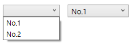
Control의 화살표를 클릭하여 표시하거나 숨길 수 있는 DropDown 목록을 사용하여 선택 Control을 나타냅니다.
[ ComboBox 기본 속성 ]
Height
ComboBox의 높이를 설정합니다.
<ComboBox Height="20" />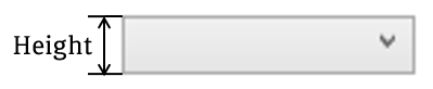
HorizontalContentAlignment
Content의 가로 정렬 위치를 설정합니다. 기본값은 Left입니다.
<ComboBox HorizontalContentAlignmnet="Center" />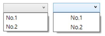
IsDropDownOpen
ComboBox의 DropDown이 현재 열려 있는지 여부를 나타내는 값을 설정합니다. DropDown이 열려있으면 true이고, 그렇지 않으면 false(기본값)입니다.
<ComboBox IsDropDownOpen="True" />
IsEditable
ComboBox의 TextBox에 있는 텍스트의 편집을 허용하거나 금지하는 값을 설정합니다. 편집할 수 있으면 true이고 그렇지 않으면 false(기본값)입니다.
<ComboBOx IsEditable="True" />
IsReadOnly
ComboBox의 내용을 선택할 수 있지만 편집할 수 없는 선택 전용 모드를 설정합니다. 읽기 전용이면 true이고 그렇지 않으면 false(기본값)입니다.
<ComboBox IsReadOnly="True" />
VerticalContentAlignment
Content의 세로 정렬 위치를 설정합니다. 기본값은 Top입니다.
<ComboBox VerticalContentAlignment="Center" />
Width
ComboBox의 너비를 설정합니다.
<ComboBox Width="100" />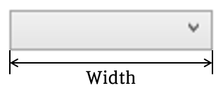
[ ComboBox Style ]
예제의 XAML 코드를 ComboBox에 적용하면 위와 같은 결과가 나옵니다. 이러한 결과에 도달하도록 코드 순서로 속성을 살펴보면 다음과 같습니다.
<Style x:Key="{x:Type ComboBox}" TargetType="{x:Type ComboBox}">
    <Setter Property="SnapsToDevicePixels" Value="true" />
    <Setter Property="OverridesDefaultStyle" Value="true" />
    <Setter Property="ScrollViewer.HorizontalScrollBarVisibility" Value="Auto" />
    <Setter Property="ScrollViewer.VerticalScrollBarVisibility" Value="Auto" />
    <Setter Property="ScrollViewer.CanContentScroll" Value="true" />
    <Setter Property="MinWidth" Value="120" />
    <Setter Property="MinHeight" Value="20" />
    <Setter Property="Template">
        <Setter.Value>
            ...
        </Setter.Value>
    </Setter>
</Style>
SnapsToDevicePixels
렌더링 하는 동안 이 요소의 렌더링에 디바이스 관련 픽셀 스냅(Pixel Snap)을 사용할지 여부를 결정하는 값을 설정합니다. 픽셀 스냅을 사용하면 값을 true로 설정하고, 그렇지 않으면 false(기본값)로 설정합니다.
⭐ 픽셀 스냅(Pixel Snap)을 사용하는 이유
WPF에서 시스템 DPI 설정에 맞게 자동으로 크기를 조정하게 됩니다. 이러한 조정할 때 가장자리가 흐려지거나 반투명하게 표시되는 문제가 발생하게 됩니다. 이 문제를 해결하기 위해서 픽셀 스냅 기능을 사용하여 객체의 가장자리를 픽셀에 맞추어 고정시키는 기능을 제공합니다. 픽셀 스냅을 사용하면 객체에 작은 단위의 offset을 적용하여 객체의 크기를 장치 픽셀에 맞추거나 일부분을 렌더링 시점에서 제거하여 해결하는 방법입니다.
OverridesDefaultStyle
테마 스타일 속성을 포함할지 여부를 설정합니다. 테마 스타일 속성을 사용하지 않으면 true입니다. 테마 스타일 속성을 사용하면(false일 경우) 직접 지정한 속성을 제외한 나머지 부분은 Local Application Style로 설정됩니다.(기본값은 false입니다.)
⭐ Template에 설정을 하지 않으면 아무것도 나오지 않는 것처럼 보일 수 있습니다.
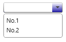
ScrollViewer.HorizontalScrollBarVisibility
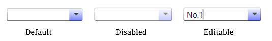
가로 ScrollBar를 표시해야 하는지 여부를 설정합니다. 기본값은 Hidden이며 다른 값으로 Auto, Disabled, Visible이 있습니다. ComboBox에서는 Popup 부분에 ScrollViewer가 구성되므로 아래의 이미지와 같이 나타납니다.
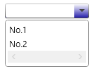
ScrollViewer.VerticalScrollBarVisibility
세로 ScrollBar를 표시해야 하는지 여부를 설정합니다. 기본값은 Hidden이며 다른 값으로 Auto, Disabled, Visible이 있습니다. ComboBox에서는 Popup 부분에 ScrollViewer가 구성되므로 아래의 이미지와 같이 나타납니다.
ScrollViewer.CanContentScroll
IScrollInfo(스크롤이 가능한 ScrollViewer Control 내의 주 영역) 인터페이스를 지원하는 요소를 스크롤할 수 있는지 여부를 설정합니다. ScrollViewer가 논리 단위의 측면에서 스크롤되는 경우 true이고 ScrollViewer이 물리적 단위 측면에서 스크롤되는 경우 false입니다.(기본값은 false입니다.)
⭐ ScrollViewer의 기본 동작은 물리적 단위를 사용하여 콘텐츠를 스크롤하는 것입니다. 예를 들어 ItemsControl이 상속되는 ListBox나 ListView 같은 Control이 있습니다. 이 경우 실제 단위가 아닌 항목의 수를 사용해야 하므로 CanContentScroll을 true로 설정해야 합니다.
MinWidth
ComboBox의 최소 너비 크기를 설정합니다.
MinHeight
ComboBox의 최소 높이 크기를 설정합니다.
Template
<Setter Property="Template">
    <Setter.Value>
        <ControlTemplate TargetType="{x:Type ComboBox}">
            <Grid>
                ...
                <ToggleButton x:Name="ToggleButton" .../>

                <ContentPresenter x:Name="ContentSite" .../>

                <TextBox x:Name="PART_EditableTextBox" .../>

                <Popup x:Name="Popup"...>
                    ...
                </Popup>
            </Grid>
            ...
        </ControlTemplate>
    </Setter.Value>
</Setter>
위의 코드는 이벤트 부분(VisualStateManager과 Triggers 부분)을 제외한 Template 코드입니다. 예제에서 사용되는 Template는 Control의 외형을 지정해줄 수 있는 ControlTemplate입니다. Template 내부 코드를 보기 전, ComboBox의 구성에 대해서 알아보도록 하겠습니다.
⭐ Template에 대해서 좀 더 아시고 싶으신 분은 이 페이지를 참고하시길 바랍니다.
ComboBox 구성
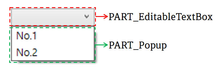
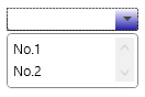
Microsoft에서 안내하는 기본 ComboBox의 구성은 PART_EditableTextBox와 PART_Popup으로 나눠집니다. PART_EditableTextBox의 유형은 TextBox로 ComboBox의 텍스트를 포함합니다. PART_Popup의 유형은 Popup으로 ComboBox에 있는 항목을 DropDown합니다.

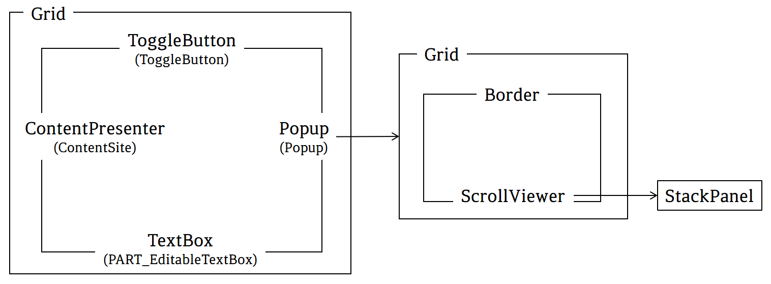
하지만 예제의 구성은 조금 다릅니다. 예제의 ComboBox 구성은 위의 이미지와 같이 Grid 내부에 ToggleButton, ContentPresenter, TextBox와 Popup으로 구성되어있습니다.
Grid
열 및 행으로 구성되는 모눈 영역을 정의하는 Control입니다.
ToggleButton(ToggleButton)
CheckBox 같이 상태를 전환할 수 있는 Control입니다.
<ToggleButton x:Name="ToggleButton" Template="{StaticResource ComboBoxToggleButton}"
              Grid.Column="2" Focusable="false" ClickMode="Press"
              IsChecked="{Binding IsDropDownOpen, Mode=TwoWay, RelativeSource={RelativeSource TemplatedParent}}"/>
⭐ ToggleButton 속성
x:Name
ToggleButton에 이름을 붙이는 것입니다. 이름을 붙이는 것과 동시에 다른 곳에서 사용할 수 있도록 만들어줍니다.
Template
ToggleButton의 모양을 설정합니다. 예제에서는 "ComboBoxToggleButton"이라는 이름으로 미리 정의해둔 ControlTemplate을 사용합니다.
Grid.Column
ToggleButton을 표시할 Grid(Parent)의 열을 설정합니다. 하지만, 이 예제에서는 Grid의 Column이 나누어져있지 않은 상태이므로 아무런 기능을 하지 않습니다.
Focusable
ToggleButton이 포커스를 받을 수 있는지 여부를 설정합니다. 포커스를 받을 수 있으면 true이고, 받을 수 없으면 false(기본값)입니다.
ClickMode
Click 이벤트가 발생하는 시기를 지정합니다. 값으로는 Hover(마우스가 Control을 가리키면 이벤트 발생), Press(Control을 누르면 이벤트 발생)와 Release(Control을 눌렀다가 떼면 이벤트 발생)가 있습니다.
IsChecked
ToggleButton이 선택된 상태인지 여부를 가져오거나 설정합니다. 선택되어 있으면 true이고 선택되어 있지 않으면 false(기본값)이며, 그렇지 않으면 null입니다. 예제에서는 TemplateParent(ComboBox)의 IsDropDownOpen 속성의 값으로 설정합니다.
ContentPresenter(ContentSite)
ContentPresenter는 모든 유형의 단일 Content로 이루어진 Control(ContentControl)의 내용을 표시합니다. 이 예제에서는 ComboBox의 ContentSite 부분을 나타냅니다.
<ContentPresenter x:Name="ContentSite" IsHitTestVisible="False"
                  Content="{TemplateBinding SelectionBoxItem}"
                  ContentTemplate="{TemplateBinding SelectionBoxItemTemplate}"
                  ContentTemplateSelector="{TemplateBinding ItemTemplateSelector}"
                  Margin="3, 3, 23, 3" VerticalAlignment="Stretch" HorizontalAlignment="Left">
</ContentPresenter>
⭐ ContentPresenter 속성
x:Name
ContentPresenter에 이름을 붙이는 것입니다. 이름을 붙이는 것과 동시에 다른 곳에서 사용할 수 있도록 만들어줍니다.
IsHitTestVisible
ContentPresenter의 일부에서 롤오버 테스트 결과로 변환될 수 있는지 여부를 설정합니다. 예제에서는 false로 마우스 이벤트를 받지 않도록 설정했습니다. 기본값은 true입니다.
Content
ContentPresenter의 자식 요소를 생성하는데 사용되는 데이터를 설정합니다. 예제에서는 ComboBox의 SelectionBoxItem(선택 상자에 표시된 항목) 속성 값으로 설정합니다.
ContentTemplate
ContentPresenter의 내용을 표시하는데 사용되는 Template을 설정합니다. 예제에서는 ComboBox의 SelectionBoxItemTemplate(선택 상자 콘텐츠의 항목 Template) 속성 값으로 설정합니다.
ContentTemplateSelector
ContentPresenter의 내용을 표시하는데 사용할 Template을 설정합니다. 예제에서는 ComboBox의 ItemTemplateSelector 속성 값으로 설정합니다.
⭐ ItemTemplateSelector : 각 항목을 표시하는 데 사용되는 템플릿을 선택하는 사용자 지정 논리를 가져오거나 설정합니다.
Margin
ContentPresenter의 외부 여백을 설정합니다. 값을 1개(상하좌우 동일), 2개(좌우, 상하), 4개(좌, 상, 우, 하)로 나누어서 설정 가능합니다.
VerticalAlignment
ContentPresenter의 세로 정렬 위치를 설정합니다. 기본값은 Stretch이며, 다른 값으로는 Top, Center, Bottom이 있습니다.
HorizontalAlignment
ContentPresenter의 가로 정렬 위치를 설정합니다. 기본값은 Stretch이며, 다른 값으로는 Center, Left, Right가 있습니다.
TextBox(PART_EditableTextBox)
서식 없는 텍스트를 표시하거나 편집하는데 사용할 수 있는 Control입니다.
<TextBox x:Name="PART_EditableTextBox" Style="{x:Null}"
         Template="{StaticResource ComboBoxTextBox}"
         HorizontalAlignment="Left" VerticalAlignment="Bottom"
         Margin="3, 3, 23, 3" Focusable="True"
         Background="Transparent" Visibility="Hidden"
         IsReadOnly="{TemplateBinding IsReadOnly}" />
⭐ TextBox 속성
x:Name
TextBox에 이름을 붙이는 것입니다. 이름을 붙이는 것과 동시에 다른 곳에서 사용할 수 있도록 만들어줍니다.
Style
TextBox에서 사용할 Style(속성들 묶음)을 설정합니다. 예제에서는 Null 값을 주어 아무런 스타일이 없도록 설정했습니다.
Template
TextBox에서 모양을 설정합니다. 예제에서는 "ComboBoxToggleButton"이라는 이름으로 미리 정의해둔 ControlTemplate을 사용합니다.
HorizontalAlignment
TextBox의 가로 정렬 위치를 설정합니다. 기본값은 Stretch이며, 다른 값으로는 Center, Left, Right가 있습니다.
VerticalAlignment
TextBox의 세로 정렬 위치를 설정합니다. 기본값은 Stretch이며, 다른 값으로는 Top, Center, Bottom이 있습니다.
Margin
TextBox의 외부 여백을 설정합니다. 값을 1개(상하좌우 동일), 2개(좌우, 상하), 4개(좌, 상, 우, 하)로 나누어서 설정가능합니다.
Focusable
TextBox가 포커스를 받을 수 있는지 여부를 설정합니다. 포커스를 받을 수 있으면 true이고, 받을 수 없으면 false(기본값)입니다.
Background
TextBox의 배경색을 설정합니다. 예제에서는 Transparent(투명)으로 설정했습니다.
Visibility
TextBox의 표시 유형을 설정합니다. 기본 값은 Visible이며 다른 값으로는 Collapsed와 Hidden이 있습니다.
IsReadOnly
TextBox의 내용을 선택할 수 있지만 편집할 수 없는 선택 전용 모드를 설정합니다. 읽기 전용이면 true이고 그렇지 않으면 false(기본값)입니다.
Popup(Popup)
지정된 요소나 화면 좌표를 기준으로 Content를 별도의 창에 표시할 수 있는 Control입니다. 예제에서는 Popup 내부에 Grid로 Border와 ScrollViewer를 구성하여 ComboBoxItem들을 표시합니다.
<Popup x:Name="Popup" Placement="Bottom" IsOpen="{TemplateBinding IsDropDownOpen}"
       AllowsTransparency="True" Focusable="False" PopupAnimation="Slide">
    <Grid x:Name="DropDown" SnapsToDevicePixels="True"
          MinWidth="{TemplateBinding ActualWidth}"
          MaxHeight="{TemplateBinding MaxDropDownHeight}">
        <Border x:Name="DropDownBorder" BorderThickness="1">
            <Border.BorderBrush>
                <SolidColorBrush Color="{DynamicResource BorderMediumColor}" />
            </Border.BorderBrush>

            <Border.Background>
                <SolidColorBrush Color="{DynamicResource ControlLightColor}" />
            </Border.Background>
        </Border>

        <ScrollViewer Margin="4,6,4,6" SnapsToDevicePixels="True">
            <StackPanel IsItemsHost="True" KeyboardNavigation.DirectionalNavigation="Contained" />
        </ScrollViewer>
    </Grid>
</Popup>
⭐ Popup 속성
x:Name
Popup에 이름을 붙이는 것입니다. 이름을 붙이는 것과 동시에 다른 곳에서 사용할 수 있도록 만들어줍니다.
Placement
Popup이 열리는 방향을 설정합니다. 기본값은 Bottom이며, Absolute, AbsolutePoint, Center, Custom, Left, Mouse, MousePoint, Relative, RelativePoint, Right, Top이 있습니다. 값에 대한 자세한 설명은 이 페이지에서 확인하시길 바랍니다.
IsOpen
Popup의 표시 여부를 설정합니다. Popup이 표시되면 true이고, 그렇지 않으면 false(기본값)입니다. 예제에서는 TemplateBinding을 이용하여 ComboBox의 IsDropDownOpen 값으로 설정하였습니다.
AllowsTransparency
Popup이 투명 Content를 포함할 수 있는지 여부를 설정합니다. 투명 Content를 포함할 수 있으면 true이고, 포함할 수 없으면 false(기본값)입니다.
Focusable
Popup이 포커스를 받을 받을 수 있는지 여부를 설정합니다. 포커스를 받을 수 있으면 true이고, 포커스를 받을 수 없으면 false(기본값)입니다.
PopupAnimation
Popup 열기 및 닫기에 대한 애니메이션을 설정합니다. 기본값은 None이며, Fade, Scroll, Slide가 있습니다. 값에 대한 자세한 설명은 이 페이지에서 확인하시길 바랍니다.
Grid
열 및 행으로 구성되는 모눈 영역을 정의하는 Control입니다.
⭐ Grid 속성
x:Name
Grid에 이름을 붙이는 것입니다. 이름을 붙이는 것과 동시에 다른 곳에서 사용할 수 있도록 만들어줍니다.
SnapsToDevicePixels
렌더링 하는 동안 이 요소의 렌더링에 디바이스 관련 픽셀 스냅(Pixel Snap)을 사용할지 여부를 결정하는 값을 설정합니다. 픽셀 스냅을 사용하면 값을 true로 설정하고, 그렇지 않으면 false(기본값)로 설정합니다.
MinWidth
Grid의 최소 너비 크기를 설정합니다. 예제에서는 TemplateBinding을 사용하여 ActualWidth(렌더링 된 너비)로 설정합니다.
MaxHeight
Grid의 최대 높이 크기를 설정합니다. 예제에서는 TemplateBinding을 사용하여 ComboBox의 MaxDropDownHeight로 설정합니다.
Border
다른 요소의 주위에 테두리, 배경 또는 둘 다를 그립니다.
⭐ Border 속성
x:Name
Border에 이름을 붙이는 것입니다. 이름을 붙이는 것과 동시에 다른 곳에서 사용할 수 있도록 만들어줍니다.
BorderThickness
Border의 윤곽선 두께를 설정합니다.
BorderBrush
Border의 윤곽선 색을 설정합니다. 예제에서는 SolidColorBrush를 사용하여 미리 정의한 BorderMediumColor 색으로 설정했습니다.
Background
Border의 배경색을 설정합니다. 예제에서는 SolidColorBrush를 사용하여 미리 정의한 ControlLightColor 색으로 설정했습니다.
ScrollViewer
표시 가능한 다른 요소를 포함할 수 있는 스크롤 가능한 영역을 나타냅니다.
⭐ ScrollViewer 속성
Margin
ScrollViewer의 외부 여백을 설정합니다. 값을 1개(상하좌우 동일), 2개(좌우, 상하), 4개(좌, 상, 우, 하)로 나누어서 설정 가능합니다.
SnapsToDevicePixels
렌더링 하는 동안 이 요소의 렌더링에 디바이스 관련 픽셀 스냅(Pixel Snap)을 사용할지 여부를 결정하는 값을 설정합니다. 픽셀 스냅을 사용하면 값을 true로 설정하고, 그렇지 않으면 false(기본값)로 설정합니다.
StackPanel
가로 또는 세로 방향으로 한 줄로 자식 요소를 정렬합니다.
⭐ StackPanel 속성
IsItemsHost
ItemsControl에 의해 생성된 UI(사용자 인터페이스) 항목에 대한 컨테이너임을 나타내는 Panel 값을 설정합니다. 항목 호스트이면 true이고, 그렇지 않으면 false(기본값)입니다.
KeyboardNavigation.DirectionalNavigation
이 속성이 설정된 요소의 자식에 대한 방향 탐색 동작을 설정합니다. 값으로는 Contained, Continue, Cycle, Local, None, Once가 있습니다. 값에 대한 자세한 설명은 이 페이지에서 확인하시길 바랍니다.
ComboBox의 이벤트
예제에서는 ComboBox의 이벤트로 Disabled와 Editable 변화를 VisualStateManager 그리고 HasItems, IsGrouping, Popup 변화를 Triggers로 표현하였습니다.
VisualStateManager
<VisualStateManager.VisualStateGroups>
    <VisualStateGroup x:Name="CommonStates">
        ...
    </VisualStateGroup>

    <VisualStateGroup x:Name="EditStates">
        ...
    </VisualStateGroup>
</VisualStateManager.VisualStateGroups>
VisualState는 Control의 시각적 상태를 나타냅니다. 예제의 이벤트에서 시각적 변화를 주기 위해서 VisualStateGroup의 x:Name을 각각 CommonStates(Disabled)와 EditStates(Editable)로 설정했습니다.
⭐ ComboBox는 4개(CommonStates, FocusStates, ValidationStates, EditStates)의 VisualStateGroup을 가지고 있습니다.
CommonStates
<VisualStateGroup x:Name="CommonStates">
    <VisualState x:Name="Normal" />
    <VisualState x:Name="MouseOver" />
    <VisualState x:Name="Disabled">
        <Storyboard>
            <ColorAnimationUsingKeyFrames Storyboard.TargetName="PART_EditableTextBox"
                                          Storyboard.TargetProperty="(TextElement.Foreground).(SolidColorBrush.Color)">
                <EasingColorKeyFrame KeyTime="0" Value="{StaticResource DisabledForegroundColor}" />
            </ColorAnimationUsingKeyFrames>
        </Storyboard>
    </VisualState>
</VisualStateGroup>
Disabled
Storyboard의 내용을 풀어보면 ["PART_EditableTextBox"라는 이름을 가진 Control의 Foreground를 DisabledForegroundColor로 바꾸는 것]입니다.
⭐ Storyboard.TargetProperty에서 (TextElement.Foreground).(SolidColorBrush.Color)로 사용한 이유는 ColorAnimationUsingKeyFrames 애니메이션 개체를 사용할 때는 Foreground 속성에 애니메이션 효과를 줄 수 없어서 (TextElement.Foreground).(SolidColorBrush.Color) 형식으로 사용해야 합니다.
⭐ Normal과 MouseOver의 경우 Storyboard가 존재하지 않지만 명시해주지 않으면 상태가 Disabled에서 Normal이나 MouseOver로 변할 때 외형이 바뀌지 않습니다.
ColorAnimationUsingKeyFrames
KeyFrames 집합을 따라 Color 속성 값에 EasingColorKeyFrame의 애니메이션 효과를 줍니다.
EditStates
<VisualStateGroup x:Name="EditStates">
    <VisualState x:Name="Editable">
        <Storyboard>
            <ObjectAnimationUsingKeyFrames Storyboard.TargetProperty="(UIElement.Visibility)"
                                           Storyboard.TargetName="PART_EditableTextBox">
                <DiscreteObjectKeyFrame KeyTime="0" Value="{x:Static Visibility.Visible}" />
            </ObjectAnimationUsingKeyFrames>
            <ObjectAnimationUsingKeyFrames Storyboard.TargetProperty="(UIElement.Visibility)"
                                           Storyboard.TargetName="ContentSite">
                <DiscreteObjectKeyFrame KeyTime="0" Value="{x:Static Visibility.Hidden}" />
            </ObjectAnimationUsingKeyFrames>
        </Storyboard>
    </VisualState>
    <VisualState x:Name="Uneditable" />
</VisualStateGroup>
Editable
Storyboard의 내용을 풀어보면 ["PART_EditableTextBox"라는 이름을 가진 Control의 Visibility를 Visible로 바꾸는 것]과 ["ContentSite"라는 이름을 가진 Control의 Visibility를 Hidden으로 바꾸는 것]입니다.
⭐ (UIElement.Visibility) 대신 Visibility로 작성하여도 동작합니다.
⭐ Uneditable의 경우 Storyboard가 존재하지 않지만 명시해주지 않으면 상태가 Editable에서 Uneditable로 변할 때 외형이 바뀌지 않습니다.
⭐ Editable/Uneditable은 IsEditable의 true/false 상태입니다.
ObjectAnimationusingKeyFrames
지정된 Object에 대해 KeyFrames 집합을 따라 Duration 속성 값에 애니메이션 효과를 줍니다.
DiscreteObjectKeyFrame
불연속 보간을 사용하여 이전 KeyFrame의 Object값에서 Value로 애니메이션 효과를 적용합니다.
Triggers
<ControlTemplate.Triggers>
    <Trigger Property="HasItems" Value="false">
        <Setter TargetName="DropDownBorder" Property="MinHeight" Value="95" />
    </Trigger>

    <Trigger Property="IsGrouping" Value="true">
        <Setter Property="ScrollViewer.CanContentScroll" Value="false" />
    </Trigger>

    <Trigger SourceName="Popup" Property="AllowsTransparency" Value="true">
        <Setter TargetName="DropDownBorder" Property="CornerRadius" Value="4" />
        <Setter TargetName="DropDownBorder" Property="Margin" Value="0, 2, 0, 0" />
    </Trigger>
</ControlTemplate.Triggers>
Trigger는 어떤 조건이나 이벤트 등이 주어졌을 때 Control의 상태 또는 이벤트 핸들러 등을 호출하는 기능을 의미합니다.
ComboBox 변화 이벤트
HasItems
ItmesControl에 항목이 있는지 여부를 나타내는 값을 가져옵니다. 이 값이 false일 경우(ComboBoxItem이 1개도 없을 경우) "DropDownBorder"이라는 이름을 가진 Control의 MinHeight를 95로 설정합니다.
IsGrouping
Control에 그룹이 사용되는지 여부를 나타내는 값을 가져옵니다. 이 값이 true일 경우 ComboBox의 ScrollViewer.CanContentScroll 속성을 false로 설정합니다.
Popup 변화 이벤트
AllowsTransparency
투명도를 지원하는지 여부를 나타내는 값을 가져옵니다. 이 값이 true일 경우 "DropDownBorder"라는 이름을 가진 Control의 CornerRadius를 4 그리고 Margin을 "0, 2, 0, 0"(위쪽만 2)으로 설정합니다.
전체 코드
<ControlTemplate x:Key="ComboBoxToggleButton" TargetType="{x:Type ToggleButton}">
  <Grid>
    <Grid.ColumnDefinitions>
      <ColumnDefinition />
      <ColumnDefinition Width="20" />
    </Grid.ColumnDefinitions>
    <VisualStateManager.VisualStateGroups>
      <VisualStateGroup x:Name="CommonStates">
        <VisualState x:Name="Normal" />
        <VisualState x:Name="MouseOver">
          <Storyboard>
            <ColorAnimationUsingKeyFrames Storyboard.TargetProperty="(Panel.Background).
                (GradientBrush.GradientStops)[1].(GradientStop.Color)"
                                          Storyboard.TargetName="Border">
              <EasingColorKeyFrame KeyTime="0"
                                   Value="{StaticResource ControlMouseOverColor}" />
            </ColorAnimationUsingKeyFrames>
          </Storyboard>
        </VisualState>
        <VisualState x:Name="Pressed" />
        <VisualState x:Name="Disabled">
          <Storyboard>
            <ColorAnimationUsingKeyFrames Storyboard.TargetProperty="(Panel.Background).
                (GradientBrush.GradientStops)[1].(GradientStop.Color)"
                                          Storyboard.TargetName="Border">
              <EasingColorKeyFrame KeyTime="0"
                                   Value="{StaticResource DisabledControlDarkColor}" />
            </ColorAnimationUsingKeyFrames>
            <ColorAnimationUsingKeyFrames Storyboard.TargetProperty="(Shape.Fill).
                (SolidColorBrush.Color)"
                                          Storyboard.TargetName="Arrow">
              <EasingColorKeyFrame KeyTime="0"
                                   Value="{StaticResource DisabledForegroundColor}" />
            </ColorAnimationUsingKeyFrames>
            <ColorAnimationUsingKeyFrames Storyboard.TargetProperty="(Border.BorderBrush).
                (GradientBrush.GradientStops)[1].(GradientStop.Color)"
                                          Storyboard.TargetName="Border">
              <EasingColorKeyFrame KeyTime="0"
                                   Value="{StaticResource DisabledBorderDarkColor}" />
            </ColorAnimationUsingKeyFrames>
          </Storyboard>
        </VisualState>
      </VisualStateGroup>
      <VisualStateGroup x:Name="CheckStates">
        <VisualState x:Name="Checked">
          <Storyboard>
            <ColorAnimationUsingKeyFrames Storyboard.TargetProperty="(Panel.Background).
                (GradientBrush.GradientStops)[1].(GradientStop.Color)"
                                          Storyboard.TargetName="Border">
              <EasingColorKeyFrame KeyTime="0"
                                   Value="{StaticResource ControlPressedColor}" />
            </ColorAnimationUsingKeyFrames>
          </Storyboard>
        </VisualState>
        <VisualState x:Name="Unchecked" />
        <VisualState x:Name="Indeterminate" />
      </VisualStateGroup>
    </VisualStateManager.VisualStateGroups>
    <Border x:Name="Border"
            Grid.ColumnSpan="2"
            CornerRadius="2"
            BorderThickness="1">
      <Border.BorderBrush>
        <LinearGradientBrush EndPoint="0,1"
                             StartPoint="0,0">
          <GradientStop Color="{DynamicResource BorderLightColor}"
                        Offset="0" />
          <GradientStop Color="{DynamicResource BorderDarkColor}"
                        Offset="1" />
        </LinearGradientBrush>
      </Border.BorderBrush>
      <Border.Background>

        <LinearGradientBrush StartPoint="0,0"
                             EndPoint="0,1">
          <LinearGradientBrush.GradientStops>
            <GradientStopCollection>
              <GradientStop Color="{DynamicResource ControlLightColor}" />
              <GradientStop Color="{DynamicResource ControlMediumColor}"
                            Offset="1.0" />
            </GradientStopCollection>
          </LinearGradientBrush.GradientStops>
        </LinearGradientBrush>

      </Border.Background>
    </Border>
    <Border Grid.Column="0"
            CornerRadius="2,0,0,2"
            Margin="1" >
      <Border.Background>
          <SolidColorBrush Color="{DynamicResource ControlLightColor}"/>
      </Border.Background>
    </Border>
    <Path x:Name="Arrow"
          Grid.Column="1"
          HorizontalAlignment="Center"
          VerticalAlignment="Center"
          Data="M 0 0 L 4 4 L 8 0 Z" >
      <Path.Fill>
          <SolidColorBrush Color="{DynamicResource GlyphColor}"/>
      </Path.Fill>
    </Path>
  </Grid>
</ControlTemplate>

<ControlTemplate x:Key="ComboBoxTextBox"
                 TargetType="{x:Type TextBox}">
  <Border x:Name="PART_ContentHost"
          Focusable="False"
          Background="{TemplateBinding Background}" />
</ControlTemplate>

<Style x:Key="{x:Type ComboBox}" TargetType="{x:Type ComboBox}">
  <Setter Property="SnapsToDevicePixels" Value="true" />
  <Setter Property="OverridesDefaultStyle" Value="true" />
  <Setter Property="ScrollViewer.HorizontalScrollBarVisibility"
          Value="Auto" />
  <Setter Property="ScrollViewer.VerticalScrollBarVisibility"
          Value="Auto" />
  <Setter Property="ScrollViewer.CanContentScroll"
          Value="true" />
  <Setter Property="MinWidth" Value="120" />
  <Setter Property="MinHeight" Value="20" />
  <Setter Property="Template">
    <Setter.Value>
      <ControlTemplate TargetType="{x:Type ComboBox}">
        <Grid>
          <VisualStateManager.VisualStateGroups>
            <VisualStateGroup x:Name="CommonStates">
              <VisualState x:Name="Normal" />
              <VisualState x:Name="MouseOver" />
              <VisualState x:Name="Disabled">
                <Storyboard>
                  <ColorAnimationUsingKeyFrames Storyboard.TargetName="PART_EditableTextBox"
                                                Storyboard.TargetProperty="(TextElement.Foreground).
                      (SolidColorBrush.Color)">
                    <EasingColorKeyFrame KeyTime="0"
                                         Value="{StaticResource DisabledForegroundColor}" />
                  </ColorAnimationUsingKeyFrames>
                </Storyboard>
              </VisualState>
            </VisualStateGroup>
            <VisualStateGroup x:Name="EditStates">
              <VisualState x:Name="Editable">
                <Storyboard>
                  <ObjectAnimationUsingKeyFrames Storyboard.TargetProperty="(UIElement.Visibility)"
                                                 Storyboard.TargetName="PART_EditableTextBox">
                    <DiscreteObjectKeyFrame KeyTime="0"
                                            Value="{x:Static Visibility.Visible}" />
                  </ObjectAnimationUsingKeyFrames>
                  <ObjectAnimationUsingKeyFrames
                      Storyboard.TargetProperty="(UIElement.Visibility)"
                                                 Storyboard.TargetName="ContentSite">
                    <DiscreteObjectKeyFrame KeyTime="0"
                                            Value="{x:Static Visibility.Hidden}" />
                  </ObjectAnimationUsingKeyFrames>
                </Storyboard>
              </VisualState>
              <VisualState x:Name="Uneditable" />
            </VisualStateGroup>
          </VisualStateManager.VisualStateGroups>
          <ToggleButton x:Name="ToggleButton"
                        Template="{StaticResource ComboBoxToggleButton}"
                        Grid.Column="2"
                        Focusable="false"
                        ClickMode="Press"
                        IsChecked="{Binding IsDropDownOpen, Mode=TwoWay,
              RelativeSource={RelativeSource TemplatedParent}}"/>
          <ContentPresenter x:Name="ContentSite"
                            IsHitTestVisible="False"
                            Content="{TemplateBinding SelectionBoxItem}"
                            ContentTemplate="{TemplateBinding SelectionBoxItemTemplate}"
                            ContentTemplateSelector="{TemplateBinding ItemTemplateSelector}"
                            Margin="3,3,23,3"
                            VerticalAlignment="Stretch"
                            HorizontalAlignment="Left">
          </ContentPresenter>
          <TextBox x:Name="PART_EditableTextBox"
                   Style="{x:Null}"
                   Template="{StaticResource ComboBoxTextBox}"
                   HorizontalAlignment="Left"
                   VerticalAlignment="Bottom"
                   Margin="3,3,23,3"
                   Focusable="True"
                   Background="Transparent"
                   Visibility="Hidden"
                   IsReadOnly="{TemplateBinding IsReadOnly}" />
          <Popup x:Name="Popup"
                 Placement="Bottom"
                 IsOpen="{TemplateBinding IsDropDownOpen}"
                 AllowsTransparency="True"
                 Focusable="False"
                 PopupAnimation="Slide">
            <Grid x:Name="DropDown"
                  SnapsToDevicePixels="True"
                  MinWidth="{TemplateBinding ActualWidth}"
                  MaxHeight="{TemplateBinding MaxDropDownHeight}">
              <Border x:Name="DropDownBorder"
                      BorderThickness="1">
                <Border.BorderBrush>
                  <SolidColorBrush Color="{DynamicResource BorderMediumColor}" />
                </Border.BorderBrush>
                <Border.Background>
                  <SolidColorBrush Color="{DynamicResource ControlLightColor}" />
                </Border.Background>
              </Border>
              <ScrollViewer Margin="4,6,4,6"
                            SnapsToDevicePixels="True">
                <StackPanel IsItemsHost="True"
                            KeyboardNavigation.DirectionalNavigation="Contained" />
              </ScrollViewer>
            </Grid>
          </Popup>
        </Grid>
        <ControlTemplate.Triggers>
          <Trigger Property="HasItems" Value="false">
            <Setter TargetName="DropDownBorder" Property="MinHeight" Value="95" />
          </Trigger>
          <Trigger Property="IsGrouping" Value="true">
            <Setter Property="ScrollViewer.CanContentScroll" Value="false" />
          </Trigger>
          <Trigger SourceName="Popup" Property="AllowsTransparency" Value="true">
            <Setter TargetName="DropDownBorder" Property="CornerRadius" Value="4" />
            <Setter TargetName="DropDownBorder" Property="Margin" Value="0,2,0,0" />
          </Trigger>
        </ControlTemplate.Triggers>
      </ControlTemplate>
    </Setter.Value>
  </Setter>
</Style>

<Style x:Key="{x:Type ComboBoxItem}" TargetType="{x:Type ComboBoxItem}">
  <Setter Property="SnapsToDevicePixels" Value="true" />
  <Setter Property="OverridesDefaultStyle" Value="true" />
  <Setter Property="Template">
    <Setter.Value>
      <ControlTemplate TargetType="{x:Type ComboBoxItem}">
        <Border x:Name="Border"
                Padding="2"
                SnapsToDevicePixels="true"
                Background="Transparent">
          <VisualStateManager.VisualStateGroups>
            <VisualStateGroup x:Name="SelectionStates">
              <VisualState x:Name="Unselected" />
              <VisualState x:Name="Selected">
                <Storyboard>
                  <ColorAnimationUsingKeyFrames Storyboard.TargetName="Border"
                                                Storyboard.TargetProperty="(Panel.Background).
                    (SolidColorBrush.Color)">
                    <EasingColorKeyFrame KeyTime="0"
                                         Value="{StaticResource SelectedBackgroundColor}" />
                  </ColorAnimationUsingKeyFrames>
                </Storyboard>
              </VisualState>
              <VisualState x:Name="SelectedUnfocused">
                <Storyboard>
                  <ColorAnimationUsingKeyFrames Storyboard.TargetName="Border"
                                                Storyboard.TargetProperty="(Panel.Background).
                    (SolidColorBrush.Color)">
                    <EasingColorKeyFrame KeyTime="0"
                                         Value="{StaticResource SelectedUnfocusedColor}" />
                  </ColorAnimationUsingKeyFrames>
                </Storyboard>
              </VisualState>
            </VisualStateGroup>
          </VisualStateManager.VisualStateGroups>
          <ContentPresenter />
        </Border>
      </ControlTemplate>
    </Setter.Value>
  </Setter>
</Style>

<!--Control colors.-->
<Color x:Key="WindowColor">#FFE8EDF9</Color>
<Color x:Key="ContentAreaColorLight">#FFC5CBF9</Color>
<Color x:Key="ContentAreaColorDark">#FF7381F9</Color>

<Color x:Key="DisabledControlLightColor">#FFE8EDF9</Color>
<Color x:Key="DisabledControlDarkColor">#FFC5CBF9</Color>
<Color x:Key="DisabledForegroundColor">#FF888888</Color>

<Color x:Key="SelectedBackgroundColor">#FFC5CBF9</Color>
<Color x:Key="SelectedUnfocusedColor">#FFDDDDDD</Color>

<Color x:Key="ControlLightColor">White</Color>
<Color x:Key="ControlMediumColor">#FF7381F9</Color>
<Color x:Key="ControlDarkColor">#FF211AA9</Color>

<Color x:Key="ControlMouseOverColor">#FF3843C4</Color>
<Color x:Key="ControlPressedColor">#FF211AA9</Color>


<Color x:Key="GlyphColor">#FF444444</Color>
<Color x:Key="GlyphMouseOver">sc#1, 0.004391443, 0.002428215, 0.242281124</Color>

<!--Border colors-->
<Color x:Key="BorderLightColor">#FFCCCCCC</Color>
<Color x:Key="BorderMediumColor">#FF888888</Color>
<Color x:Key="BorderDarkColor">#FF444444</Color>

<Color x:Key="PressedBorderLightColor">#FF888888</Color>
<Color x:Key="PressedBorderDarkColor">#FF444444</Color>

<Color x:Key="DisabledBorderLightColor">#FFAAAAAA</Color>
<Color x:Key="DisabledBorderDarkColor">#FF888888</Color>

<Color x:Key="DefaultBorderBrushDarkColor">Black</Color>

<!--Control-specific resources.-->
<Color x:Key="HeaderTopColor">#FFC5CBF9</Color>
<Color x:Key="DatagridCurrentCellBorderColor">Black</Color>
<Color x:Key="SliderTrackDarkColor">#FFC5CBF9</Color>

<Color x:Key="NavButtonFrameColor">#FF3843C4</Color>

<LinearGradientBrush x:Key="MenuPopupBrush" EndPoint="0.5,1" StartPoint="0.5,0">
  <GradientStop Color="{DynamicResource ControlLightColor}" Offset="0" />
  <GradientStop Color="{DynamicResource ControlMediumColor}" Offset="0.5" />
  <GradientStop Color="{DynamicResource ControlLightColor}" Offset="1" />
</LinearGradientBrush>

<LinearGradientBrush x:Key="ProgressBarIndicatorAnimatedFill" StartPoint="0,0" EndPoint="1,0">
  <LinearGradientBrush.GradientStops>
    <GradientStopCollection>
      <GradientStop Color="#000000FF" Offset="0" />
      <GradientStop Color="#600000FF" Offset="0.4" />
      <GradientStop Color="#600000FF" Offset="0.6" />
      <GradientStop Color="#000000FF" Offset="1" />
    </GradientStopCollection>
  </LinearGradientBrush.GradientStops>
</LinearGradientBrush>
이 글의 내용은 아래의 사이트에서 기초합니다.
ComboBox 스타일 및 템플릿 - WPF .NET Framework
Windows Presentation Foundation ComboBox 컨트롤의 스타일 및 템플릿에 대해 알아봅니다. ControlTemplate을 수정하여 컨트롤에 고유한 모양을 제공합니다.
docs.microsoft.com
'프로그램 개발 > WPF: Style&Template' 카테고리의 다른 글
| ContextMenu (0) | 2022.05.11 |
|---|---|
| ComboBox② (0) | 2022.05.10 |
| CheckBox (0) | 2022.05.05 |
| Calendar③ (0) | 2022.05.04 |
| Calendar② (0) | 2022.05.04 |