
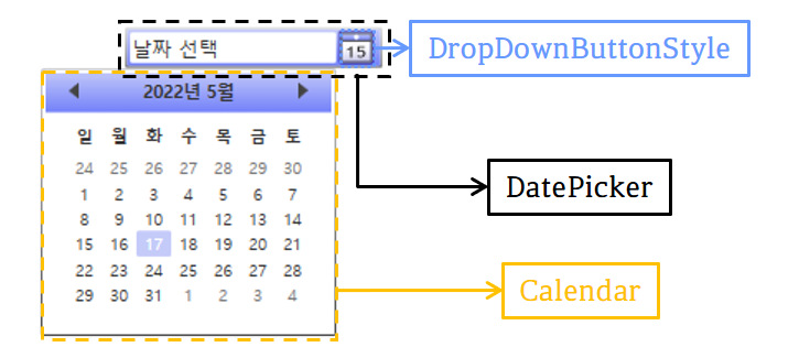
안녕하세요, 이번 글에서는 지난 글에 이어서 Microsoft에서 제공하는 WPF [DatePicker의 스타일 및 템플릿] 예제를 톺아보도록 하겠습니다. DatePicker Style의 경우 DatePicker, DropDownButtonStyle, Calendar로 나눠집니다. 이번 글에서는 DropDownButtonStyle에 대해서 보도록 하겠습니다.
👀 Calendar의 경우 예제에서 [Calendar의 스타일 및 템플릿] 예제를 사용하였기 때문에 DatePicker에서는 따로 다루지 않습니다.
[ DropDownButtonStyle ]
예제에 사용된 DropDownButtonStyle은 DatePicker의 Button 부분을 Style로 미리 정의해둔 것입니다.
DropDownButtonStyle 속성
<Style x:Key="DropDownButtonStyle" TargetType="Button">
    <Setter Property="Template">
        <Setter.Value>
            ...
        </Setter.Value>
    </Setter>
</Style>
x:Key
XAML 정의 사전에서 만들고 참조하는 요소를 고유하게 식별합니다.
TargetType
이 Style을 적용할 형식을 설정합니다. 예제에서는 "Button"으로 설정했습니다.
Template
<Setter Property="Template">
    <Setter.Value>
        <ControlTemplate TargetType="{x:Type Button}">
            <Grid>
                ...
                <Grid ... >
                    ...
                    <Border x:Name="Highlight" ... />
                    <Border x:Name="Background" ... />
                    <Border x:Name="BackgroundGradient" ... />
                    <Rectangle ... />
                    <Path ... />
                    <Ellipse ... />
                    <Border x:Name="DisabledVisual" ... />
                </Grid>
            </Grid>
        </ControlTemplate>
    </Setter.Value>
</Setter>
Control의 템플릿을 설정합니다. 예제에서 사용되는 Template는 Control의 외형을 지정해줄 수 있는 ControlTemplate입니다.
👀 Template에 대해서 좀 더 아시고 싶으신 분은 이 페이지를 참고하시길 바랍니다.
DropDownButtonStyle 구성
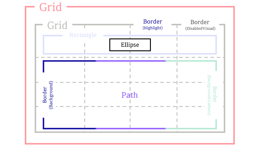
DropDownButtonStyle은 위의 이미지처럼 구성되어 있습니다. 예제의 코드에는 속성뿐만 아니라 구성에서도 쓸데없는 부분이 좀 많아 아쉽습니다. 그중에서 큰 부분만 정리해보면 아래와 같습니다.
- 아무 기능을 하지 않는 Grid 대신 Border(Hightlight) 부분을 바로 사용하였으면 코드 길이도 줄고 코드 이해도도 높아졌을 것입니다.
- Grid의 ColumnDefinition의 경우 똑같은 4 등분한다면, "20*"말고 "*"로 설정하는 것이 코드 길이가 줄었을 것입니다.
- Path 부분의 배경색을 Border(Background)와 Border(BackgroundGradient)로 나누어서 그라데이션 설정하였는데, 차라리 1개의 Border로 구성하였으면 코드 길이가 줄었을 것입니다.
- 예제에서는 Border(DisabledVisual)을 구성하였지만 결국 사용되지 않습니다.
🙄 만약 DropDownButtonStyle을 참고하여 Template을 구성하시는 분이라면 구성을 바꾸시는 것을 추천드립니다.
Grid
열 및 행으로 구성되는 유연한 모눈 영역을 정의합니다.
Grid
열 및 행으로 구성되는 유연한 모눈 영역을 정의합니다.
⭐ Grid 속성
<Grid Background="#11FFFFFF" FlowDirection="LeftToRight" HorizontalAlignment="Center"
    Height="18" Margin="0" VerticalAlignment="Center" Width="19">
  <Grid.ColumnDefinitions>
    <ColumnDefinition Width="20*" /> <ColumnDefinition Width="20*" /> <ColumnDefinition Width="20*" /> <ColumnDefinition Width="20*" />
  </Grid.ColumnDefinitions>
  <Grid.RowDefinitions>
    <RowDefinition Height="23*" /> <RowDefinition Height="19*" /> <RowDefinition Height="19*" /> <RowDefinition Height="19*" />
  </Grid.RowDefinitions>
  ...
</Grid>
Background
Grid의 배경색을 설정합니다.
FlowDirection
텍스트 및 기타 UI(사용자 인터페이스) 요소가 레이아웃을 제어하는 Parent 요소 내에서 흐르는 방향을 설정합니다. 기본값은 LeftToRight(왼쪽에서 오른쪽으로 흐름)이며, 다른 값은 RightToLeft(오른쪽에서 왼쪽으로 흐름)입니다.
HorizontalAlignment
Grid의 가로 맞춤 설정입니다. 기본값은 Stretch이며, 다른 값으로 Left, Center, Right가 있습니다.
Height
Grid의 높이를 설정합니다.
Margin
Grid의 바깥쪽 여백을 설정합니다. 예제에서는 값이 0이기 때문에 적지 않아도 되는 속성입니다.
VerticalAlignment
Grid의 세로 맞춤 설정입니다. 기본값은 Stretch이며, 다른 값으로는 Top, Center, Bottom이 있습니다.
Width
Grid의 너비를 설정합니다.
ColumnDefinitions
Grid에 ColumnDefinition을 사용하여 ColumnDefinitionCollection(ColumnDefinition 개체의 순서가 지정된 컬렉션)을 설정합니다.
ColumnDefinition
Grid 요소에 적용되는 열 별 속성을 정의합니다. Width로 너비를 숫자 값, Auto 또는 '*'(기본값)로 설정할 수 있습니다.
RowDefinitions
Grid에 RowDefinition을 사용하여 RowDefinitionCollection(RowDefinition 개체의 순서가 지정된 컬렉션)을 설정합니다.
RowDefinition
Grid 요소에 적용되는 행 별 속성을 정의합니다. Height로 높이를 숫자 값, Auto 또는 '*'(기본값)로 설정할 수 있습니다.
Border(Highlight)
다른 요소의 주위에 윤곽선, 배경 또는 둘 다를 그립니다.
⭐ Border 속성
<Border x:Name="Highlight" BorderThickness="1" Grid.ColumnSpan="4"
        CornerRadius="0,0,1,1" Margin="-1" Opacity="1" Grid.Row="0" Grid.RowSpan="4">
    <Border.BorderBrush>
        <SolidColorBrush Color="{DynamicResource ControlPressedColor}" />
    </Border.BorderBrush>
</Border>
x:Name
Border에 이름을 설정합니다. 이름을 붙이는 것과 동시에 다른 곳에서 사용할 수 있도록 만들어줍니다.
BorderThickness
Border의 윤곽선 두께를 설정합니다.
Grid.ColumnSpan
Grid에서 자식 Content를 채울 전체 열 수를 설정합니다.
CornerRadius
Border의 모퉁이가 둥근 정도를 설정합니다.
Margin
Border의 바깥쪽 여백을 설정합니다.
Opacity
Border의 불투명도를 설정합니다. 값은 0(투명) ~ 1(불투명) 사이를 사용합니다.
Grid.Row
표시할 Grid(Parent)의 행을 설정합니다.
Grid.RowSpan
Grid에서 자식 Content를 채울 전체 행 수를 설정합니다.
BorderBrush
Border의 윤곽선 색을 설정합니다.
Border(Background)
다른 요소의 주위에 윤곽선, 배경 또는 둘 다를 그립니다. 예제에서는 Border(BackgroundGradient)와 함께 Path 부분의 배경색으로 사용됩니다.
⭐ Border 속성
<Border x:Name="Background" BorderBrush="#FFFFFFFF" BorderThickness="1"
        Grid.ColumnSpan="4" CornerRadius=".5" Margin="0,-1,0,0" Opacity="1" Grid.Row="1" Grid.RowSpan="3">
    <Border.Background>
        <SolidColorBrush Color="{DynamicResource ControlDarkColor}" />
    </Border.Background>
</Border>
x:Name
Border에 이름을 설정합니다. 이름을 붙이는 것과 동시에 다른 곳에서 사용할 수 있도록 만들어줍니다.
BorderBrush
Border의 윤곽선 색을 설정합니다.
BorderThickness
Border의 윤곽선 두께를 설정합니다.
Grid.ColumnSpan
Grid에 자식 Content를 채울 전체 열 수를 설정합니다.
CornerRadius
Border의 모퉁이가 둥근 정도를 설정합니다.
Margin
Border의 바깥쪽 여백을 설정합니다.
Opacity
Border의 불투명도를 설정합니다. 값은 0(투명) ~ 1(불투명) 사이를 사용합니다.
Grid.Row
표시할 Grid(Parent)의 행을 설정합니다.
Grid.RowSpan
Grid에 자식 Content를 채울 전체 행 수를 설정합니다.
Background
Border의 배경색을 설정합니다. 예제에서는 DynamicResource를 사용하여 미리 정의한 ControlDarkColor로 설정했습니다.
Border(BackgroundGradient)
다른 요소의 주위에 윤곽선, 배경 또는 둘 다를 그립니다. 예제에서는 Border(Background)와 함께 Path 부분의 배경색으로 사용됩니다.
⭐ Border 속성
<Border x:Name="BackgroundGradient" BorderBrush="#BF000000" BorderThickness="1" Grid.ColumnSpan="4"
        CornerRadius=".5" Margin="0,-1,0,0" Opacity="1" Grid.Row="1" Grid.RowSpan="3">
    <Border.Background>
        <LinearGradientBrush EndPoint=".7, 1" StartPoint=".7,0">
            <GradientStop Color="#FFFFFFFF" Offset="0" />
            <GradientStop Color="#F9FFFFFF" Offset="0.375" />
            <GradientStop Color="#E5FFFFFF" Offset="0.625" />
            <GradientStop Color="#C6FFFFFF" Offset="1" />
        </LinearGradientBrush>
    </Border.Background>
</Border>
x:Name
Border에 이름을 설정합니다. 이름을 붙이는 것과 동시에 다른 곳에서 사용할 수 있도록 만들어줍니다.
BorderBrush
Border의 윤곽선 색을 설정합니다.
BorderThickness
Border의 윤곽선 두께를 설정합니다.
Grid.ColumnSpan
Grid에 자식 Content를 채울 전체 열 수를 설정합니다.
CornerRadius
Border의 모퉁이가 둥근 정도를 설정합니다.
Margin
Border의 바깥쪽 여백을 설정합니다.
Opacity
Border의 불투명도를 설정합니다. 값은 0(투명) ~ 1(불투명) 사이를 사용합니다.
Grid.Row
표시할 Grid(Parent)의 행을 설정합니다.
Grid.RowSpan
Grid에 자식 Content를 채울 전체 행 수를 설정합니다.
Background
Border의 배경색을 설정합니다. 예제에서는 LinearGradientBrush를 사용하여 그라데이션 색으로 설정했습니다.
👀 그라데이션 색에 대해서 궁금하신 분은 이 페이지를 참고하시길 바랍니다.
Rectangle
사각형을 그립니다.
⭐ Rectangle 속성
<Rectangle Grid.ColumnSpan="4" Grid.RowSpan="1" StrokeThickness="1">
    <Rectangle.Fill>
        <LinearGradientBrush EndPoint="0, 1" StartPoint="0,0">
            <GradientStop Color="{DynamicResource HeaderTopColor}" />
            <GradientStop Color="{DynamicResource ControlMediumColor}" Offset="1" />
        </LinearGradientBrush>
    </Rectangle.Fill>

    <Rectangle.Stroke>
        <LinearGradientBrush EndPoint="0.48, -1" StartPoint="0.48,1.25">
            <GradientStop Color="#FF494949" />
            <GradientStop Color="#FF9F9F9F" Offset="1" />
        </LinearGradientBrush>
    </Rectangle.Stroke>
</Rectangle>
Grid.ColumnSpan
Grid에 자식 Content를 채울 전체 열 수를 설정합니다.
Grid.RowSpan
Grid에 자식 Content를 채울 전체 행 수를 설정합니다.
StrokeThickness
도형 윤곽선의 두께를 설정합니다.
Fill
도형의 내부 색을 설정합니다. 예제에서는 LinearGradientBrush를 사용하여 그라데이션 색으로 설정했습니다.
Stroke
도형의 윤곽선 색을 설정합니다. 예제에서는 LinearGradientBrush를 사용하여 그라데이션 색으로 설정했습니다.
👀 그라데이션 색에 대해서 궁금하신 분은 이 페이지를 참고하시길 바랍니다.
Path
일련의 연결된 선 및 곡선을 그립니다.
⭐ Path 속성
<Path Fill="#FF2F2F2F" Grid.Row="1" Grid.Column="0" Grid.RowSpan="3"
      Grid.ColumnSpan="4" HorizontalAlignment="Center" VerticalAlignment="Center"
      RenderTransformOrigin="0.5,0.5" Margin="4,3,4,3" Stretch="Fill"
      Data="M11.426758,8.4305077 ... z" />
Fill
도형의 내부 색을 설정합니다.
Grid.Row
표시할 Grid(Parent)의 행을 설정합니다.
Grid.Column
표시할 Grid(Parent)의 열을 설정합니다.
Grid.RowSpan
Grid에 자식 Content를 채울 전체 행 수를 설정합니다.
Grid.ColumnSpan
Grid에 자식 Content를 채울 전체 열 수를 설정합니다.
HorizontalAlignment
Path의 가로 맞춤 설정입니다. 기본값은 Stretch이며, 다른 값으로 Left, Center, Right가 있습니다.
VerticalAlignment
Path의 세로 맞춤 설정입니다. 기본값으로 Stretch이며, 다른 값으로 Top, Center, Bottom이 있습니다.
RenderTransformOrigin
요소의 경계에 따라 RenderTransform에서 선언된 모든 사용 가능한 렌더링 변형의 중심점을 설정합니다.
Margin
Path의 바깥쪽 여백을 설정합니다. 예제에서는 4개(좌, 상, 우, 하)로 나누어서 설정했습니다.
Stretch
도형이 할당된 영역을 채우는 방식을 설정합니다. 값은 Fill, None, Uniform, UniformToFill이 있습니다.
👀 값에 대한 설명은 이 페이지를 참고하시길 바랍니다.
Data
그릴 모양을 지정하는 Geometry를 설정합니다.
👀 Path에 대한 더 자세한 설명은 이 페이지를 참고하시길 바랍니다.
Ellipse
타원을 그립니다.
⭐ Ellipse 속성
<Ellipse Grid.ColumnSpan="4" Fill="#FFFFFFFF" HorizontalAlignment="Center"
         Height="3" StrokeThickness="0" VerticalAlignment="Center" Width="3" />
Grid.ColumnSpan
Grid에 자식 Content를 채울 전체 열 수를 설정합니다.
Fill
도형의 내부 색을 설정합니다.
HorizontalAlignment
Ellipse의 가로 맞춤 설정입니다. 기본값은 Stretch이며, 다른 값으로 Left, Center, Right가 있습니다.
Height
Ellipse의 높이를 설정합니다.
StrokeThickness
도형의 윤곽선 두께를 설정합니다.
VerticalAlignment
Ellipse의 세로 맞춤 설정입니다. 기본값은 Stretch이며, 다른 값으로 Top, Center, Bottom이 있습니다.
Width
Ellipse의 너비를 설정합니다.
Border(DisabledVisual)
다른 요소의 주위에 윤곽선, 배경 또는 둘 다를 그립니다. 예제에서는 구성되어있지만 Opacity 값이 0이어서 표시되지 않습니다. 그리고 이벤트에서도 따로 Opacity 값이 변경되지 않기 때문에 동작 중에서 확인할 수 없습니다.
DropDownButtonStyle 이벤트

예제에서는 DropDownButtonStyle이벤트로 MouseOver와 Pressed 변화를 VisualStateManager로 표현하였습니다.
VisualStateManager
<VisualStateManager.VisualStateGroups>
  <VisualStateGroup x:Name="CommonStates">
    <VisualStateGroup.Transitions>
      <VisualTransition GeneratedDuration="0" />
      <VisualTransition GeneratedDuration="0:0:0.1" To="MouseOver" />
      <VisualTransition GeneratedDuration="0:0:0.1" To="Pressed" />
    </VisualStateGroup.Transitions>

    <VisualState x:Name="Normal" />
    <VisualState x:Name="MouseOver">
      ...
    </VisualState>
    <VisualState x:Name="Pressed">
      ...
    </VisualState>
  <VisualState x:Name="Disabled" />
</VisualStateGroup>
</VisualStateManager.VisualStateGroups>
VisualState는 Control의 시각적 상태를 나타냅니다. 예제의 이벤트에서 시각적 변화를 주기 위해서 VisualStateGroup의 x:Name을 CommonStates로 설정했습니다.
CommonStates
  <VisualStateGroup x:Name="CommonStates">
    ...
    <VisualState x:Name="Normal" />
    <VisualState x:Name="MouseOver">
      <Storyboard>
        <ColorAnimationUsingKeyFrames BeginTime="0" Duration="00:00:00.001" Storyboard.TargetName="BackgroundGradient"
                                      Storyboard.TargetProperty="(Border.Background).(GradientBrush.GradientStops)[1].(GradientStop.Color)">
          <SplineColorKeyFrame KeyTime="0" Value="#F2FFFFFF" />
        </ColorAnimationUsingKeyFrames>
        <ColorAnimationUsingKeyFrames BeginTime="0" Duration="00:00:00.001" Storyboard.TargetName="BackgroundGradient"
                                      Storyboard.TargetProperty="(Border.Background).(GradientBrush.GradientStops)[2].(GradientStop.Color)">
          <SplineColorKeyFrame KeyTime="0" Value="#CCFFFFFF" />
        </ColorAnimationUsingKeyFrames>
        <ColorAnimation Duration="0" To="#FF448DCA"
                        Storyboard.TargetProperty="(Border.Background).(SolidColorBrush.Color)"
                        Storyboard.TargetName="Background" />
        <ColorAnimationUsingKeyFrames BeginTime="0" Duration="00:00:00.001" Storyboard.TargetName="BackgroundGradient"
                                      Storyboard.TargetProperty="(Border.Background).(GradientBrush.GradientStops)[3].(GradientStop.Color)">
          <SplineColorKeyFrame KeyTime="0" Value="#7FFFFFFF" />
        </ColorAnimationUsingKeyFrames>
      </Storyboard>
    </VisualState>
    <VisualState x:Name="Pressed">
      <Storyboard>
        <ColorAnimationUsingKeyFrames BeginTime="0" Duration="00:00:00.001" Storyboard.TargetName="Background"
                                      Storyboard.TargetProperty="(Border.Background).(SolidColorBrush.Color)">
          <SplineColorKeyFrame KeyTime="0" Value="#FF448DCA" />
        </ColorAnimationUsingKeyFrames>
        <DoubleAnimationUsingKeyFrames BeginTime="0" Duration="00:00:00.001"
                                       Storyboard.TargetProperty="(UIElement.Opacity)"
                                       Storyboard.TargetName="Highlight">
          <SplineDoubleKeyFrame KeyTime="0" Value="1" />
        </DoubleAnimationUsingKeyFrames>
        <ColorAnimationUsingKeyFrames BeginTime="0" Duration="00:00:00.001" Storyboard.TargetName="BackgroundGradient"
                                      Storyboard.TargetProperty="(Border.Background).(GradientBrush.GradientStops)[0].(GradientStop.Color)">
          <SplineColorKeyFrame KeyTime="0" Value="#F4FFFFFF" />
        </ColorAnimationUsingKeyFrames>
        <ColorAnimationUsingKeyFrames BeginTime="0" Duration="00:00:00.001" Storyboard.TargetName="BackgroundGradient"
                                      Storyboard.TargetProperty="(Border.Background).(GradientBrush.GradientStops)[1].(GradientStop.Color)">
          <SplineColorKeyFrame KeyTime="0" Value="#EAFFFFFF" />
        </ColorAnimationUsingKeyFrames>
        <ColorAnimationUsingKeyFrames BeginTime="0" Duration="00:00:00.001" Storyboard.TargetName="BackgroundGradient"
                                      Storyboard.TargetProperty="(Border.Background).(GradientBrush.GradientStops)[2].(GradientStop.Color)">
          <SplineColorKeyFrame KeyTime="0" Value="#C6FFFFFF" />
        </ColorAnimationUsingKeyFrames>
        <ColorAnimationUsingKeyFrames BeginTime="0" Duration="00:00:00.001" Storyboard.TargetName="BackgroundGradient"
                                      Storyboard.TargetProperty="(Border.Background).(GradientBrush.GradientStops)[3].(GradientStop.Color)">
          <SplineColorKeyFrame KeyTime="0" Value="#6BFFFFFF" />
        </ColorAnimationUsingKeyFrames>
      </Storyboard>
    </VisualState>
  <VisualState x:Name="Disabled" />
</VisualStateGroup>
MouseOver
Storyboard의 내용을 풀어보면 ["BackgroundGradient"라는 이름을 가진 Control의 Background GradientStops 묶음의 색들을 바꾸는 것]입니다.
Pressed
Storyboard의 내용을 풀어보면 ["BackgroundGradient"라는 이름을 가진 Control의 Background GradientStops 묶음의 색들을 바꾸는 것]과 ["Background"라는 이름을 가진 Control의 Background 색을 #FF448DCA으로 바꾸는 것]입니다.
🙄 추가로 "Highlight"라는 이름을 가진 Control의 Opacity 값을 1로 바꾸는 것도 있지만 이 값은 원래부터 1이라서 변화가 없습니다.
🌟 Normal과 Disabled의 경우 Storyboard가 존재하지 않지만 명시해주지 않으면 Normal이나 Disabled로 상태가 변할 때 외형이 바뀌지 않습니다.
🙄 Disabled 이벤트에 "DisabledVisual"의 Opacity 값 변경하기!<VisualState x:Name="Disabled" > <Storyboard> <DoubleAnimationUsingKeyFrames BeginTime="0" Duration="00:00:00.001" Storyboard.TargetProperty="(UIElement.Opacity)" Storyboard.TargetName="DisabledVisual"> <SplineDoubleKeyFrame KeyTime="0" Value="1" /> </DoubleAnimationUsingKeyFrames> </Storyboard> </VisualState>

전체 코드
<!--In this example, an implecit style for Calendar is defined elsewhere
in the application. DatePickerCalendarStyle is based on the implicit
style so that the DatePicker will use the application's calendar style.-->
<Style x:Key="DatePickerCalendarStyle"
TargetType="{x:Type Calendar}"
BasedOn="{StaticResource {x:Type Calendar}}" />
<!--The template for the button that displays the calendar.-->
<Style x:Key="DropDownButtonStyle"
TargetType="Button">
<Setter Property="Template">
<Setter.Value>
<ControlTemplate TargetType="{x:Type Button}">
<Grid>
<VisualStateManager.VisualStateGroups>
<VisualStateGroup x:Name="CommonStates">
<VisualStateGroup.Transitions>
<VisualTransition GeneratedDuration="0" />
<VisualTransition GeneratedDuration="0:0:0.1"
To="MouseOver" />
<VisualTransition GeneratedDuration="0:0:0.1"
To="Pressed" />
</VisualStateGroup.Transitions>
<VisualState x:Name="Normal" />
<VisualState x:Name="MouseOver">
<Storyboard>
<ColorAnimationUsingKeyFrames BeginTime="0"
Duration="00:00:00.001"
Storyboard.TargetName="BackgroundGradient"
Storyboard.TargetProperty="(Border.Background).
(GradientBrush.GradientStops)[1].(GradientStop.Color)">
<SplineColorKeyFrame KeyTime="0"
Value="#F2FFFFFF" />
</ColorAnimationUsingKeyFrames>
<ColorAnimationUsingKeyFrames BeginTime="0"
Duration="00:00:00.001"
Storyboard.TargetName="BackgroundGradient"
Storyboard.TargetProperty="(Border.Background).
(GradientBrush.GradientStops)[2].(GradientStop.Color)">
<SplineColorKeyFrame KeyTime="0"
Value="#CCFFFFFF" />
</ColorAnimationUsingKeyFrames>
<ColorAnimation Duration="0"
To="#FF448DCA"
Storyboard.TargetProperty="(Border.Background).
(SolidColorBrush.Color)"
Storyboard.TargetName="Background" />
<ColorAnimationUsingKeyFrames BeginTime="0"
Duration="00:00:00.001"
Storyboard.TargetName="BackgroundGradient"
Storyboard.TargetProperty="(Border.Background).
(GradientBrush.GradientStops)[3].(GradientStop.Color)">
<SplineColorKeyFrame KeyTime="0"
Value="#7FFFFFFF" />
</ColorAnimationUsingKeyFrames>
</Storyboard>
</VisualState>
<VisualState x:Name="Pressed">
<Storyboard>
<ColorAnimationUsingKeyFrames BeginTime="0"
Duration="00:00:00.001"
Storyboard.TargetName="Background"
Storyboard.TargetProperty="(Border.Background).
(SolidColorBrush.Color)">
<SplineColorKeyFrame KeyTime="0"
Value="#FF448DCA" />
</ColorAnimationUsingKeyFrames>
<DoubleAnimationUsingKeyFrames BeginTime="0"
Duration="00:00:00.001"
Storyboard.TargetProperty="(UIElement.Opacity)"
Storyboard.TargetName="Highlight">
<SplineDoubleKeyFrame KeyTime="0"
Value="1" />
</DoubleAnimationUsingKeyFrames>
<ColorAnimationUsingKeyFrames BeginTime="0"
Duration="00:00:00.001"
Storyboard.TargetName="BackgroundGradient"
Storyboard.TargetProperty="(Border.Background).
(GradientBrush.GradientStops)[0].(GradientStop.Color)">
<SplineColorKeyFrame KeyTime="0"
Value="#F4FFFFFF" />
</ColorAnimationUsingKeyFrames>
<ColorAnimationUsingKeyFrames BeginTime="0"
Duration="00:00:00.001"
Storyboard.TargetName="BackgroundGradient"
Storyboard.TargetProperty="(Border.Background).
(GradientBrush.GradientStops)[1].(GradientStop.Color)">
<SplineColorKeyFrame KeyTime="0"
Value="#EAFFFFFF" />
</ColorAnimationUsingKeyFrames>
<ColorAnimationUsingKeyFrames BeginTime="0"
Duration="00:00:00.001"
Storyboard.TargetName="BackgroundGradient"
Storyboard.TargetProperty="(Border.Background).
(GradientBrush.GradientStops)[2].(GradientStop.Color)">
<SplineColorKeyFrame KeyTime="0"
Value="#C6FFFFFF" />
</ColorAnimationUsingKeyFrames>
<ColorAnimationUsingKeyFrames BeginTime="0"
Duration="00:00:00.001"
Storyboard.TargetName="BackgroundGradient"
Storyboard.TargetProperty="(Border.Background).
(GradientBrush.GradientStops)[3].(GradientStop.Color)">
<SplineColorKeyFrame KeyTime="0"
Value="#6BFFFFFF" />
</ColorAnimationUsingKeyFrames>
</Storyboard>
</VisualState>
<VisualState x:Name="Disabled" />
</VisualStateGroup>
</VisualStateManager.VisualStateGroups>
<Grid Background="#11FFFFFF"
FlowDirection="LeftToRight"
HorizontalAlignment="Center"
Height="18"
Margin="0"
VerticalAlignment="Center"
Width="19">
<Grid.ColumnDefinitions>
<ColumnDefinition Width="20*" />
<ColumnDefinition Width="20*" />
<ColumnDefinition Width="20*" />
<ColumnDefinition Width="20*" />
</Grid.ColumnDefinitions>
<Grid.RowDefinitions>
<RowDefinition Height="23*" />
<RowDefinition Height="19*" />
<RowDefinition Height="19*" />
<RowDefinition Height="19*" />
</Grid.RowDefinitions>
<Border x:Name="Highlight"
BorderThickness="1"
Grid.ColumnSpan="4"
CornerRadius="0,0,1,1"
Margin="-1"
Opacity="1"
Grid.Row="0"
Grid.RowSpan="4">
<Border.BorderBrush>
<SolidColorBrush Color="{DynamicResource ControlPressedColor}" />
</Border.BorderBrush>
</Border>
<Border x:Name="Background"
BorderBrush="#FFFFFFFF"
BorderThickness="1"
Grid.ColumnSpan="4"
CornerRadius=".5"
Margin="0,-1,0,0"
Opacity="1"
Grid.Row="1"
Grid.RowSpan="3">
<Border.Background>
<SolidColorBrush Color="{DynamicResource ControlDarkColor}" />
</Border.Background>
</Border>
<Border x:Name="BackgroundGradient"
BorderBrush="#BF000000"
BorderThickness="1"
Grid.ColumnSpan="4"
CornerRadius=".5"
Margin="0,-1,0,0"
Opacity="1"
Grid.Row="1"
Grid.RowSpan="3">
<Border.Background>
<LinearGradientBrush EndPoint=".7,1"
StartPoint=".7,0">
<GradientStop Color="#FFFFFFFF"
Offset="0" />
<GradientStop Color="#F9FFFFFF"
Offset="0.375" />
<GradientStop Color="#E5FFFFFF"
Offset="0.625" />
<GradientStop Color="#C6FFFFFF"
Offset="1" />
</LinearGradientBrush>
</Border.Background>
</Border>
<Rectangle Grid.ColumnSpan="4"
Grid.RowSpan="1"
StrokeThickness="1">
<Rectangle.Fill>
<LinearGradientBrush EndPoint="0,1"
StartPoint="0,0">
<GradientStop Color="{DynamicResource HeaderTopColor}" />
<GradientStop Color="{DynamicResource ControlMediumColor}"
Offset="1" />
</LinearGradientBrush>
</Rectangle.Fill>
<Rectangle.Stroke>
<LinearGradientBrush EndPoint="0.48,-1"
StartPoint="0.48,1.25">
<GradientStop Color="#FF494949" />
<GradientStop Color="#FF9F9F9F"
Offset="1" />
</LinearGradientBrush>
</Rectangle.Stroke>
</Rectangle>
<Path Fill="#FF2F2F2F"
Grid.Row="1"
Grid.Column="0"
Grid.RowSpan="3"
Grid.ColumnSpan="4"
HorizontalAlignment="Center"
VerticalAlignment="Center"
RenderTransformOrigin="0.5,0.5"
Margin="4,3,4,3"
Stretch="Fill"
Data="M11.426758,8.4305077 L11.749023,8.4305077
L11.749023,16.331387 L10.674805,16.331387
L10.674805,10.299648 L9.0742188,11.298672
L9.0742188,10.294277 C9.4788408,10.090176
9.9094238,9.8090878 10.365967,9.4510155
C10.82251,9.0929432 11.176106,8.7527733
11.426758,8.4305077 z M14.65086,8.4305077
L18.566387,8.4305077 L18.566387,9.3435936
L15.671368,9.3435936 L15.671368,11.255703
C15.936341,11.058764 16.27293,10.960293
16.681133,10.960293 C17.411602,10.960293
17.969301,11.178717 18.354229,11.615566
C18.739157,12.052416 18.931622,12.673672
18.931622,13.479336 C18.931622,15.452317
18.052553,16.438808 16.294415,16.438808
C15.560365,16.438808 14.951641,16.234707
14.468243,15.826504 L14.881817,14.929531
C15.368796,15.326992 15.837872,15.525723
16.289043,15.525723 C17.298809,15.525723
17.803692,14.895514 17.803692,13.635098
C17.803692,12.460618 17.305971,11.873379
16.310528,11.873379 C15.83071,11.873379
15.399232,12.079271 15.016094,12.491055
L14.65086,12.238613 z" />
<Ellipse Grid.ColumnSpan="4"
Fill="#FFFFFFFF"
HorizontalAlignment="Center"
Height="3"
StrokeThickness="0"
VerticalAlignment="Center"
Width="3" />
<Border x:Name="DisabledVisual"
BorderBrush="#B2FFFFFF"
BorderThickness="1"
Grid.ColumnSpan="4"
CornerRadius="0,0,.5,.5"
Opacity="0"
Grid.Row="0"
Grid.RowSpan="4" />
</Grid>
</Grid>
</ControlTemplate>
</Setter.Value>
</Setter>
</Style>
<Style TargetType="{x:Type DatePicker}">
<Setter Property="Foreground"
Value="#FF333333" />
<Setter Property="IsTodayHighlighted"
Value="True" />
<Setter Property="SelectedDateFormat"
Value="Short" />
<Setter Property="Padding"
Value="2" />
<Setter Property="BorderThickness"
Value="1" />
<Setter Property="HorizontalContentAlignment"
Value="Stretch" />
<!--Set CalendarStyle to DatePickerCalendarStyle.-->
<Setter Property="CalendarStyle"
Value="{DynamicResource DatePickerCalendarStyle}" />
<Setter Property="Template">
<Setter.Value>
<ControlTemplate TargetType="{x:Type DatePicker}">
<Border BorderThickness="{TemplateBinding BorderThickness}"
Padding="{TemplateBinding Padding}">
<Border.BorderBrush>
<LinearGradientBrush EndPoint="0.5,1"
StartPoint="0.5,0">
<GradientStop Color="{DynamicResource BorderLightColor}"
Offset="0" />
<GradientStop Color="{DynamicResource BorderDarkColor}"
Offset="1" />
</LinearGradientBrush>
</Border.BorderBrush>
<Border.Background>
<LinearGradientBrush EndPoint="0.5,1"
StartPoint="0.5,0">
<GradientStop Color="{DynamicResource HeaderTopColor}"
Offset="0" />
<GradientStop Color="{DynamicResource ControlMediumColor}"
Offset="1" />
</LinearGradientBrush>
</Border.Background>
<VisualStateManager.VisualStateGroups>
<VisualStateGroup x:Name="CommonStates">
<VisualState x:Name="Normal" />
<VisualState x:Name="Disabled">
<Storyboard>
<DoubleAnimation Duration="0"
To="1"
Storyboard.TargetProperty="Opacity"
Storyboard.TargetName="PART_DisabledVisual" />
</Storyboard>
</VisualState>
</VisualStateGroup>
</VisualStateManager.VisualStateGroups>
<Grid x:Name="PART_Root"
HorizontalAlignment="{TemplateBinding HorizontalContentAlignment}"
VerticalAlignment="{TemplateBinding VerticalContentAlignment}">
<Grid.ColumnDefinitions>
<ColumnDefinition Width="*" />
<ColumnDefinition Width="Auto" />
</Grid.ColumnDefinitions>
<Button x:Name="PART_Button"
Grid.Column="1"
Foreground="{TemplateBinding Foreground}"
Focusable="False"
HorizontalAlignment="Left"
Margin="3,0,3,0"
Grid.Row="0"
Style="{StaticResource DropDownButtonStyle}"
VerticalAlignment="Top" />
<DatePickerTextBox x:Name="PART_TextBox"
Grid.Column="0"
Foreground="{TemplateBinding Foreground}"
Focusable="{TemplateBinding Focusable}"
HorizontalContentAlignment="Stretch"
Grid.Row="0"
VerticalContentAlignment="Stretch" />
<Grid x:Name="PART_DisabledVisual"
Grid.ColumnSpan="2"
Grid.Column="0"
IsHitTestVisible="False"
Opacity="0"
Grid.Row="0">
<Grid.ColumnDefinitions>
<ColumnDefinition Width="*" />
<ColumnDefinition Width="Auto" />
</Grid.ColumnDefinitions>
<Rectangle Grid.Column="0"
Fill="#A5FFFFFF"
RadiusY="1"
Grid.Row="0"
RadiusX="1" />
<Rectangle Grid.Column="1"
Fill="#A5FFFFFF"
Height="18"
Margin="3,0,3,0"
RadiusY="1"
Grid.Row="0"
RadiusX="1"
Width="19" />
<Popup x:Name="PART_Popup"
AllowsTransparency="True"
Placement="Bottom"
PlacementTarget="{Binding ElementName=PART_TextBox}"
StaysOpen="False" />
</Grid>
</Grid>
</Border>
</ControlTemplate>
</Setter.Value>
</Setter>
</Style>
<!--Control colors.-->
<Color x:Key="WindowColor">#FFE8EDF9</Color>
<Color x:Key="ContentAreaColorLight">#FFC5CBF9</Color>
<Color x:Key="ContentAreaColorDark">#FF7381F9</Color>
<Color x:Key="DisabledControlLightColor">#FFE8EDF9</Color>
<Color x:Key="DisabledControlDarkColor">#FFC5CBF9</Color>
<Color x:Key="DisabledForegroundColor">#FF888888</Color>
<Color x:Key="SelectedBackgroundColor">#FFC5CBF9</Color>
<Color x:Key="SelectedUnfocusedColor">#FFDDDDDD</Color>
<Color x:Key="ControlLightColor">White</Color>
<Color x:Key="ControlMediumColor">#FF7381F9</Color>
<Color x:Key="ControlDarkColor">#FF211AA9</Color>
<Color x:Key="ControlMouseOverColor">#FF3843C4</Color>
<Color x:Key="ControlPressedColor">#FF211AA9</Color>
<Color x:Key="GlyphColor">#FF444444</Color>
<Color x:Key="GlyphMouseOver">sc#1, 0.004391443, 0.002428215, 0.242281124</Color>
<!--Border colors-->
<Color x:Key="BorderLightColor">#FFCCCCCC</Color>
<Color x:Key="BorderMediumColor">#FF888888</Color>
<Color x:Key="BorderDarkColor">#FF444444</Color>
<Color x:Key="PressedBorderLightColor">#FF888888</Color>
<Color x:Key="PressedBorderDarkColor">#FF444444</Color>
<Color x:Key="DisabledBorderLightColor">#FFAAAAAA</Color>
<Color x:Key="DisabledBorderDarkColor">#FF888888</Color>
<Color x:Key="DefaultBorderBrushDarkColor">Black</Color>
<!--Control-specific resources.-->
<Color x:Key="HeaderTopColor">#FFC5CBF9</Color>
<Color x:Key="DatagridCurrentCellBorderColor">Black</Color>
<Color x:Key="SliderTrackDarkColor">#FFC5CBF9</Color>
<Color x:Key="NavButtonFrameColor">#FF3843C4</Color>
<LinearGradientBrush x:Key="MenuPopupBrush"
EndPoint="0.5,1"
StartPoint="0.5,0">
<GradientStop Color="{DynamicResource ControlLightColor}"
Offset="0" />
<GradientStop Color="{DynamicResource ControlMediumColor}"
Offset="0.5" />
<GradientStop Color="{DynamicResource ControlLightColor}"
Offset="1" />
</LinearGradientBrush>
<LinearGradientBrush x:Key="ProgressBarIndicatorAnimatedFill"
StartPoint="0,0"
EndPoint="1,0">
<LinearGradientBrush.GradientStops>
<GradientStopCollection>
<GradientStop Color="#000000FF"
Offset="0" />
<GradientStop Color="#600000FF"
Offset="0.4" />
<GradientStop Color="#600000FF"
Offset="0.6" />
<GradientStop Color="#000000FF"
Offset="1" />
</GradientStopCollection>
</LinearGradientBrush.GradientStops>
</LinearGradientBrush>
이 글의 내용은 아래의 사이트에서 기초합니다.
DatePicker 스타일 및 템플릿 - WPF .NET Framework
DatePicker 스타일 및 템플릿 아티클 05/06/2022 읽는 데 7분 걸림 기여자 1명 이 문서의 내용 --> 이 항목에서는 DatePicker 컨트롤의 스타일 및 템플릿을 설명합니다. 기본값을 수정할 수 있습니다 ControlTe
docs.microsoft.com
'프로그램 개발 > WPF: Style&Template' 카테고리의 다른 글
| Expander (0) | 2022.05.20 |
|---|---|
| DocumentViewer (0) | 2022.05.20 |
| DatePicker① (0) | 2022.05.18 |
| DataGrid④ (0) | 2022.05.17 |
| DataGrid③ (0) | 2022.05.16 |