
안녕하세요, 이번 글에서는 Microsoft에서 제공하는 WPF [DocumentViewer의 스타일 및 템플릿] 예제를 톺아보도록 하겠습니다.
DocumentViewer

DocumentViewer는 페이지를 매긴 형식으로 FixedDocument Content를 보는 데 사용됩니다.
⭐ FixedDocument : 사용자 텍스트 선택, 키보드 탐색 및 검색을 위한 읽기 권한을 가진 휴대용, 고화질, 고정 형식의 문서를 호스트 합니다.
[ DocumentViewer 속성 ]
HorizontalOffset
가로 스크롤 위치를 설정합니다. 초기 기본값은 0.0입니다.
<DocumentViewer HorizontalOffset="50" />
HorizontalPageSpacing
페이지 간의 가로 간격을 설정합니다. 기본값은 10.0입니다.
<DocumentViewer HorizontalPageSpacing="100" />
MaxPagesAcross
표시할 최대 페이지 열 수를 설정합니다.
<DocumentViewer MaxPagesAcross="3" />
ShowPageBorders
그림자 페이지 윤곽선이 표시되는지 여부를 설정합니다. 그림자 윤곽선이 표시되면 true(기본값)이고, 그렇지 않으면 false입니다.
<DocumentViewer ShowPageBorders="false" />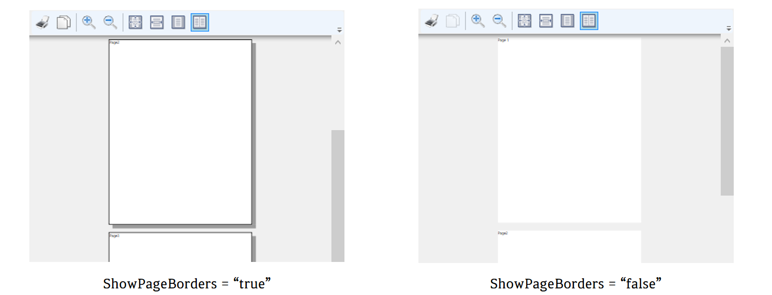
VerticalOffset
세로 스크롤 위치를 설정합니다. 기본값은 0.0입니다.
<DocumentViewer VerticalOffset="100" />
VerticalPageSpacing
표시되는 페이지 간의 세로 간격을 설정합니다. 기본값은 10.0입니다.
<DocumentViewer VerticalPageSpacing="100" />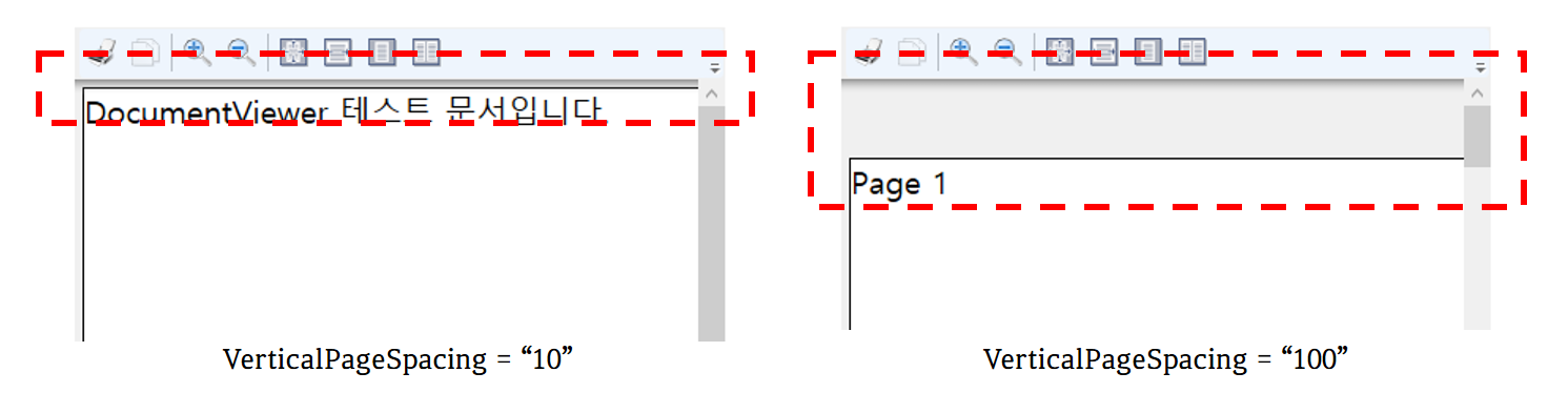
Zoom
문서 확대/축소 배율을 설정합니다. 5.0에서 5000.0 사이의 값으로 표시되는 확대/축소 배율입니다. 기본값은 100입니다.
<DocumentViewer Zoom="200" />
[ DocumentViewer Style ]

예제의 XAML 코드를 DocumentViewer에 적용하면 위와 같은 결과가 나옵니다. 이러한 결과에 도달하도록 코드 순서로 속성을 살펴보면 다음과 같습니다.
DocumentViewer 속성
<Style x:Key="{x:Type DocumentViewer}" TargetType="{x:Type DocumentViewer}">
  <Setter Property="Foreground" Value="{DynamicResource {x:Static SystemColors.WindowTextBrushKey}}" />
  <Setter Property="Background" Value="{DynamicResource {x:Static SystemColors.ControlBrushKey}}" />
  <Setter Property="FocusVisualStyle" Value="{x:Null}" />
  <Setter Property="Template">
    <Setter.Value>
      ...
    </Setter.Value>
  </Setter>
</Style>
x:Key
XAML 정의 사전에서 만들고 참고하는 요소를 고유하게 식별합니다.
TargetType
이 Style을 적용할 형식을 설정합니다. 예제에서는 "{x:Type DocumentViewer}"으로 설정했습니다.
Foreground
전경색을 설명하는 브러시를 설정합니다.
Background
DocumentViewer의 배경색을 설정합니다.
FocusVisualStyle
키보드 focus를 캡처할 때 DocumentViewer에 적용되는 모양, 효과 또는 기타 Style 특성을 사용자 지정할 수 있는 속성을 설정합니다.
Template
<Setter Property="Template">
  <Setter.Value>
    <ControlTemplate TargetType="{x:Type DocumentViewer}">
      <Border ... >
        <Grid ... >
          ...
          <ToolBar ... >
            <Button ... Content="Print" />
            <Button ... Content="Copy" />
            <Separator />
            <Button ... Content="Zoom In" />
            <Button ...Content="Zoom Out" />
            <Separator />
            <Button ... Content="Actual Size" />
            <Button ... Content="Fit to Width" />
            <Button ... Content="Whole Page" />
            <Button .... Content="Two Pages" />
          </ToolBar>

          <ScrollViewer x:Name="PART_ContentHost" ... />

          <ContentControl Grid.Row="2" x:Name="PART_FindToolBarHost"/>
        </Grid>
      </Border>
    </ControlTemplate>
  </Setter.Value>
</Setter>
Control의 템플릿을 설정합니다. 예제에서 사용되는 Template는 Control의 외형을 지정해줄 수 있는 ControlTemplate입니다.
👀 Template에 대해서 좀 더 아시고 싶으신 분은 이 페이지를 참고하시길 바랍니다.
DocumentViewer Style 구성
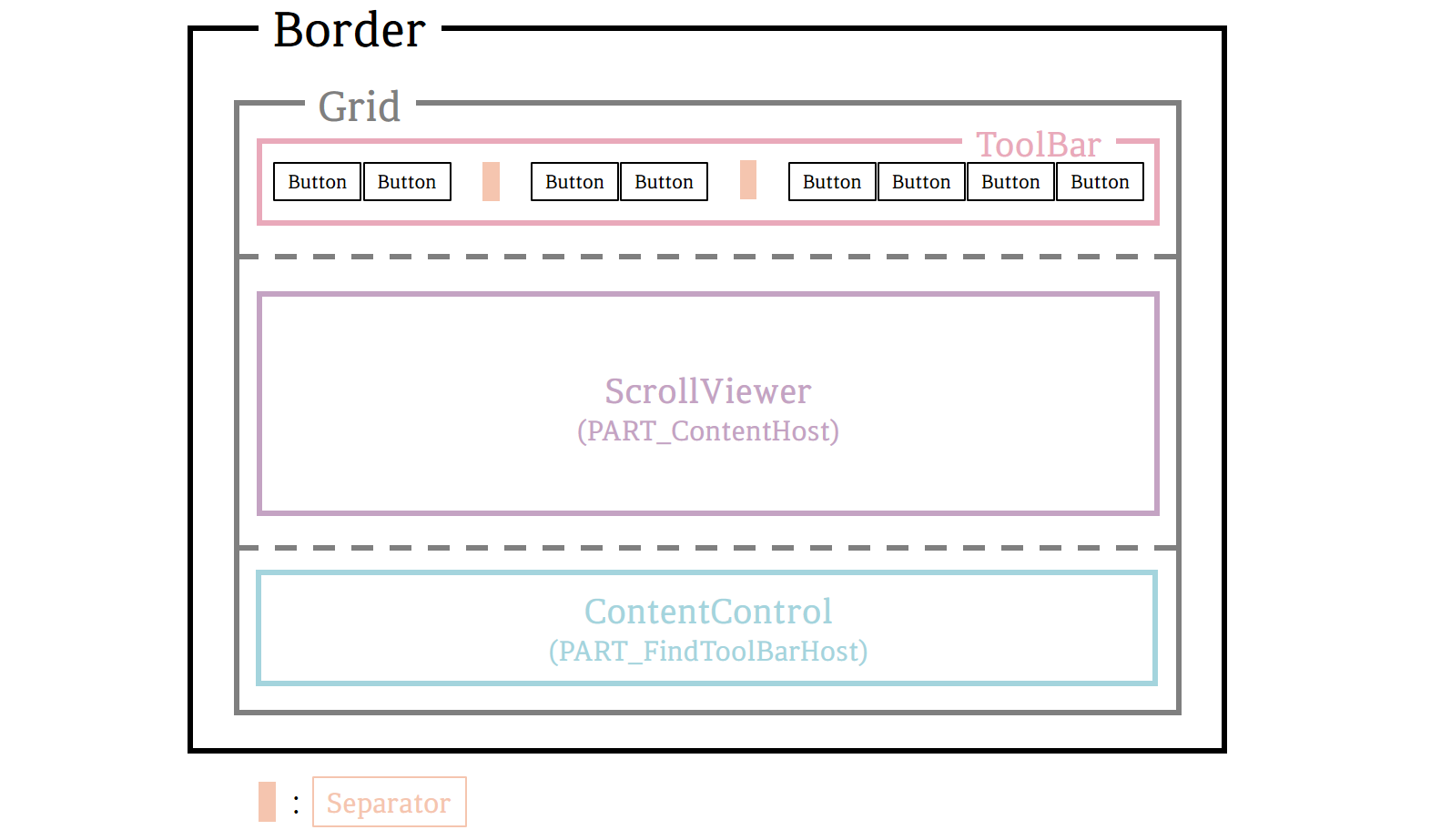
DocumentViewer Style은 Grid 내부에 특정 기능을 가지고 있는 Button들을 가지고 있는 ToolBar, ScrollViewer와 ContentControl로 구성되어있습니다.
Border
다른 요소의 주위에 윤곽선, 배경 또는 둘 다를 그립니다.
⭐ Border 속성
<Border BorderThickness="{TemplateBinding BorderThickness}"
        BorderBrush="{TemplateBinding BorderBrush}" Focusable="False">
  ...
</Border>
BorderThickness
Border의 윤곽선 두께를 설정합니다.
BorderBrush
Border의 윤곽선 색을 설정합니다.
Focusable
Border가 focus를 받을 수 있는지 여부를 설정합니다. focus를 받을 수 있으면 true이고, 받을 수 없으면 false(기본값)입니다.
Grid
열 및 행으로 구성되는 유연한 모눈 영역을 정의합니다.
⭐ Grid 속성
<Grid KeyboardNavigation.TabNavigation="Local">
  <Grid.Background>
    <SolidColorBrush Color="{DynamicResource ControlLightColor}" />
  </Grid.Background>
  <Grid.RowDefinitions>
    <RowDefinition Height="Auto" />
    <RowDefinition Height="*" />
    <RowDefinition Height="Auto" />
  </Grid.RowDefinitions>
  ...
</Grid>
KeyboardNavigation.TabNavigation
Grid의 자식에 대한 논리적 탭 탐색 동작을 설정합니다. 값으로는 Contained, Continue, Cycle, Local, None과 Once가 있습니다.
👀 KeyboardNavigation.TabNavigation의 값에 대한 자세한 설명은 이 페이지를 참고하시면 됩니다.
Background
Grid의 배경색을 설정합니다. 예제에서는 SolidColorBrush를 사용하여 미리 정의한 ControlLightColor로 설정했습니다.
RowDefinitions
Grid에 RowDefinition을 사용하여 RowDefinitionCollection(RowDefinition 개체의 순서가 지정된 컬렉션)을 설정합니다.
RowDefinition
Grid 요소에 적용되는 행 별 속성을 정의합니다. Height로 높이를 숫자 값, 'Auto' 또는 '*'(기본값)로 설정할 수 있습니다.
ToolBar
Command 또는 Control 그룹의 컨테이너를 제공합니다.
⭐ ToolBar 속성
<ToolBar ToolBarTray.IsLocked="True" KeyboardNavigation.TabNavigation="Continue">
  ...
</ToolBar>
ToolBarTray.IsLocked
ToolBar를 ToolBarTray 내부에서 이동할 수 있는지 여부를 설정합니다. 도구 모음을 도구 모음 트레이 내부에서 이동할 수 없으면 true이고, 그렇지 않으면 false(기본값)입니다.
KeyboardNavigation.TabNavigation
ToolBar의 자식에 대한 논리적 탭 탐색 동작을 설정합니다. 값으로는 Contained, Continue, Cycle, Local, None과 Once가 있습니다.
👀 KeyboardNavigation.TabNavigation의 값에 대한 자세한 설명은 이 페이지를 참고하시면 됩니다.
Button
Click 이벤트에 반응하는 Windows Control을 나타냅니다.
⭐ Button 속성
  <Button Command="ApplicationCommands.Print"
          CommandTarget="{Binding RelativeSource={RelativeSource TemplatedParent}}"
          Content="Print" />
  <Button Command="ApplicationCommands.Copy"
          CommandTarget="{Binding RelativeSource={RelativeSource TemplatedParent}}"
          Content="Copy" />
  <Button Command="NavigationCommands.IncreaseZoom"
          CommandTarget="{Binding RelativeSource={RelativeSource TemplatedParent}}"
          Content="Zoom In" />
  <Button Command="NavigationCommands.DecreaseZoom"
          CommandTarget="{Binding RelativeSource={RelativeSource TemplatedParent}}"
          Content="Zoom Out" />
  <Button Command="NavigationCommands.Zoom"
          CommandTarget="{Binding RelativeSource={RelativeSource TemplatedParent}}"
          CommandParameter="100.0"
          Content="Actual Size" />
  <Button Command="DocumentViewer.FitToWidthCommand"
          CommandTarget="{Binding RelativeSource={RelativeSource TemplatedParent}}"
          Content="Fit to Width" />
  <Button Command="DocumentViewer.FitToMaxPagesAcrossCommand"
          CommandTarget="{Binding RelativeSource={RelativeSource TemplatedParent}}"
          CommandParameter="1"
          Content="Whole Page" />
  <Button Command="DocumentViewer.FitToMaxPagesAcrossCommand"
          CommandTarget="{Binding RelativeSource={RelativeSource TemplatedParent}}"
          CommandParameter="2"
          Content="Two Pages" />
Command
Button을 누를 때 호출할 명령을 설정합니다.
CommandTarget
지정된 명령을 호출하는 요소를 설정합니다.
CommandParameter
Command 속성으로 전달할 매개 변수를 설정합니다.
Content
ContentControl의 내용을 설정합니다.
🌟 Command 값
ApplicationCommands.Print : 현재 항목을 인쇄 명령
ApplicationCommands.Copy : 선택 영역을 클립보드에 복사 명령
NavigationCommands.IncreaseZoom : 확대/축소비율을 늘리는 명령
NavigationCommands.DecreaseZoom : 확재/축소비율을 줄이는 명령
NavigationCommands.Zoom : 확대/축소 명령
DocumentViewer.FitToWidthCommand : FitToWdith(단일 페이지를 현재 뷰포트의 너비에 맞추는 설정) 작업을 수행하는 명령
DocumentViewer.FitToMaxPagesAcrossCommand : MaxPagesAcross(표시할 최대 페이지 열 수를 설정) 작업을 수행하는 명령
Separator
항목을 구분하는 데 사용되는 Control입니다.
ScrollViewer(PART_ContentHost)
표시 가능한 다른 요소를 포함할 수 있는 Scroll 가능한 영역을 나타냅니다.
⭐ ScrollViewer 속성
<ScrollViewer Grid.Row="1" CanContentScroll="true" HorizontalScrollBarVisibility="Auto"
              x:Name="PART_ContentHost" IsTabStop="true">
  <ScrollViewer.Background>
    <LinearGradientBrush EndPoint="0.5,1" StartPoint="0.5,0">
      <GradientStop Color="{DynamicResource ControlLightColor}" Offset="0" />
      <GradientStop Color="{DynamicResource ControlMediumColor}" Offset="1" />
    </LinearGradientBrush>
  </ScrollViewer.Background>
</ScrollViewer>
Grid.Row
표시할 Grid(Parent)의 행을 설정합니다.
CanContentScroll
IScrollInfo 인터페이스를 지원하는 요소를 Scroll 할 수 있는지 여부를 설정합니다.
HorizontalScrollBarVisibility
가로 ScrollBar를 표시해야 하는지 여부를 설정합니다. 기본값은 Hidden이고, 다른 값으로는 Auto, Disabled, Visible이 있습니다.
x:Name
ScrollViewer에 이름을 설정합니다. 이름을 붙이는 것과 동시에 다른 곳에서 사용할 수 있도록 만들어줍니다.
IsTabStop
ScrollViewer이 탭 탐색에 포함되는지 여부를 설정합니다. 탭 탐색에 포함되면 true(기본값)이고, 그렇지 않으면 false입니다.
Background
ScrollViewer의 배경색을 설정합니다. 예제에서는 LinearGradientBrush를 사용하여 그라데이션 색을 설정했습니다.
👀 그라데이션 색에 관해서 궁금하신 분은 이 페이지를 참고하시길 바랍니다.
ContentControl(PART_FindToolBarHost)
모든 유형의 단일 Content로 이루어진 Control을 나타냅니다.
⭐ ContentControl 속성
<ContentControl Grid.Row="2" x:Name="PART_FindToolBarHost"/>
Grid.Row
표시할 Grid(Parent)의 행을 설정합니다.
x:Name
ContentControl에 이름을 설정합니다. 이름을 붙이는 것과 동시에 다른 곳에서 사용할 수 있도록 만들어줍니다.
전체 코드
<Style x:Key="{x:Type DocumentViewer}"
       TargetType="{x:Type DocumentViewer}">
  <Setter Property="Foreground"
          Value="{DynamicResource {x:Static SystemColors.WindowTextBrushKey}}" />
  <Setter Property="Background"
          Value="{DynamicResource {x:Static SystemColors.ControlBrushKey}}" />
  <Setter Property="FocusVisualStyle"
          Value="{x:Null}" />
  <Setter Property="Template">
    <Setter.Value>
      <ControlTemplate TargetType="{x:Type DocumentViewer}">
        <Border BorderThickness="{TemplateBinding BorderThickness}"
                BorderBrush="{TemplateBinding BorderBrush}"
                Focusable="False">
          <Grid KeyboardNavigation.TabNavigation="Local">
            <Grid.Background>
              <SolidColorBrush Color="{DynamicResource ControlLightColor}" />
            </Grid.Background>
            <Grid.RowDefinitions>
              <RowDefinition Height="Auto" />
              <RowDefinition Height="*" />
              <RowDefinition Height="Auto" />
            </Grid.RowDefinitions>
            <ToolBar ToolBarTray.IsLocked="True"
                     KeyboardNavigation.TabNavigation="Continue">
              <Button Command="ApplicationCommands.Print"
                      CommandTarget="{Binding RelativeSource={RelativeSource TemplatedParent}}"
                      Content="Print" />
              <Button Command="ApplicationCommands.Copy"
                      CommandTarget="{Binding RelativeSource={RelativeSource TemplatedParent}}"
                      Content="Copy" />
              <Separator />
              <Button Command="NavigationCommands.IncreaseZoom"
                      CommandTarget="{Binding RelativeSource={RelativeSource TemplatedParent}}"
                      Content="Zoom In" />
              <Button Command="NavigationCommands.DecreaseZoom"
                      CommandTarget="{Binding RelativeSource={RelativeSource TemplatedParent}}"
                      Content="Zoom Out" />
              <Separator />
              <Button Command="NavigationCommands.Zoom"
                      CommandTarget="{Binding RelativeSource={RelativeSource TemplatedParent}}"
                      CommandParameter="100.0"
                      Content="Actual Size" />
              <Button Command="DocumentViewer.FitToWidthCommand"
                      CommandTarget="{Binding RelativeSource={RelativeSource TemplatedParent}}"
                      Content="Fit to Width" />
              <Button Command="DocumentViewer.FitToMaxPagesAcrossCommand"
                      CommandTarget="{Binding RelativeSource={RelativeSource TemplatedParent}}"
                      CommandParameter="1"
                      Content="Whole Page" />
              <Button Command="DocumentViewer.FitToMaxPagesAcrossCommand"
                      CommandTarget="{Binding RelativeSource={RelativeSource TemplatedParent}}"
                      CommandParameter="2"
                      Content="Two Pages" />
            </ToolBar>

            <ScrollViewer Grid.Row="1"
                          CanContentScroll="true"
                          HorizontalScrollBarVisibility="Auto"
                          x:Name="PART_ContentHost"
                          IsTabStop="true">
              <ScrollViewer.Background>
                <LinearGradientBrush EndPoint="0.5,1"
                                     StartPoint="0.5,0">
                  <GradientStop Color="{DynamicResource ControlLightColor}"
                                Offset="0" />
                  <GradientStop Color="{DynamicResource ControlMediumColor}"
                                Offset="1" />
                </LinearGradientBrush>
              </ScrollViewer.Background>
            </ScrollViewer>

            <ContentControl Grid.Row="2"
                            x:Name="PART_FindToolBarHost"/>
          </Grid>
        </Border>
      </ControlTemplate>
    </Setter.Value>
  </Setter>
</Style>
<!--Control colors.-->
<Color x:Key="WindowColor">#FFE8EDF9</Color>
<Color x:Key="ContentAreaColorLight">#FFC5CBF9</Color>
<Color x:Key="ContentAreaColorDark">#FF7381F9</Color>

<Color x:Key="DisabledControlLightColor">#FFE8EDF9</Color>
<Color x:Key="DisabledControlDarkColor">#FFC5CBF9</Color>
<Color x:Key="DisabledForegroundColor">#FF888888</Color>

<Color x:Key="SelectedBackgroundColor">#FFC5CBF9</Color>
<Color x:Key="SelectedUnfocusedColor">#FFDDDDDD</Color>

<Color x:Key="ControlLightColor">White</Color>
<Color x:Key="ControlMediumColor">#FF7381F9</Color>
<Color x:Key="ControlDarkColor">#FF211AA9</Color>

<Color x:Key="ControlMouseOverColor">#FF3843C4</Color>
<Color x:Key="ControlPressedColor">#FF211AA9</Color>


<Color x:Key="GlyphColor">#FF444444</Color>
<Color x:Key="GlyphMouseOver">sc#1, 0.004391443, 0.002428215, 0.242281124</Color>

<!--Border colors-->
<Color x:Key="BorderLightColor">#FFCCCCCC</Color>
<Color x:Key="BorderMediumColor">#FF888888</Color>
<Color x:Key="BorderDarkColor">#FF444444</Color>

<Color x:Key="PressedBorderLightColor">#FF888888</Color>
<Color x:Key="PressedBorderDarkColor">#FF444444</Color>

<Color x:Key="DisabledBorderLightColor">#FFAAAAAA</Color>
<Color x:Key="DisabledBorderDarkColor">#FF888888</Color>

<Color x:Key="DefaultBorderBrushDarkColor">Black</Color>

<!--Control-specific resources.-->
<Color x:Key="HeaderTopColor">#FFC5CBF9</Color>
<Color x:Key="DatagridCurrentCellBorderColor">Black</Color>
<Color x:Key="SliderTrackDarkColor">#FFC5CBF9</Color>

<Color x:Key="NavButtonFrameColor">#FF3843C4</Color>

<LinearGradientBrush x:Key="MenuPopupBrush"
                     EndPoint="0.5,1"
                     StartPoint="0.5,0">
  <GradientStop Color="{DynamicResource ControlLightColor}"
                Offset="0" />
  <GradientStop Color="{DynamicResource ControlMediumColor}"
                Offset="0.5" />
  <GradientStop Color="{DynamicResource ControlLightColor}"
                Offset="1" />
</LinearGradientBrush>

<LinearGradientBrush x:Key="ProgressBarIndicatorAnimatedFill"
                     StartPoint="0,0"
                     EndPoint="1,0">
  <LinearGradientBrush.GradientStops>
    <GradientStopCollection>
      <GradientStop Color="#000000FF"
                    Offset="0" />
      <GradientStop Color="#600000FF"
                    Offset="0.4" />
      <GradientStop Color="#600000FF"
                    Offset="0.6" />
      <GradientStop Color="#000000FF"
                    Offset="1" />
    </GradientStopCollection>
  </LinearGradientBrush.GradientStops>
</LinearGradientBrush>
이 글의 내용은 아래의 사이트에서 기초합니다.
DocumentViewer 스타일 및 템플릿 - WPF .NET Framework
DocumentViewer 스타일 및 템플릿 아티클 05/04/2022 읽는 데 3분 걸림 기여자 1명 이 문서의 내용 --> 이 항목에서는 DocumentViewer 컨트롤의 스타일 및 템플릿을 설명합니다. 기본값을 수정할 수 있습니다 C
docs.microsoft.com
'프로그램 개발 > WPF: Style&Template' 카테고리의 다른 글
| Frame① (0) | 2022.05.25 |
|---|---|
| Expander (0) | 2022.05.20 |
| DatePicker② (0) | 2022.05.19 |
| DatePicker① (0) | 2022.05.18 |
| DataGrid④ (0) | 2022.05.17 |